A Relative Report
A brief note on my favourite relative trends within the markets
Do you like to have ten indicators on your charts or even those complex indicators people are making over in trading view? I know I don’t! I like to keep things clean and straightforward, and I find by doing this I am getting better information out of the charts… thus my analysis of the markets is better.
Let’s talk about Relative Strength…
I’m not bring anything new to the game here… this type of analysis has been around forever… but if you're not using Relative Strength Comparisons (A/B), you are missing out on some important information!
It’s easy math...
I promise!
So, all you need to do is divide the price of the security/index (numerator) by the price of the base security/index (denominator).
The information that this provides us is when the line is rising, the security/index is outperforming the base security/index. When the line is falling, the base security/index is outperforming the security/index. When it moves sideways, both prices are rising and falling equally percentage-wise.
See I told you it was simple math!
Now that we know what is 'relative strength' and why I like to use it as one of my primary analysis tools. Let's get stuck into some charts…
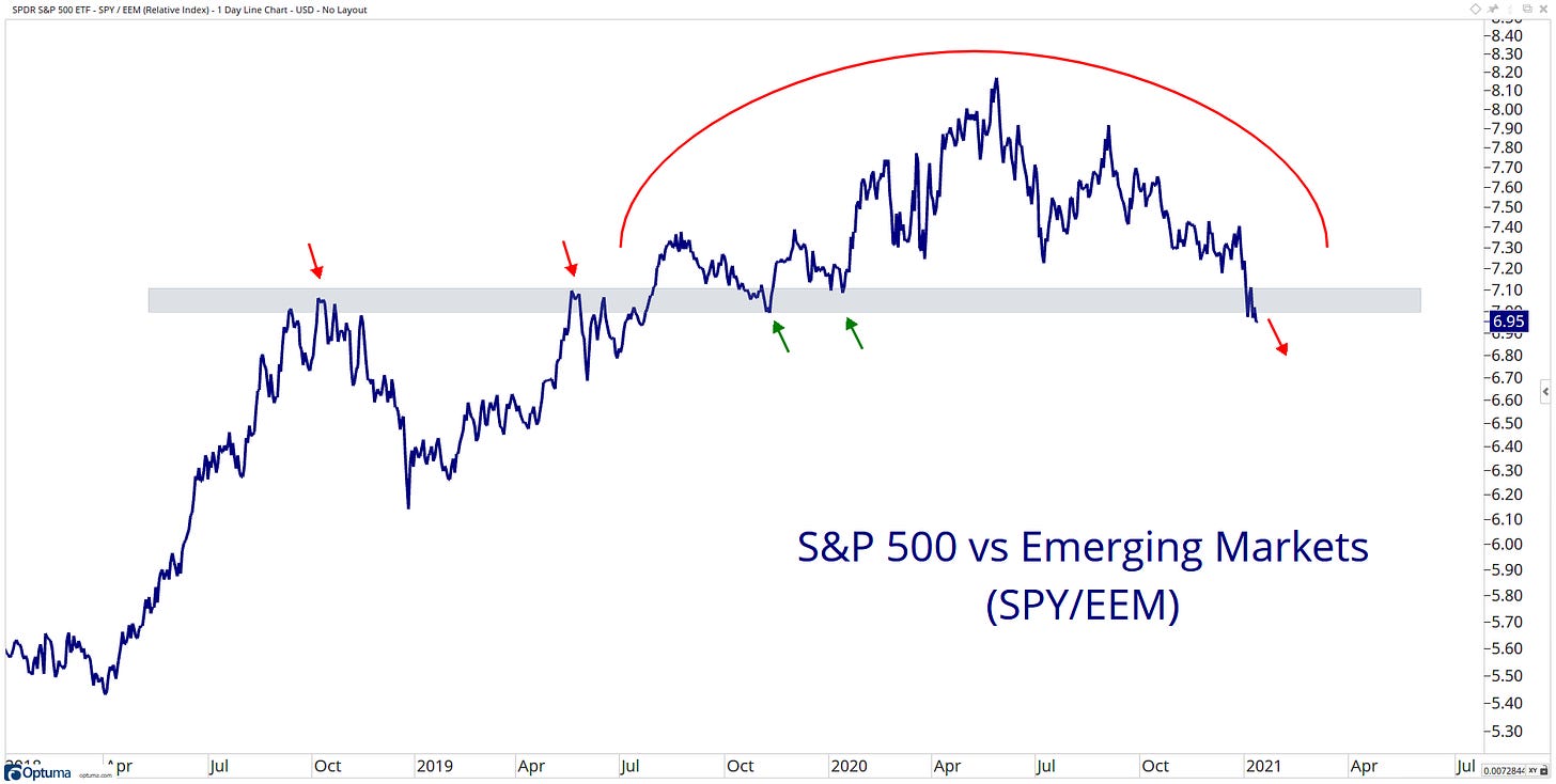
US stocks have been outperforming international stocks since 2008. This ratio looks to have put in rounding top formation, and since the September peak, it has been trending lower.
US Stocks have been outperforming Emerging Markets. However, it now looks as if Emerging Markets have taken the leadership role with a break to the downside of a critical level.
Emerging Markets looks to be taking a leadership role.
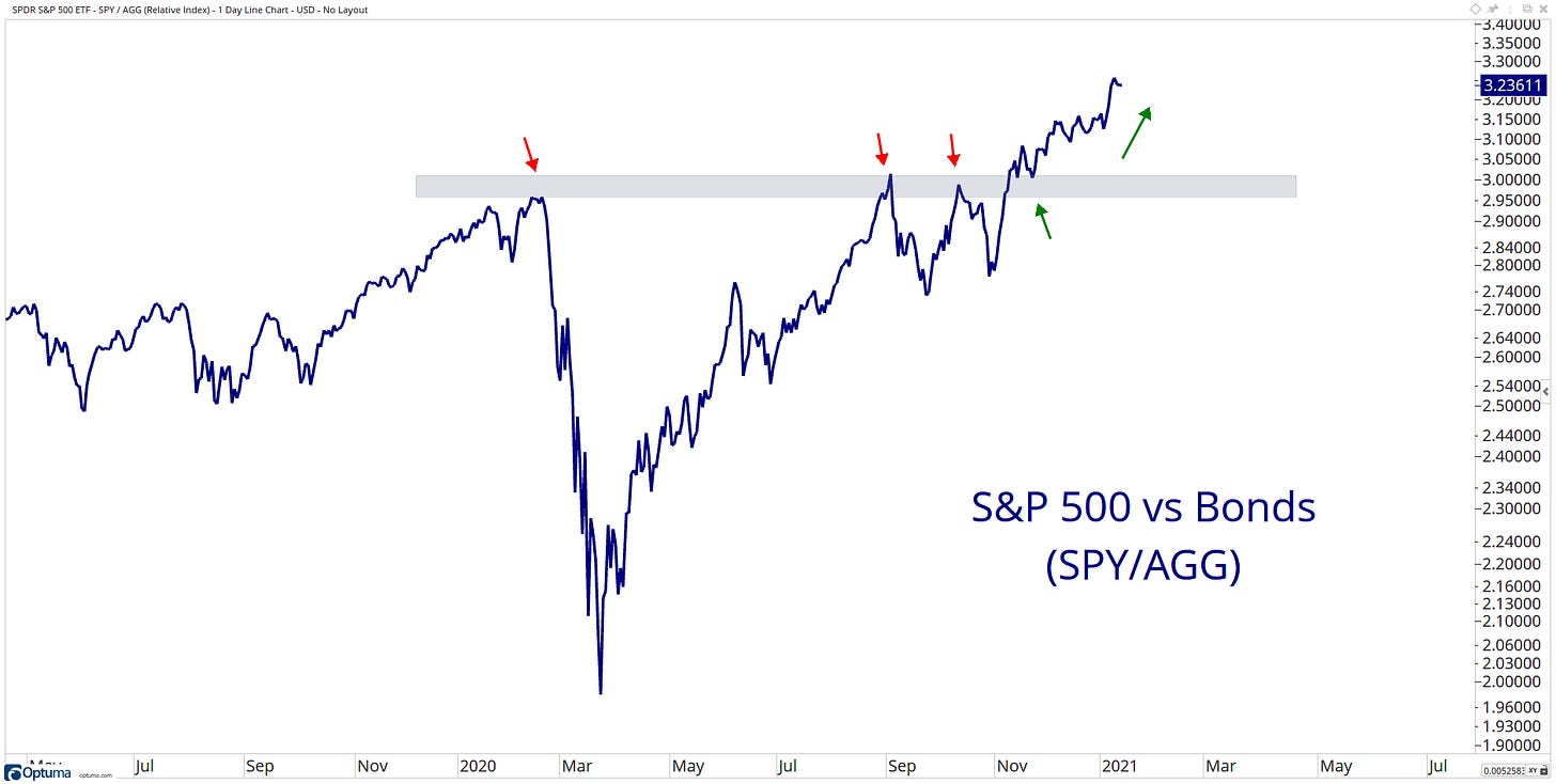
The ratio of stocks to bonds continues to grind to new highs.
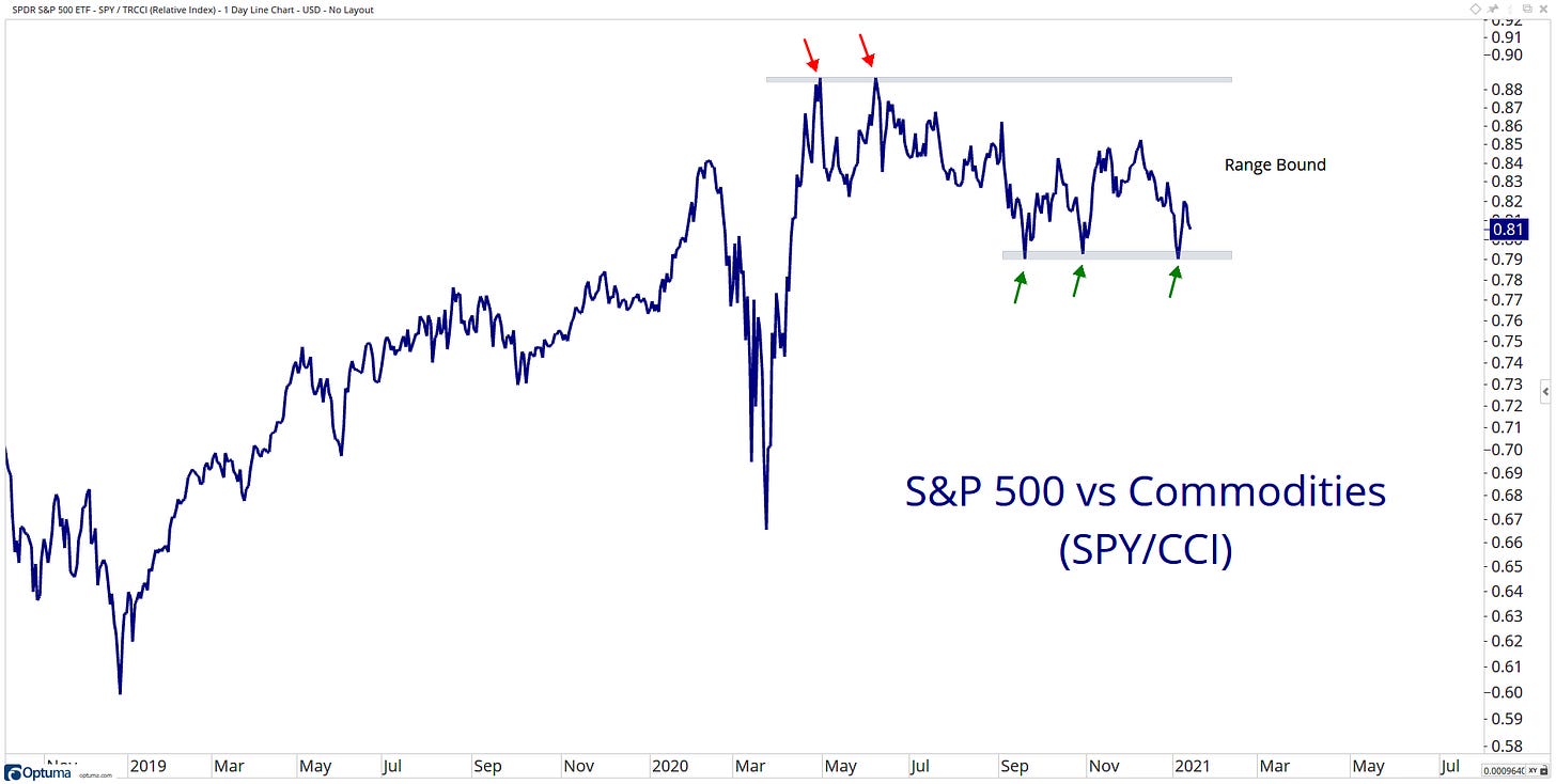
US stocks have been outperforming commodities since 2011. However, do we see a shift in leadership? Stocks are holding tightly onto that level of support.
Large-cap stocks have been outperforming Small-cap stocks since what feels like forever. This ratio peaked last March and has been trending lower since!
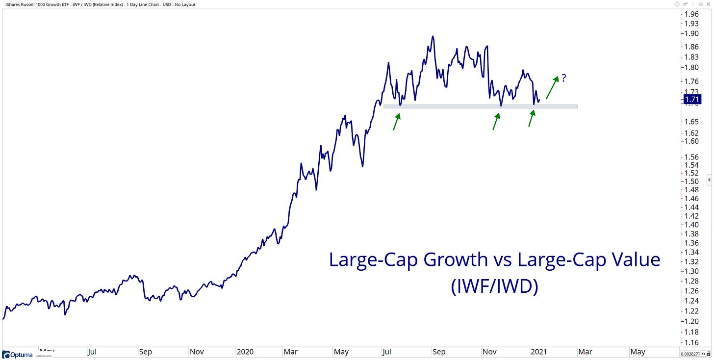
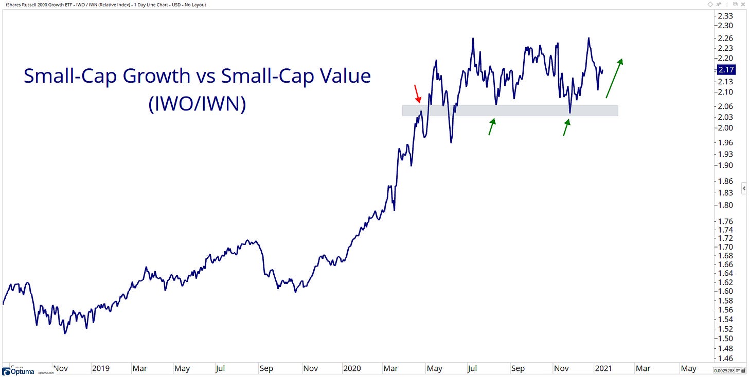
Another rato that feels like Growth has been outperforming value forever! Growth is now on the ropes, but it still holding above a key level of support.
Same story when you drop down the market cap scale…
High Beta is coming out of left field…
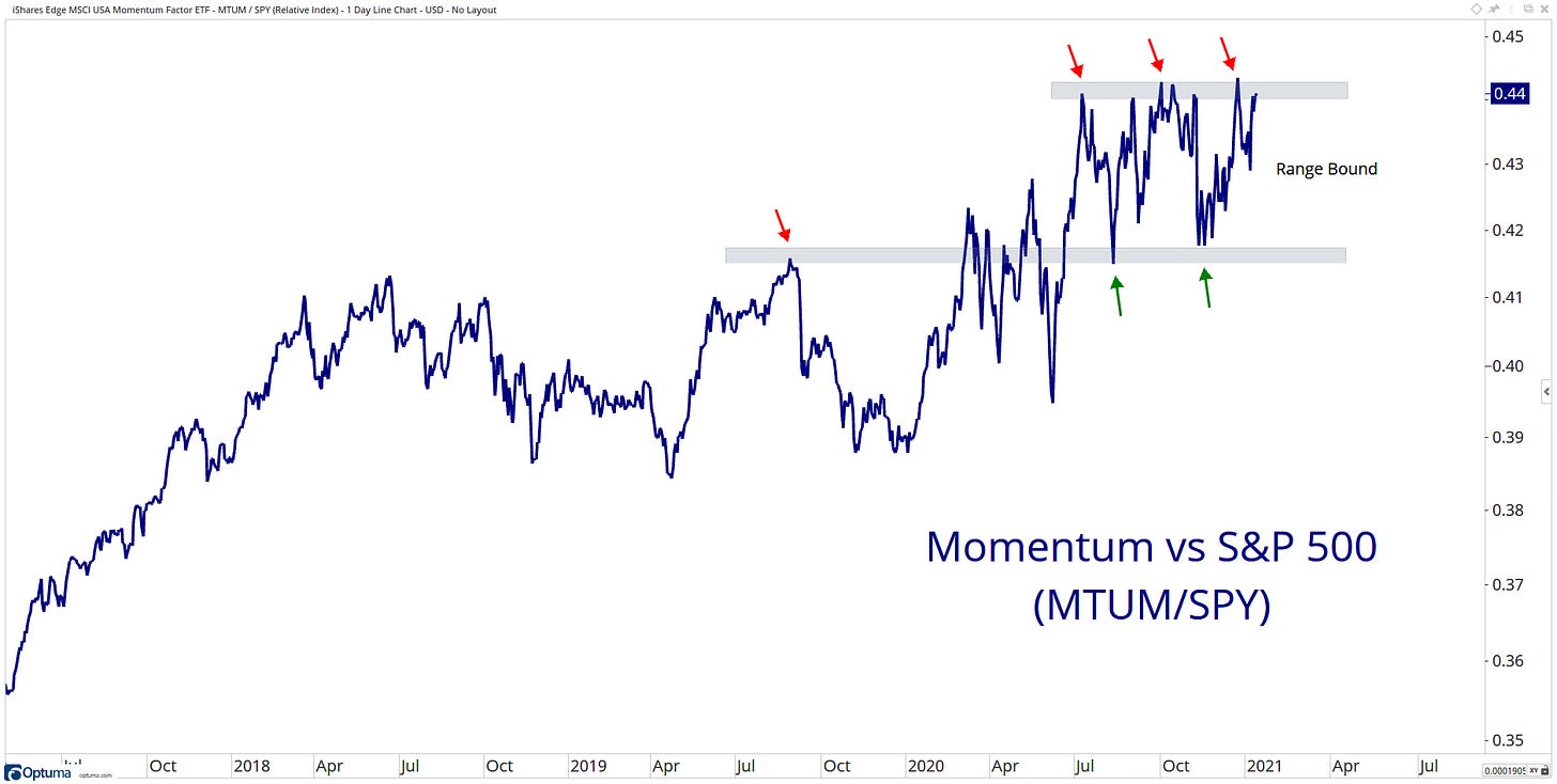
High momentum stocks have a strong run of outperformance though it looks that it’s now caught in a range…
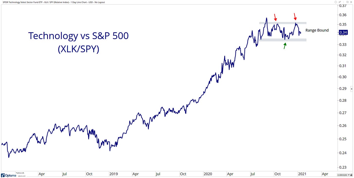
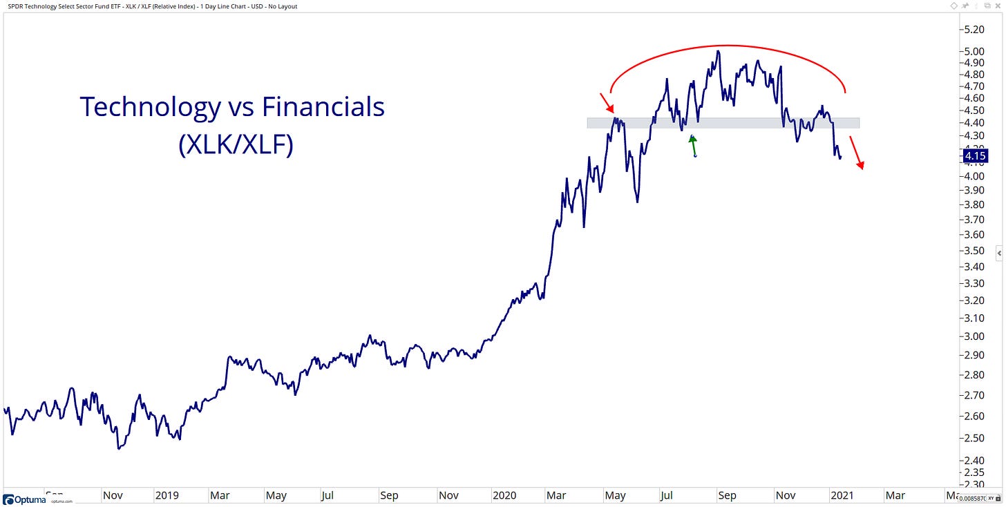
Technology had a fantastic year in 2020! Now it looks to be taking a breather relative to the Market…
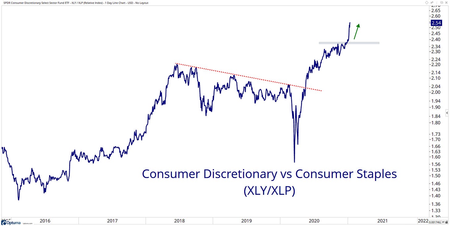
Since Discretionary stocks broke above the downtrend line relative to Staple stocks, it has taken well to its new leadership role…
Is the rotation real?
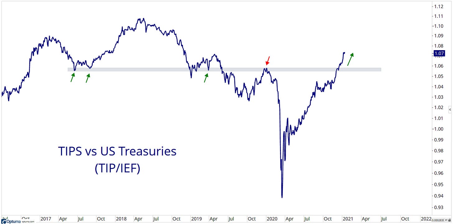
As inflation expectations continue to rise, this ratio to treasuries has been grinding higher since March 2020 lows.
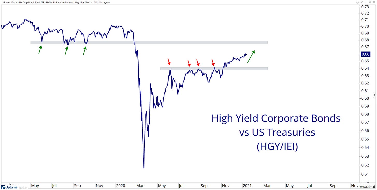
High yield grinding higher versus treasuries...
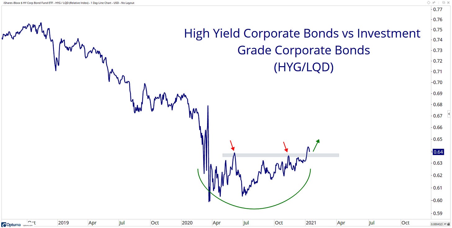
People looking for my risker assets?
The long duration ratio to short duration bonds has been moving lower and even breaking a key level of support. Short duration bonds taking on a new leadership role here?
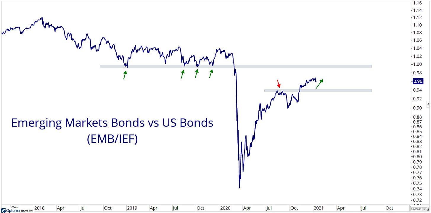
Emerging Market bonds grinding higher with contained outperformance relative to US treasuries. This fits the current market's theme.
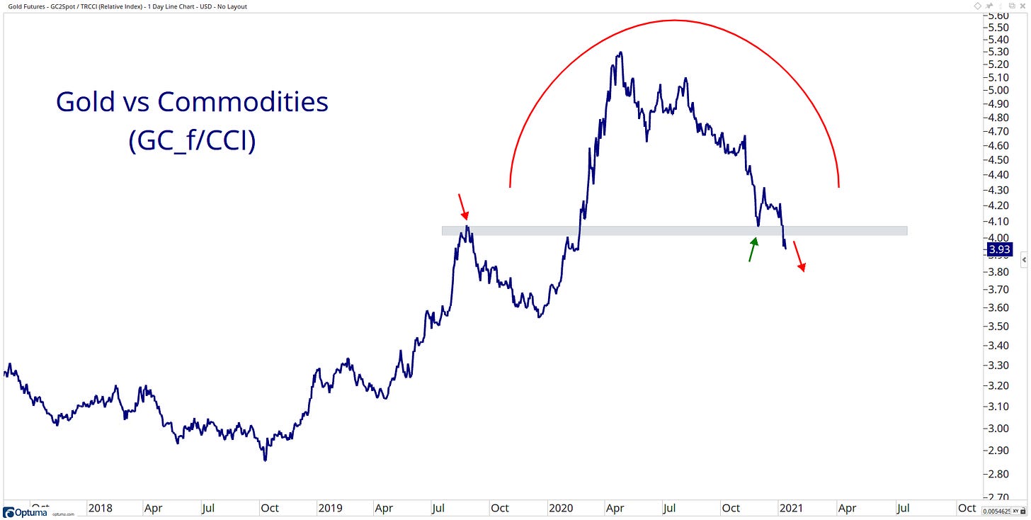
Gold looks to be losing its leadership role among the commodities space…
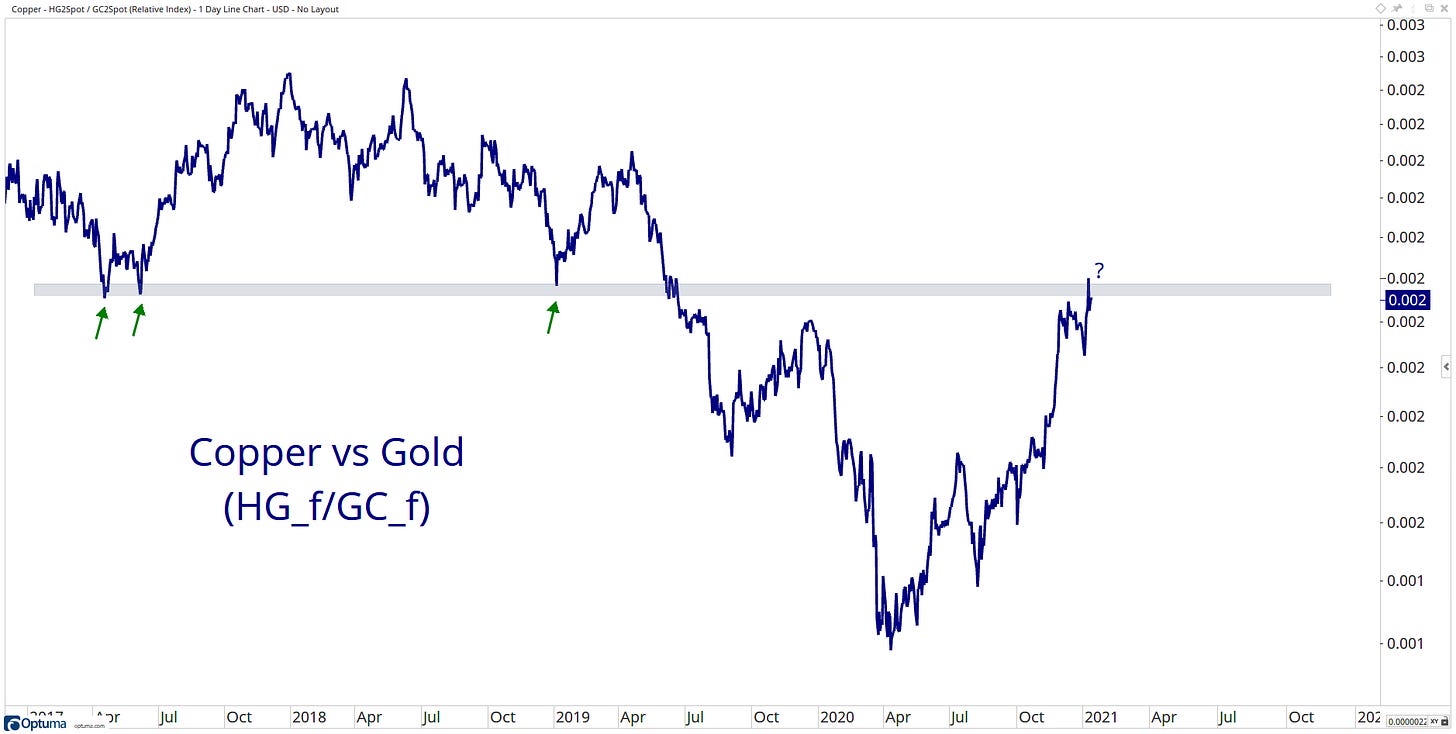
That leadership role looks to have been taken up by copper…
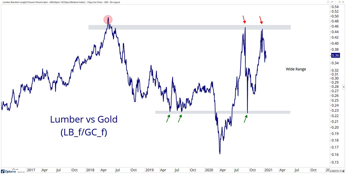
Also seeing a strong move in Lumber…
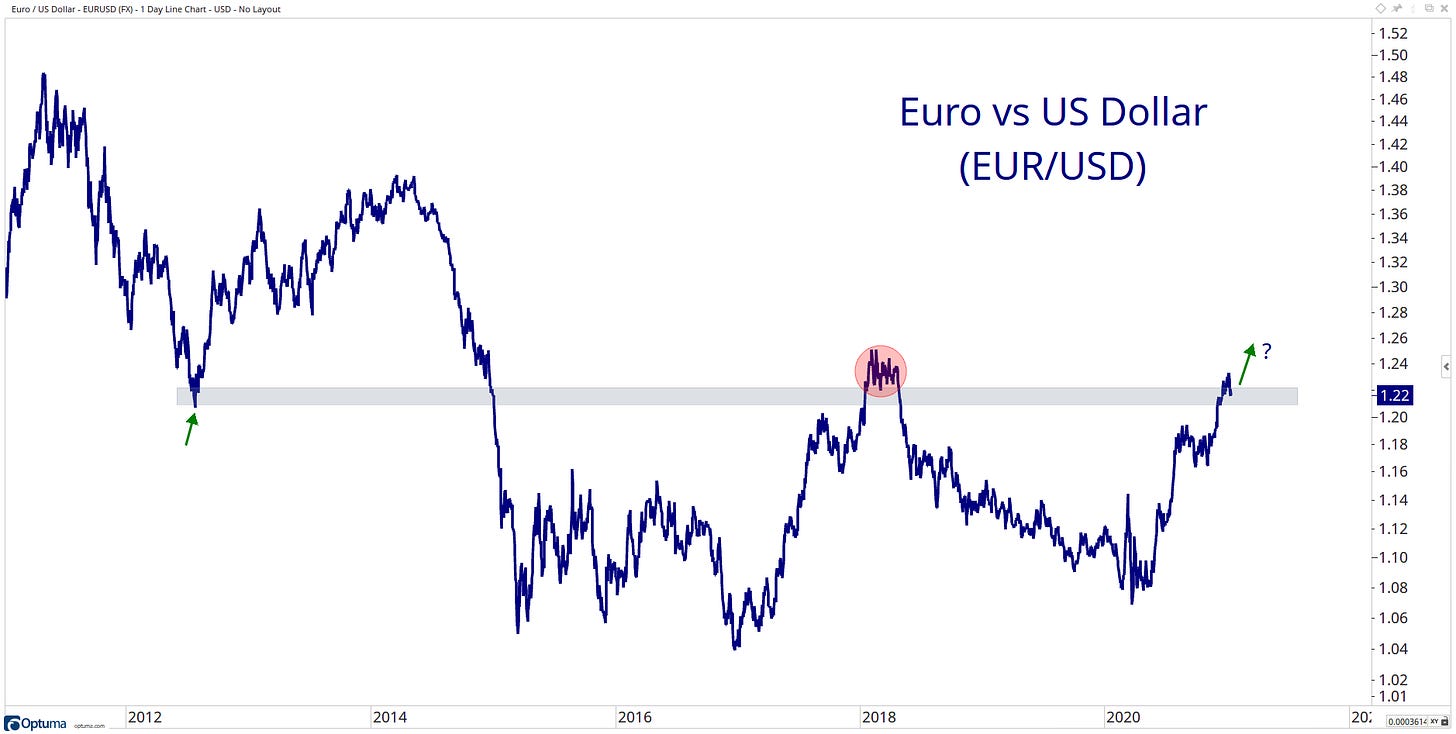
Strength in the Euro, can it hold above current levels?
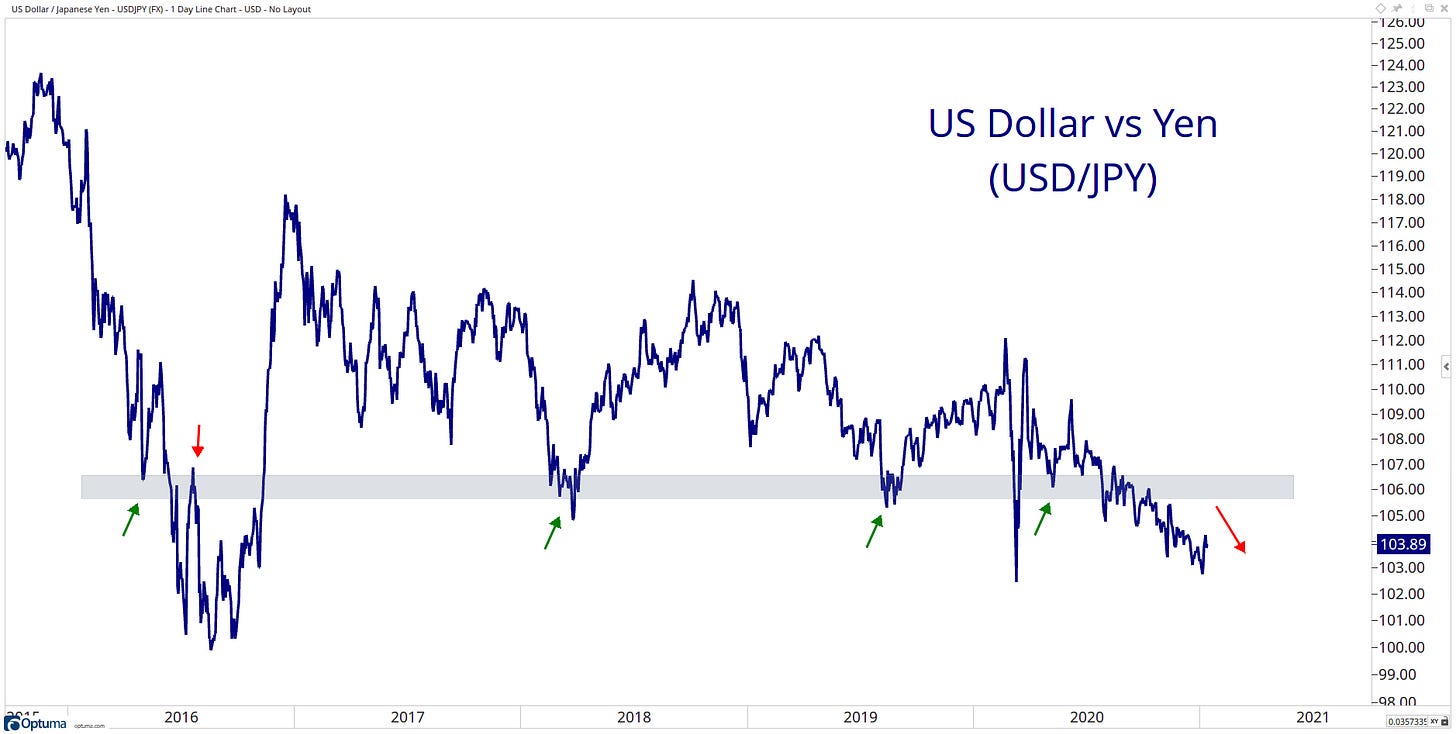
The Yen continues to grind…
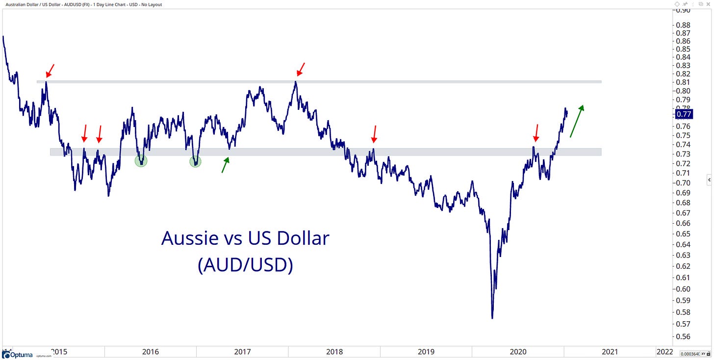
The Aussie dollar is putting in work since it bottomed in March 2020.
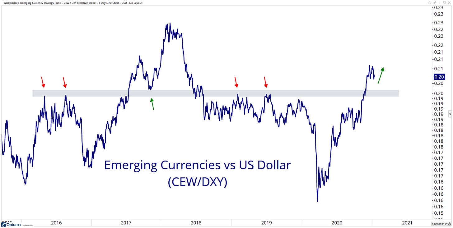
Emerging Market currencies taking a leadership role since the covid crash…
When it comes to identifying opportunities in the markets, the most straightforward solution can sometimes be the most effective.
So… my question to you, what information did you get out of my charts? I would love to hear from you… please get in contact with me on Twitter @granthawkridge.
That’s a wrap for today, hope you enjoyed my charts, and please don’t forget to share your ideas in the comment section or get in contact with me on Twitter @granthawkridge.
Stay safe and good luck out there…
GH
DISCLAIMER: The information included in this report are obtained from sources which Jotting on Charts believes to be reliable, but we do not guarantee its accuracy. All of the information contained herein should be independently verified and confirmed. All opinions expressed by Jotting on Charts are for informational purposes only. Jotting on Charts is not a financial advisor, and this does not constitute investment advice nor any opinions expressed, constitute a solicitation of the purchase or sale of any securities or related financial instruments. Jotting on Charts is not responsible for any losses incurred from any use of this information. Do not trade with money you cannot afford to lose. It is recommended that you consult a qualified financial advisor before making any investment decisions.


