Do you like to have ten indicators on your charts or even those complex indicators people are making over in trading view? I know I don’t! I want to keep things clean and straightforward, and I find by doing this, I am getting better information out of the charts… thus, my analysis of the markets is better.
One of my favourite tools to use is Relative Strength, so let’s talk about it…
I’m not bringing anything new to the game here… this type of analysis has been around forever… but if you're not using Relative Strength Comparisons (A/B), you miss out on some important information!
It’s easy math...
I promise!
So, all you need to do is divide the price of the security/index (numerator) by the price of the base security/index (denominator).
The information that this provides us is when the line is rising, the security/index is outperforming the base security/index. When the line is falling, the base security/index is outperforming the security/index. When it moves sideways, both prices are rising and falling equally percentage-wise.
See, I told you it was simple math!
Now that we know what is 'relative strength' and why I like to use it as my primary analysis tool. Let's get stuck into some charts…
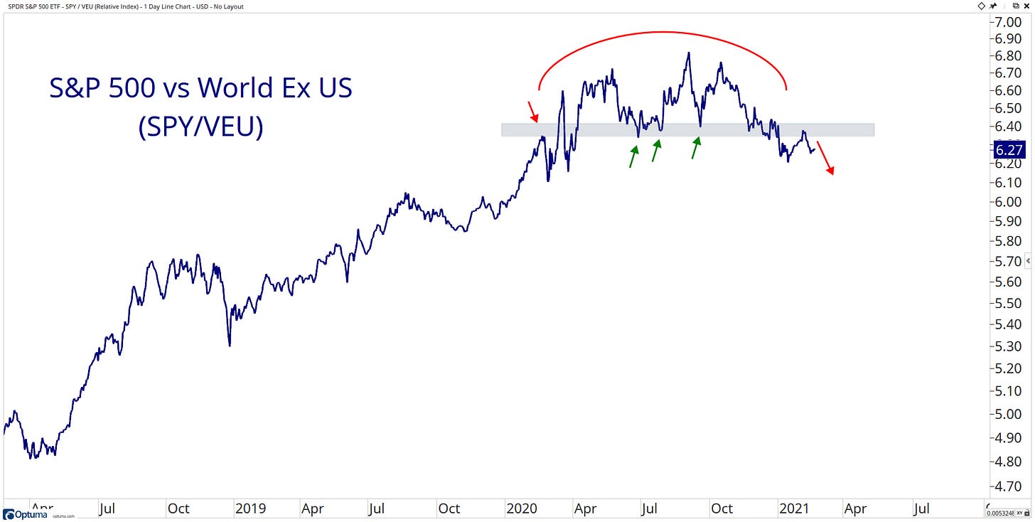
S&P 500 relative to the World ex-US looks to have put in rounding top formation, and since the September peak and has been trending lower, has the leadership role changed to international stocks now? I think so.
US Stocks have been outperforming Emerging Markets for the past decade. Has the leadership role changed hands here as it has broken below a critical level? I think so.
Emerging Markets posting a fairly big false breakout.
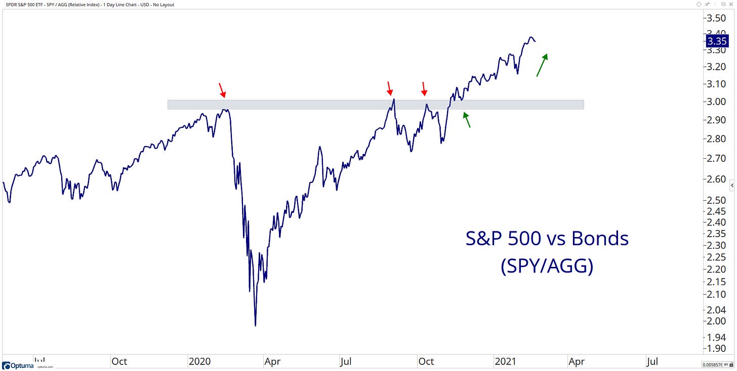
The ratio of stocks to bonds continues to grind to new highs. People are still willing to put their money to work where it’s treated best!
I think this will be the story of 2021. US stocks have been outperforming commodities for the better part of a decade. However, I think we can see a shift in the leadership role.
Large-cap stocks have been outperforming Small-cap stocks for what feels like forever. However, this ratio peaked last March, then performed a fast and robust rotation into small-caps, and now it’s looking like we might see a re-test of those 2016/2018 lows.
Growth has been outperforming Value… feels like forever! Growth is on the ropes. Is this the breakdown we have been waiting for? Maybe… Time will tell!
Same story when you drop down the market cap scale…
The leadership from High Beta has been very impressive!
High momentum stocks have had a strong run of outperformance, but it has sharply reversed course over the past week…
Technology had a fantastic year in 2020! Now it looks to be taking a breather relative to the Market…
Since Discretionary stocks broke above the downtrend line relative to Staple stocks, it has marched forward with its new leadership role.
It’s the same story as the Growth vs Value chart. It looks like Financial stocks want to take the leadership role into 2021
As inflation expectations continue to rise, this ratio to treasuries has been grinding higher since March 2020 lows.
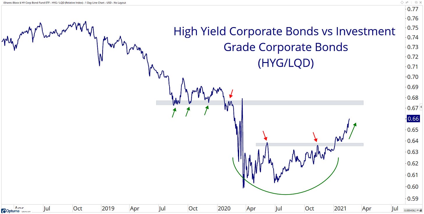
High yield grinding higher versus treasuries...
People are looking for my risker assets…
The long- to short-duration bond ratio has been moving lower and even breaking a key support level. Short duration bonds have taken on the leadership role here. Now at lowest levels in over a year.
Emerging Market bonds grinding higher relative to US treasuries. This continues to fits the current market's theme.
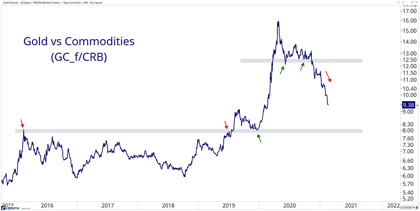
Gold was the commodity leader in early 2020 but has since trended lower.
That leadership role looks to have been taken up by copper… What an impressive move the past few months… It will be interesting to see how it reacts to this current level of resistance.
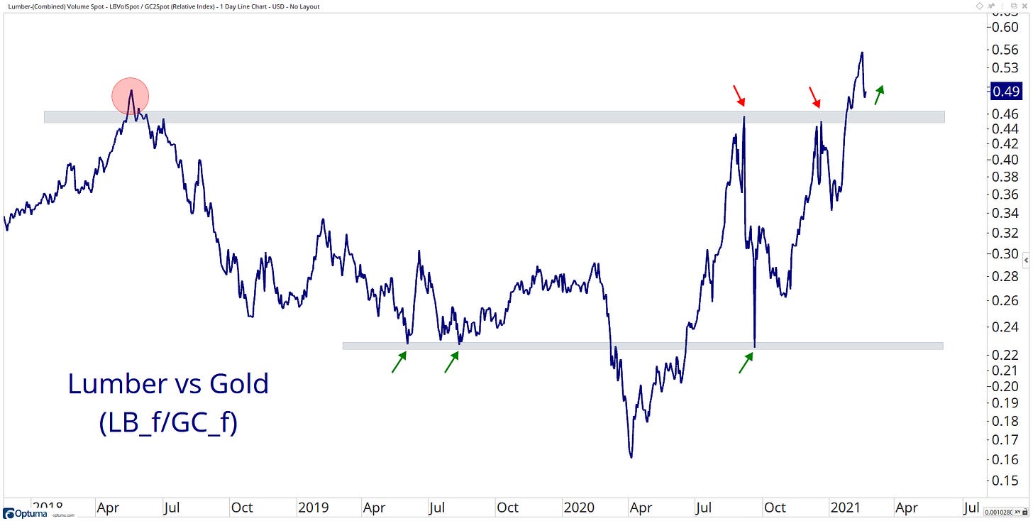
Also, seeing a strong move in Lumber…
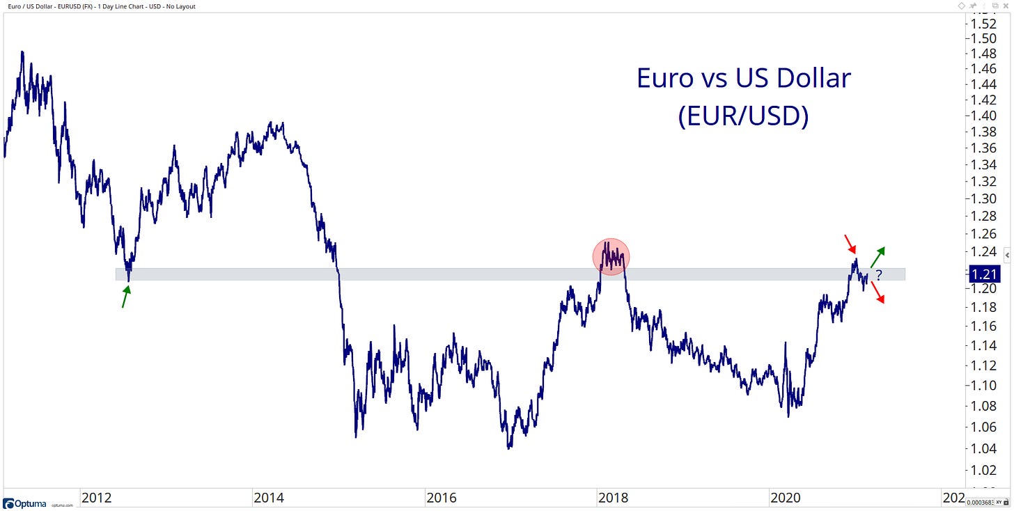
Euro is looking a bit confused at current levels.
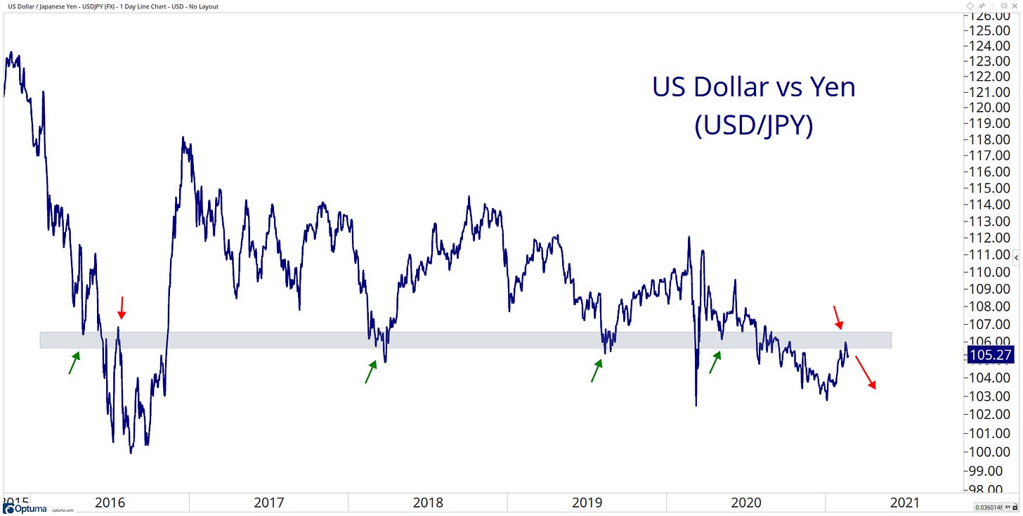
The Yen continues to grind… sideways!
The Aussie dollar is putting in work since it bottomed in March 2020. AUD looks to be eye off those 2018 highs.
Emerging market currencies taking a leadership role since the covid crash… now sitting below a considerable level of resistance, one to watch moving forward!
When it comes to identifying opportunities in the markets, the most straightforward solution can sometimes be the most effective.
So… my question to you, what information did you get out of my charts? I would love to hear from you… please get in contact with me on Twitter @granthawkridge.
That’s a wrap for today. I hope you enjoyed my charts, and please don’t forget to share your ideas in the comment section or get in contact with me on Twitter @granthawkridge.
If you enjoyed this blog, please consider sharing it for more people to see it!
Stay safe, and good luck out there…
GH
DISCLAIMER: The information included in this report are obtained from sources which Jotting on Charts believes to be reliable, but we do not guarantee its accuracy. All of the information contained herein should be independently verified and confirmed. All opinions expressed by Jotting on Charts are for informational purposes only. Jotting on Charts is not a financial advisor, and this does not constitute investment advice nor any opinions expressed, constitute a solicitation of the purchase or sale of any securities or related financial instruments. Jotting on Charts is not responsible for any losses incurred from any use of this information. Do not trade with money you cannot afford to lose. It is recommended that you consult a qualified financial advisor before making any investment decisions.











Great charts, learned a lot!