A Relative Report
A brief note on my preferred relative trends within the markets
Welcome to Jotting on Charts. If you’re reading my blog but haven’t subscribed, please join to learn more about uptrends, downtrends and everything in between alongside +550 other subscribers. Thank you to all who are following along on this journey!
If you share this with 2 of your friends who also like to look at charts, it will be GREATLY appreciated. Thank you to all those who share.
One of my favourite tools to use is Relative Strength…
So let's talk about it…
I like to keep my charts clean and straightforward, and I find by doing this, I am getting better information out of the charts… thus my analysis of the markets is better.
I'm not bringing anything new to the game here… this type of analysis has been around forever… but if you're not using Relative Strength Comparisons (A/B), you are missing out on some important information!
So, all you need to do is divide the security/index (numerator) price by the base security/index (denominator).
The information that this provides us is when the line is rising, the security/index is outperforming the base security/index. When the line falls, the base security/index is outperforming the security/index. When it moves sideways, both prices are rising and falling equally percentage-wise.
Simple mathematics!
When identifying opportunities in the markets, the most straightforward solution can sometimes be the most effective.
Now that we know what relative strength is and why I like it…
Here’s a summary table:
Let's dig into the charts…
Asset Allocation.
Stocks over Bonds: The trend continues to be in favour of stocks since coming off 2020 lows, with the ratio recently posting a fresh ATH.
Stocks over Commodities: Throughout 2023, this trend has ripped higher in favour of stocks, with the ratio at fresh 2-year highs.
Stocks over Cash: Stocks look ready to emerge even higher over cash after building a 2-year consolidation base.
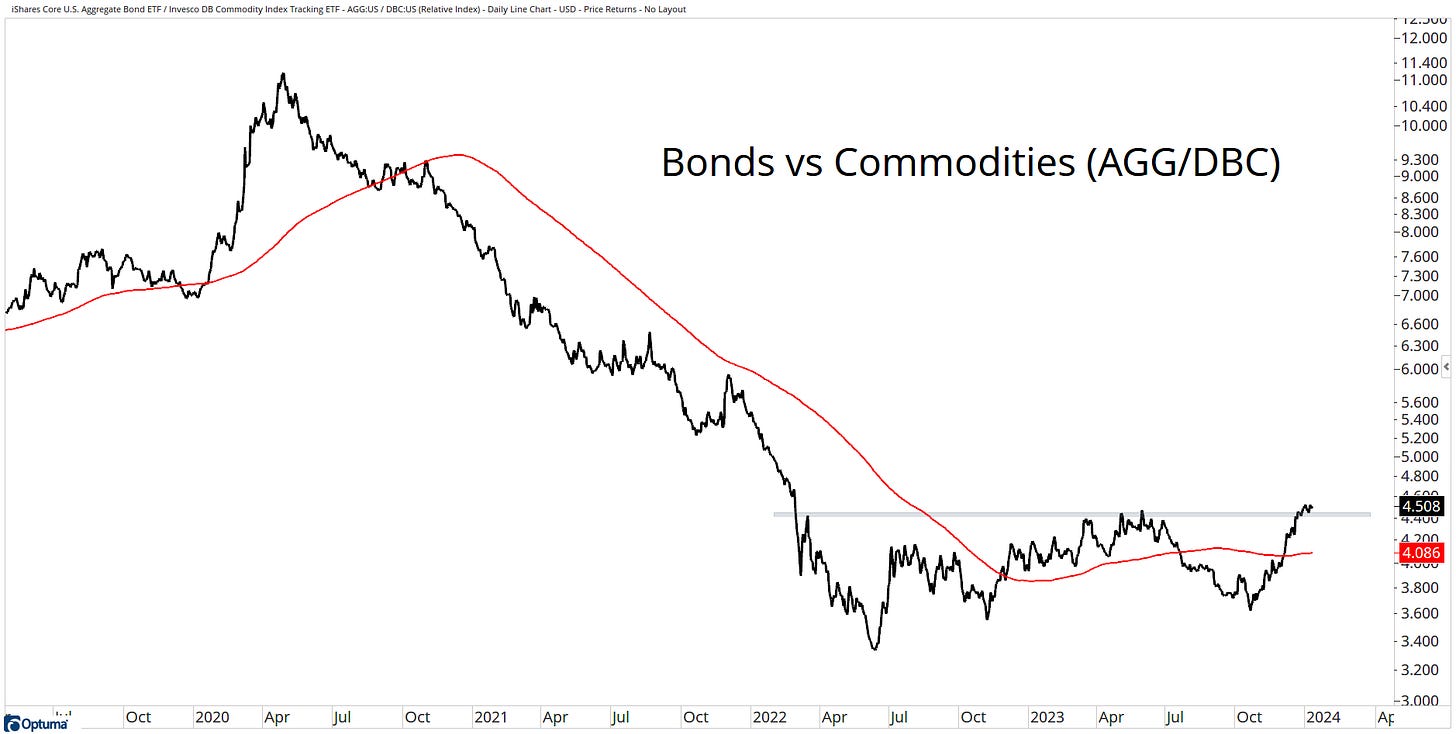
Bonds over Commodities: Even bonds have moved higher vs commodities, with the ratio sitting at 2-year highs.
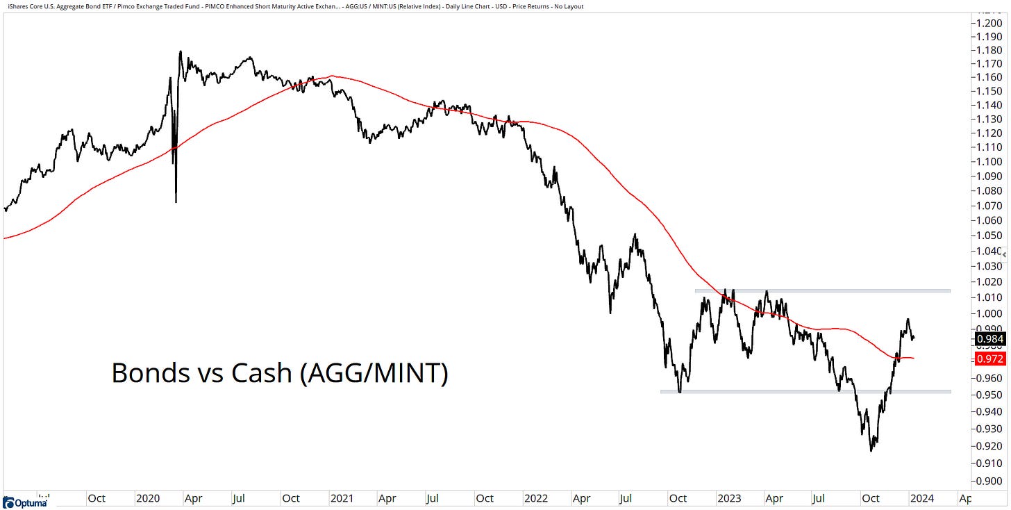
Bonds over Cash: It’s been an uneven transition, but bonds are gaining the upper hand versus cash.
Cash over Commodities: Commodities peaked in June 2022. Since then, the trend has rolled over and has continued to move lower.
Stocks.
Large over Mid & Small: With an impressive move throughout 2023 from large-cap stocks, it now looks like the trend may have switched in favour of mid and small caps since finding resistance. However, the trend is still in favour of large-cap.
Mega over Micro: We still see higher highs and lower lows for Mega vs Micro.
Market Cap over Equal: This trend favours market cap exposure. More recently, equal weight has dug in its heels at prior highs.
Growth over Value: Growth continues to hold up well versus Value, with the ratio now back to 2020 & 2021 highs.
Financials, Industrials & Technology: These sectors are near the top of the relative strength rankings.
US over International: The trend still favours US leadership and has been for over a decade. International stocks are showing no signs of strength yet.
Developed over Frontier over Emerging: Developed markets continue with their strong leadership versus EM & FM.
Bonds.
Corporates over Treasuries: Corporates remain below a falling trend versus Treasuries. The ratio is now at 12-year lows.
High Yield over High Quality: There is little evidence of stress in the economy, which has helped high yield continue this trend vs high grade.
Nominal Treasuries over Inflation Protection: The ratio has been in a sideways mess for the past 3-years. The trend is slightly in favour of nominal treasuries.
Short-term over Long-term: The short end of the curve is where you want to focus. However, the trend is under pressure.
Emerging Market Debt over US Debt: This ratio has traded sideways for two years with a slight bias to favouring EM debt.
US Debt over International Debt: US debt has been gaining strength versus international debt since finding a low in October 2023.
Commodities & Alternatives.
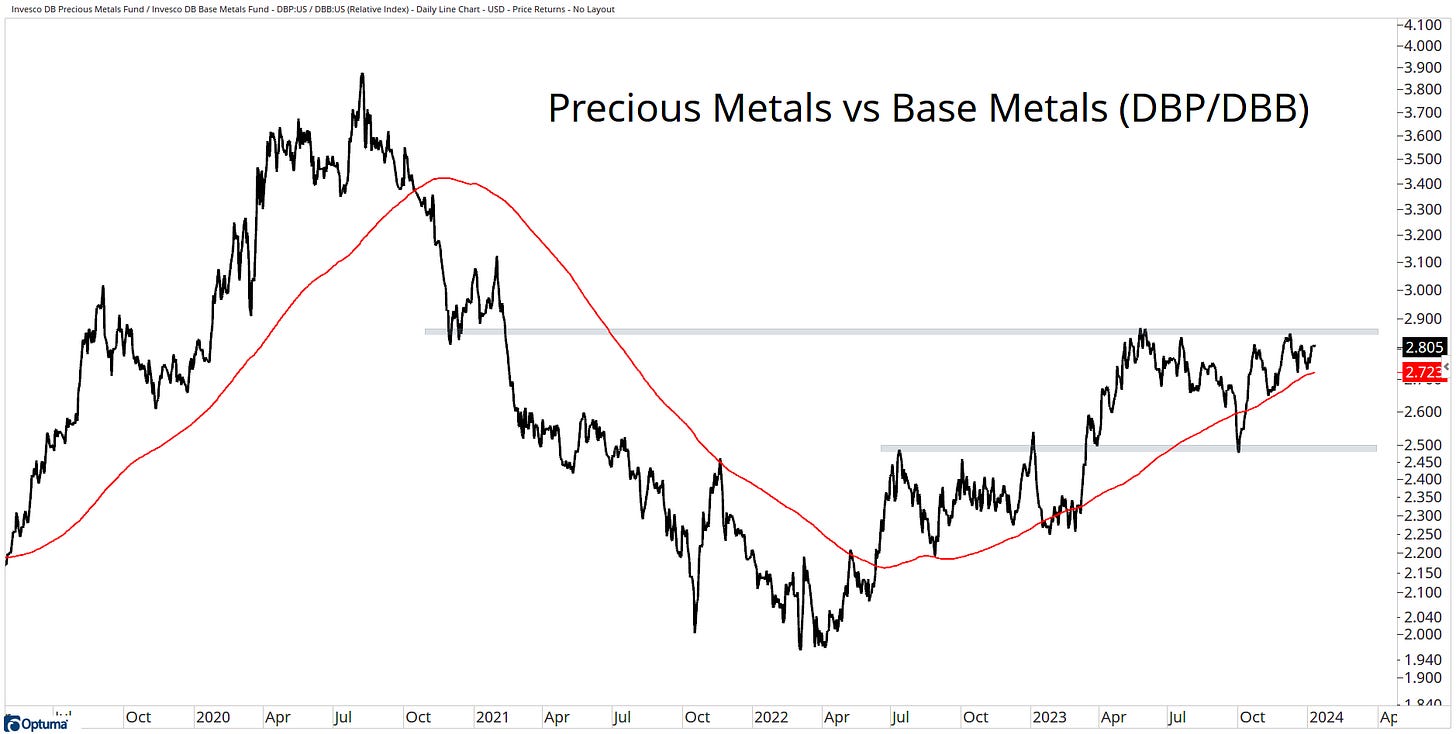
Precious Metals over Base Metals: The trend favours precious metals over base metals, but the ratio has been moving sideways throughout 2023.
Stocks over Gold: The ratio hasn’t moved much over the past 2-years. However, the trend favours stocks, with the ratio trading below its 200-day average.
Bonds over Gold: Gold remains in an uptrend versus bonds. This trend has been in place for the past 8-years.
US Dollar over Yen: The Yen has bounced at a logical area, but the trend has not turned in its favour just yet.
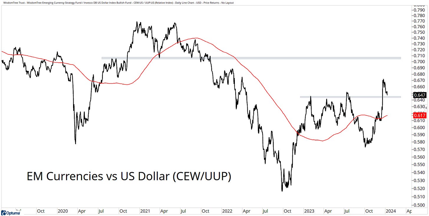
EM Currencies over US Dollar: EM currencies remain strong versus the US dollar, with the ratio trading well above its 200-day average.
Aussie Dollar over Yen: Strength from the Aussie Dollar as it nears 10-year highs.
Stocks over Real Estate: Real Estate continues to be under pressure, with a pattern of lower highs and lower lows versus stocks.
Before I finish up, always remember:
Remain flexible.
We can only work with the information that is available today.
Keep an open mind.
“I can't change the direction of the wind, but I can adjust my sails to always reach my destination.” — Jimmy Dean.
If you enjoyed this post, please consider sharing it for more people to see!
I would love to hear from you, so please get in touch with me on X.
Stay safe, and good luck out there…
GH
DISCLAIMER: The information in this report is obtained from sources that Jotting on Charts believes to be reliable, but we do not guarantee its accuracy. All of the information contained herein should be independently verified and confirmed. All opinions expressed by Jotting on Charts are for informational purposes only. Jotting on Charts is not a financial advisor. This does not constitute investment advice, nor any opinions expressed, constitute a solicitation of any securities or related financial instruments' purchase or sale. Jotting on Charts is not responsible for any losses incurred from any use of this information. Do not trade with money you cannot afford to lose. It is recommended that you consult a qualified financial advisor before making any investment decisions.


Great insights, as always from u. It seems the commentary on one chart is backwards. IEF/VCIT