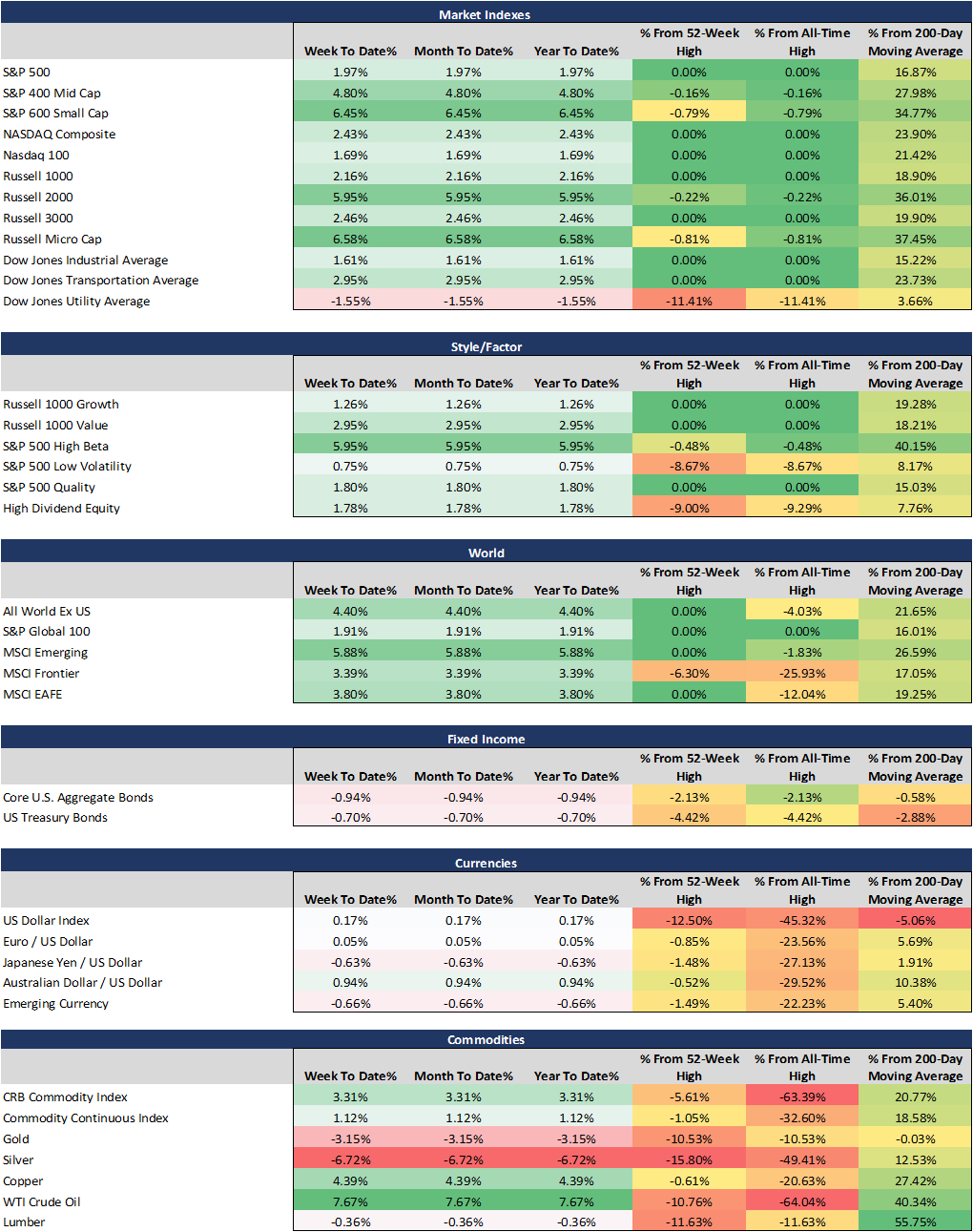
The first full week trading is now over for 2021... and the strength in the stock market continues to push to new highs, here is a performance overview for week 1 of 2021
This week’s movers and shakers: Oil, High Beta, Micro-Cap, Small-Cap, Emerging Markets.
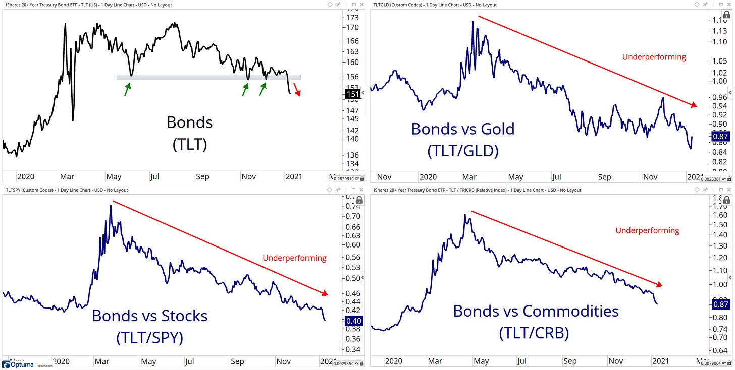
This week’s losers: Silver, Gold, Bonds
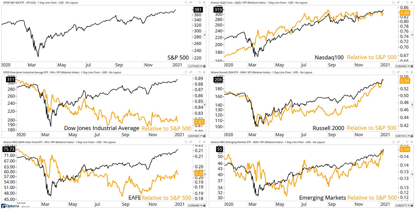
Broad participation continues to be the key theme in the below chart, S&P 500, Russell 2000, NASDAQ-100, Dow Jones Industrials the first week of trading at new all-time highs.
On a relative basis, Emerging Markets are broken through its relative resistance level while NASDAQ-100 finding some resistance at current levels.
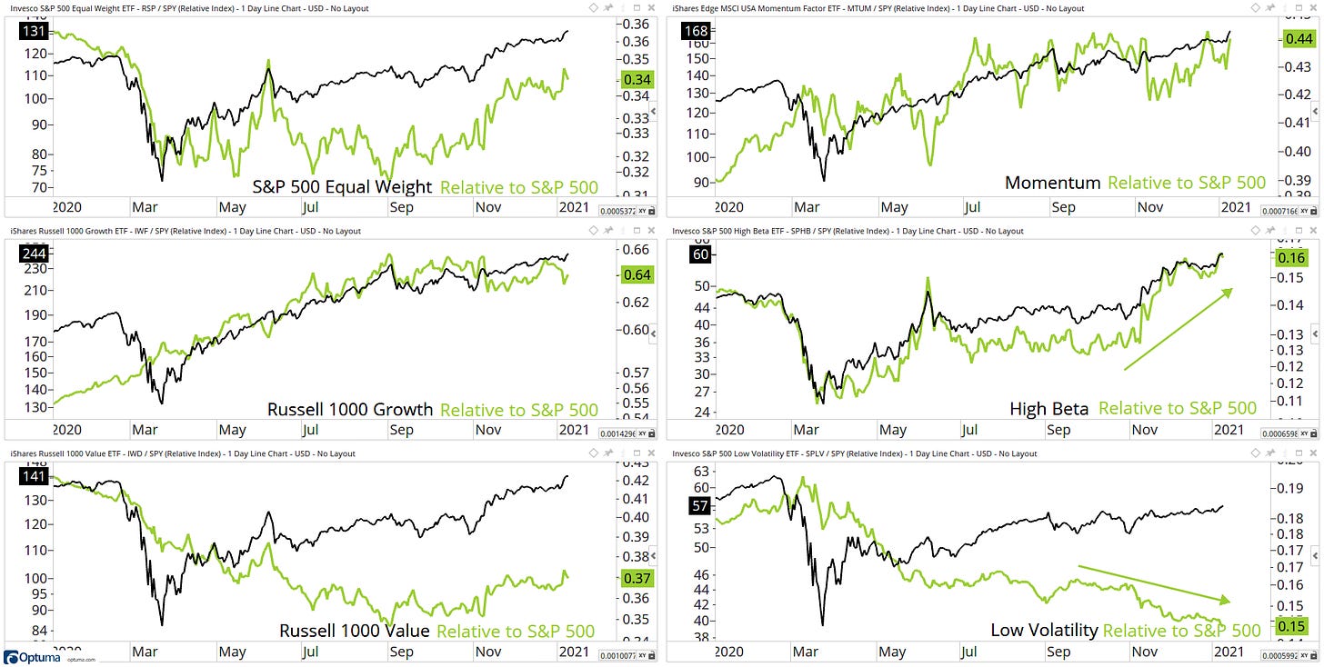
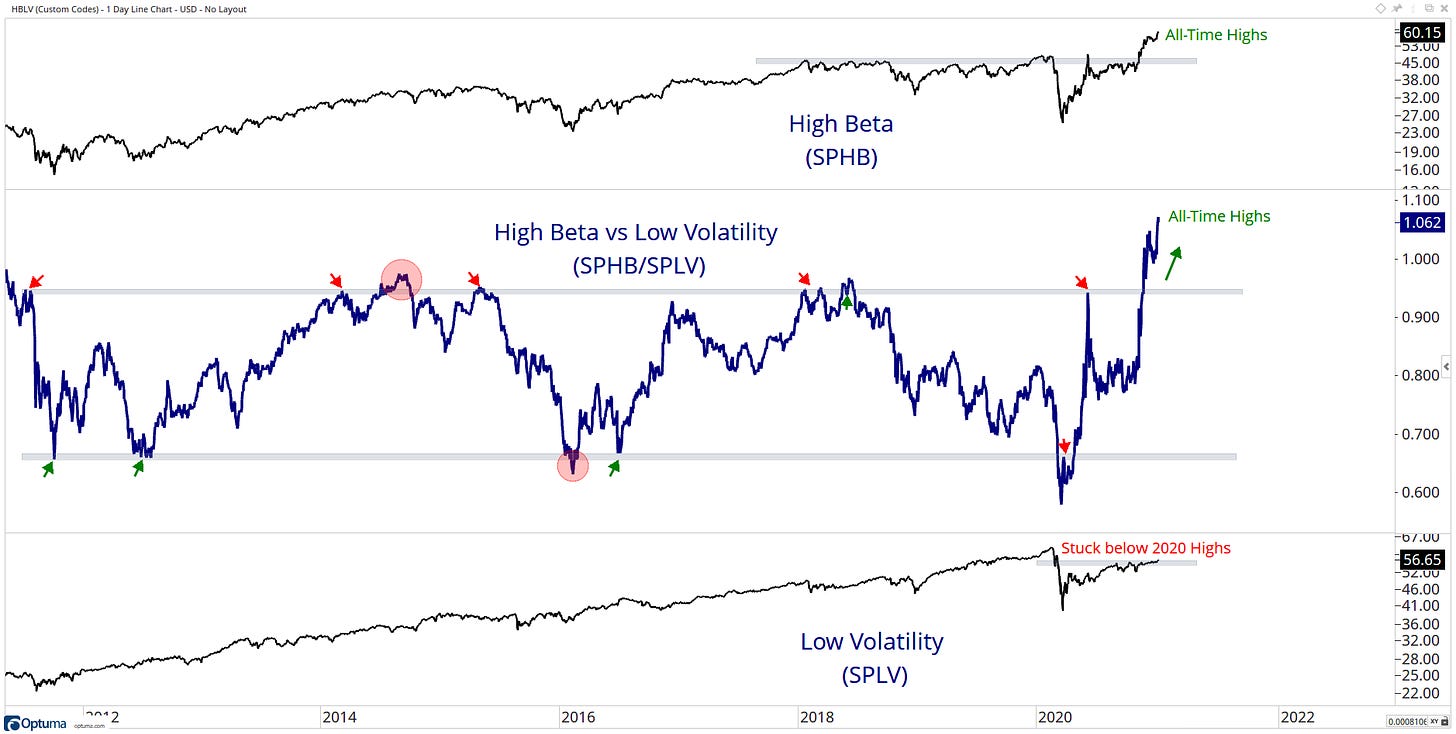
High-Beta outperforming Low-Volatility continues to widen on a relative basis. The powerhouse of 2020 growth on a relative basis is finding some resistance at current levels while Value on a relative basis looks to be coming out of a base. Will we see a meaning full rotation in 2021?
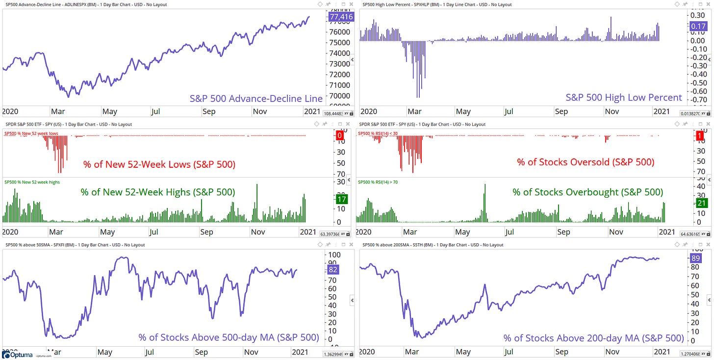
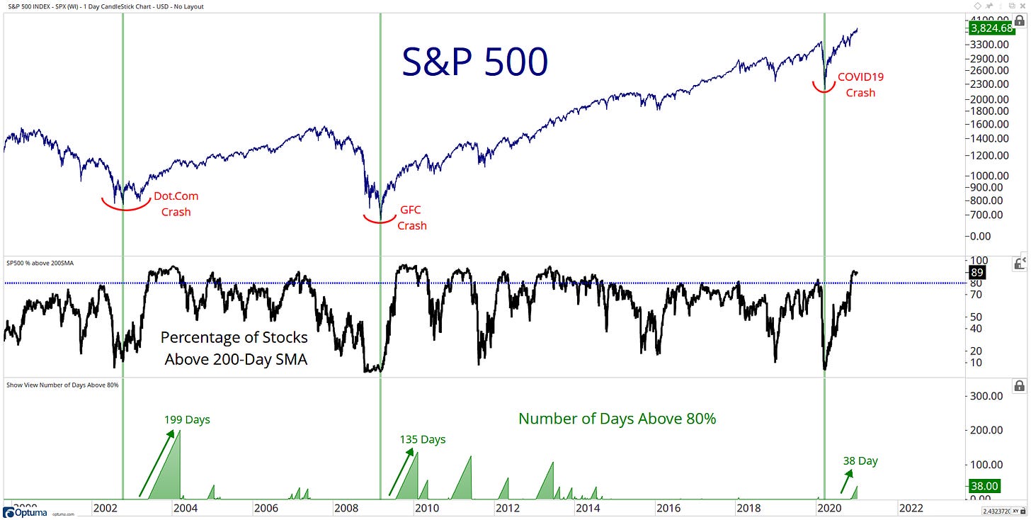
Breadth metrics at these high levels can persist a long time - look at my breath chart from my weekly scan below.
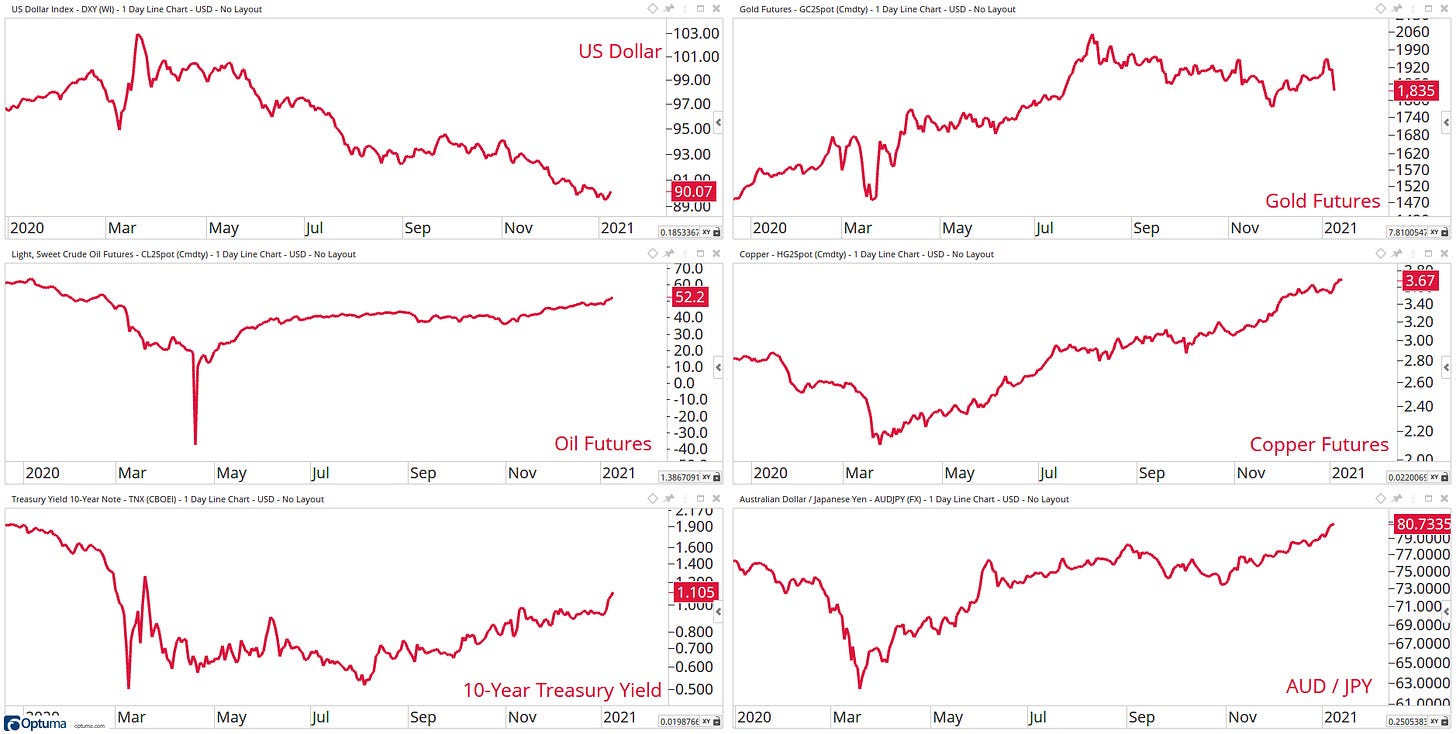
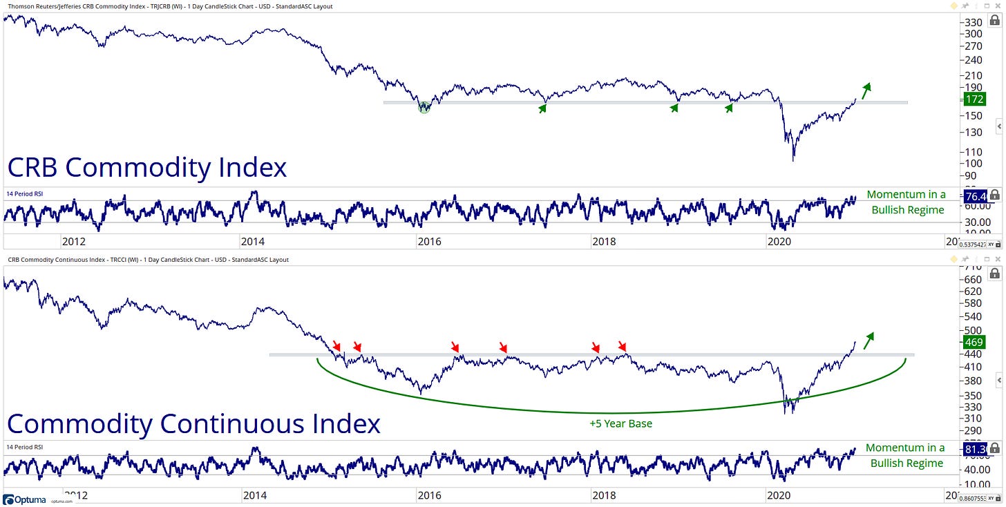
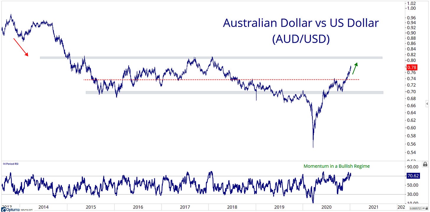
Same story here, Higher inflation expectations suggest rates grind higher, continue strength from copper and a lower US dollar with outperformance within ‘risk-on’ currencies.
The RTM
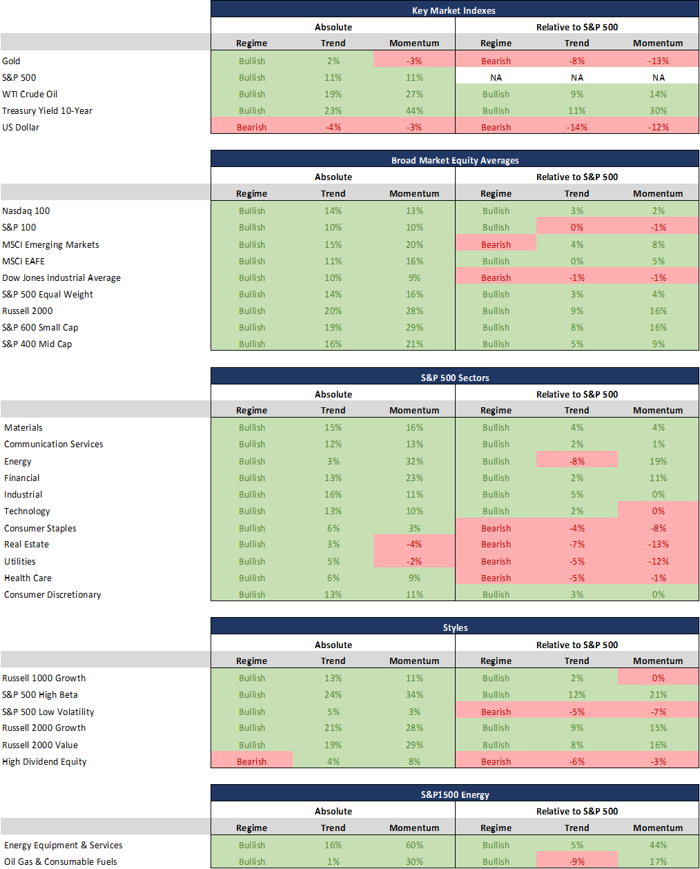
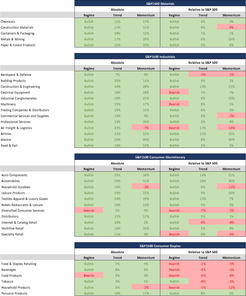
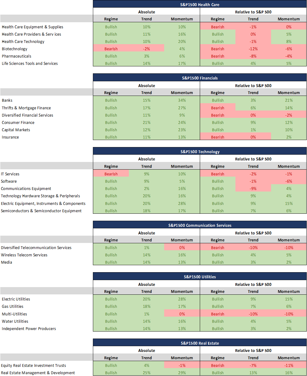
The RTM is a current and brief overview of the leaders and laggards throughout the equity market.
Regime: Bullish Regime indicates the 14-day Relative Strength Index reading is between 100-31 and remains until the value is less than 30 and a Bearish Regime indicates the 14-day Relative Strength Index reading is between 0-69 and remains until the value is more than 70
Trend: A positive percentage (coloured green) indicates how far the 50-day moving average is above the 200-day moving average and a negative percentage (coloured red) indicates how far the 50-day moving average is below the 200-day moving average.
Momentum: A positive percentage (coloured green) indicates that the 63-day rate of change is positive, and a negative percentage (coloured red) indicates that the 63-day rate of change is negative.
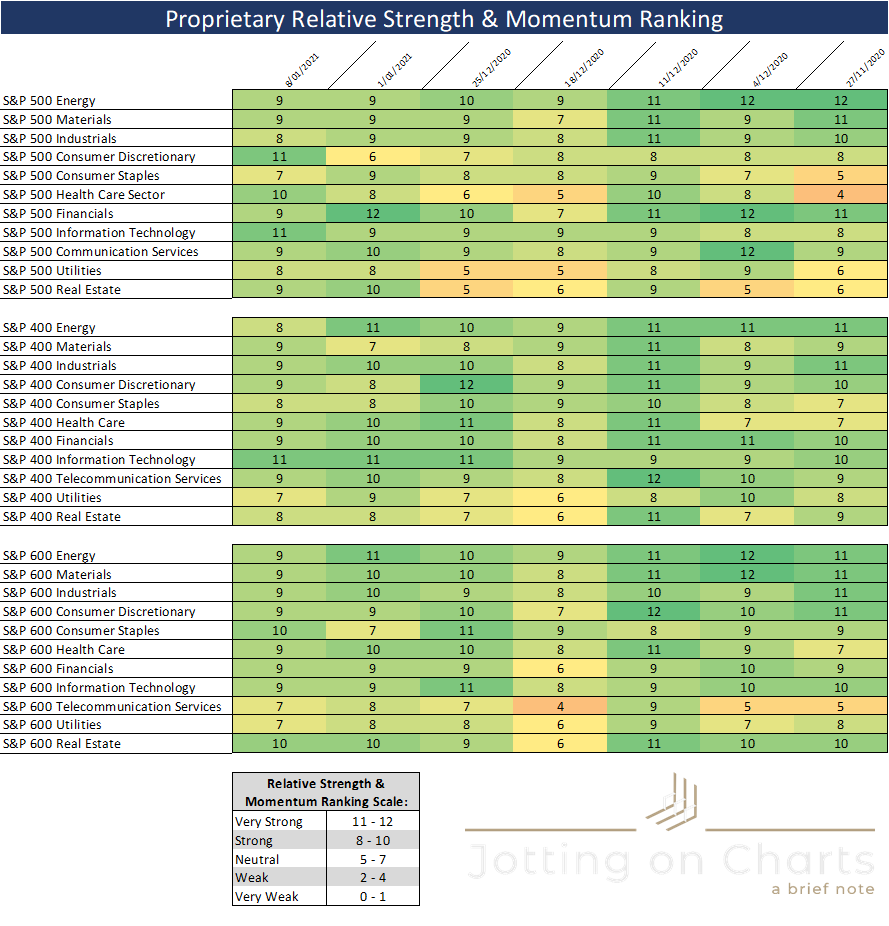
My proprietary momentum and relative strength ranking system is a numerical score that ranks the S&P 500, 400 and 600 sectors.
These sectors are assigned a score based on twelve key technical indicators covering different timeframes.
Using this report, we can observer the sectors according to their technical rank to identify the leaders and laggards within a specific group.
This is my starting point for my Top/Down Wednesday posts!
Sectors that jumped out at me this week:
Strength in S&P500 Consumer Disc, S&P600 Consumer Staples.
Weakness in S&P500 Financials.
I am now moving on to the sexy stuff… charts! As always, I am going to share my favourite charts from my weekend charting session.
World
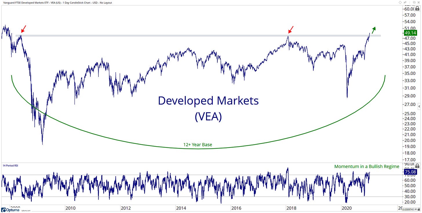
You know I like my big booty bases if you have been reading my stuff for awhile… and here is another one to add to the list! Developed Markets with a 12 years break out! The only level left before blue skies is its ATH from 2007, which is only ~6% away.
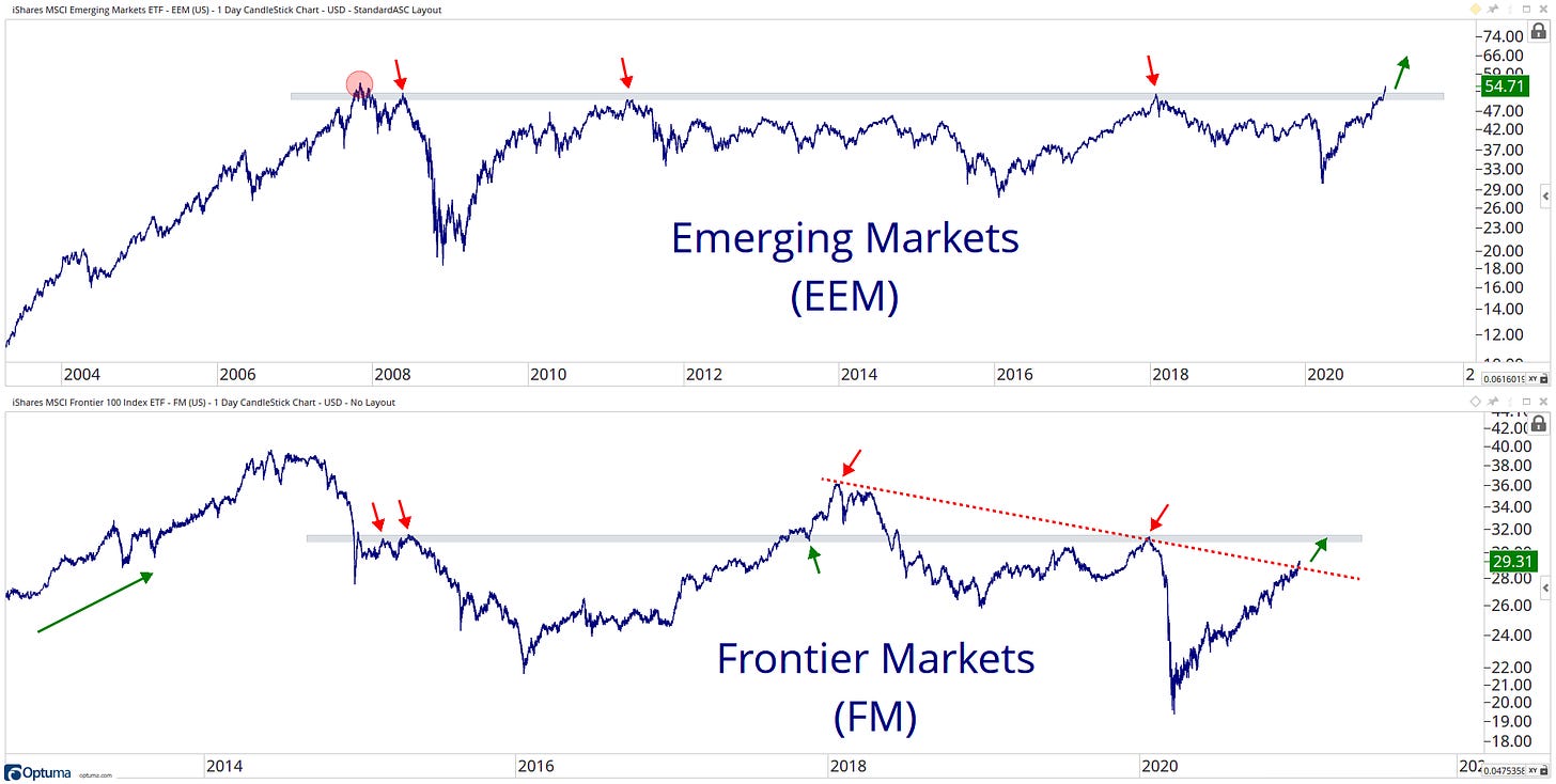
Emerging Markets looking even better, as it is only 1.83% away from its ATH in 2007… Frontier Market while lagging… still are showing positive movements breaking above the downtrend line starting from 2018.
US
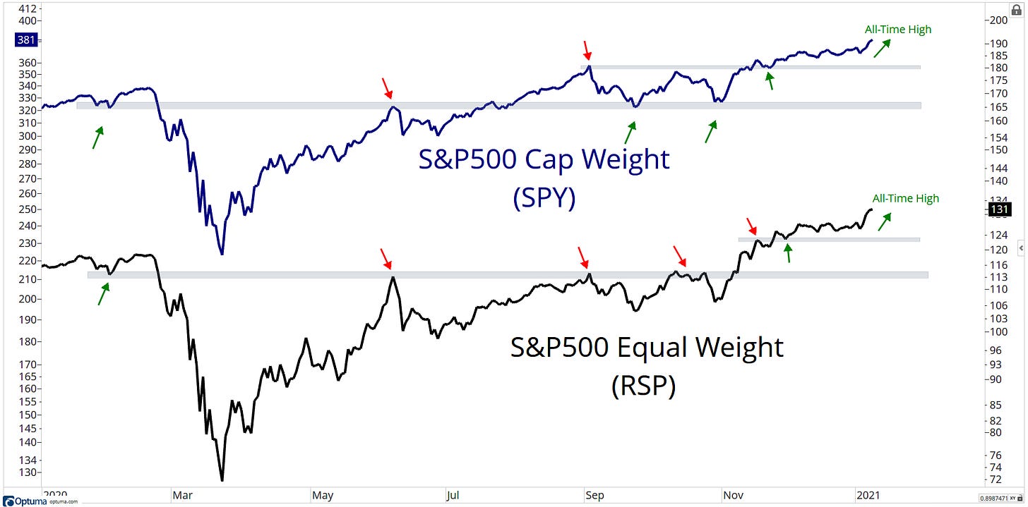
S&P 500 Equal Weight is leading the way with a new all-time high to start 2021… and people are still shouting ‘only five stocks pushing the market higher’... If you hear this… Don’t follow that person!
US Sectors
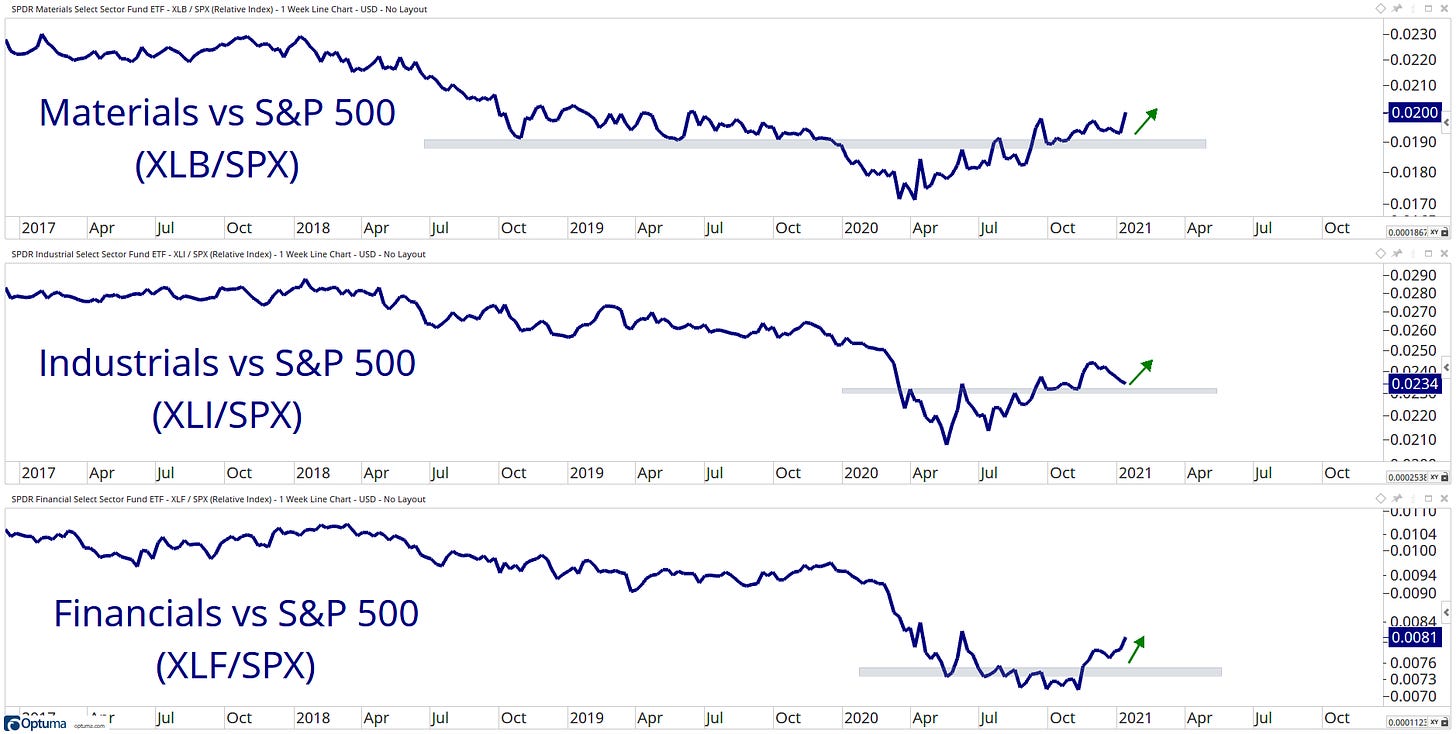
Cyclical sectors are grinding higher relative to the S&P500.
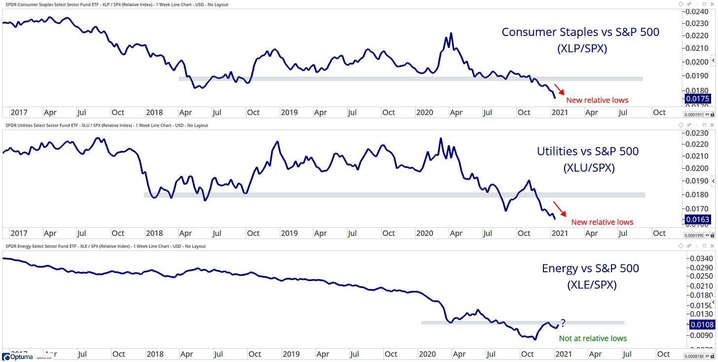
While defensive sectors make new relative lows… But what is going on with Energy here? Pushing up against a key level here… This will be interesting to see how it reacts.
US Industries
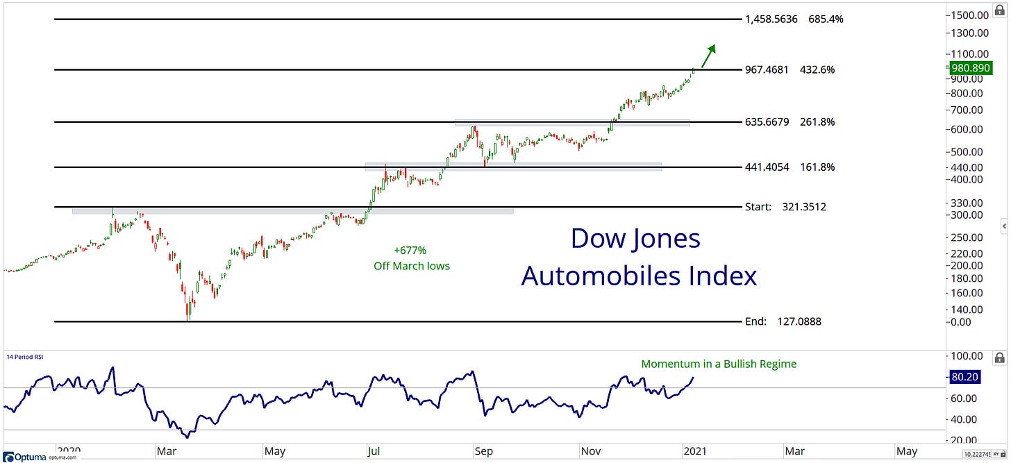
The Automobiles index was a monster in 2020... one word... Tesla!
Fixed Income
Bonds break down!
Commodities
The CRB index, which has a higher weight in energy/oil has begun the breaking out process and following the Continuous Commodity Index, an equal-weighted index of commodities which broke out in late 2020.
Currencies
81 level is incoming! Risk on baby!
Intermarket
This week high beta stocks are hitting all-time highs relative to stocks with low volatility. I think this trend is here to stay for now and we can continue to expect high beta stocks to outperform the low vol names moving forward. This is risk appetite, as opposed to the risk aversion… the bull train keeps rolling on!
Factor/Style
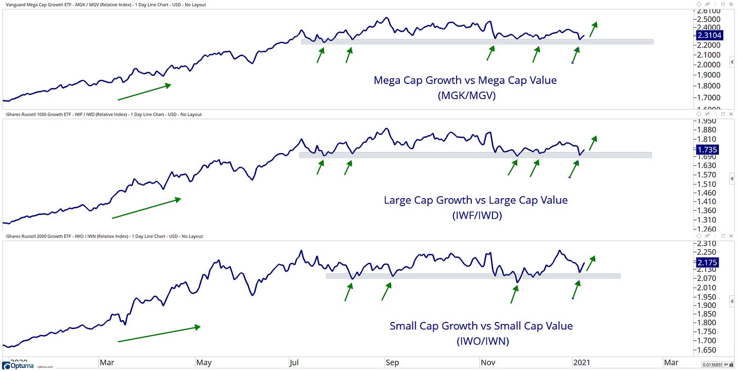
Growth at a market cap level is on the ropes!
Breadth
I pointed this out above, that breadth metrics can persist for longer than you might think. For example, this chart shows the percentage of stocks above there 200-day SMA which can stay above 80% for a long time, and we can see perfect examples were the Dot-com bubble and the Great Financial Crisis… We are only on day 38, do you think this can stay above 80% for another 100 days?
Themes
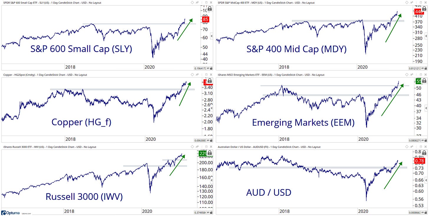
You have seen this chart from me multiple time over the past month… These are the current themes I have been following, and they continue to work higher.
That’s a wrap for today, hope you enjoyed my charts, and please don’t forget to share your ideas in the comment section or get in contact with me on Twitter @granthawkridge.
Stay safe and good luck out there…
GH
DISCLAIMER: The information included in this report are obtained from sources which Jotting on Charts believes to be reliable, but we do not guarantee its accuracy. All of the information contained herein should be independently verified and confirmed. All opinions expressed by Jotting on Charts are for informational purposes only. Jotting on Charts is not a financial advisor, and this does not constitute investment advice nor any opinions expressed, constitute a solicitation of the purchase or sale of any securities or related financial instruments. Jotting on Charts is not responsible for any losses incurred from any use of this information. Do not trade with money you cannot afford to lose. It is recommended that you consult a qualified financial advisor before making any investment decisions.


