


Measured Move Monday - 02/01/2021
A brief note on my favourite high-level charts going into next week


Welcome to Jotting on Chart’s weekly newsletter. If you’re reading my opinionated charting newsletter but haven’t subscribed, please join to learn more about uptrend, downtrends and everything in between alongside 298 other subscribers (up 10 since last week). Thank you to all who are following along on this journey!
If you share this to 2 of your friends who also like to look at charts, it will be GREATLY appreciated. My goal is to hit 1k subs by the end of next year! Thank you to all those who share.
It’s Monday again…
Let’s rise and grind!
Welcome to Measured Move Monday
Oh yes, the weekly post has got a name change… why the name change you ask? Well, I think this name is more appropriate!
Now onto the more important stuff… The weight of the evidence continues to still been leaning in favour of the bulls, and the risk appetite areas are still finding somewhat of a tailwind, even with last weeks weakness… My main focus in these environments is to find leadership within the leading areas of the market and block out all the noise!
Let’s have a look at the performance overview for week 4 of 2021
This week’s movers: Micro-Caps, Silver & Lumber
This week’s losers: High-Beta & Transportation

There is short term weakness across the board on a relative and absolute value.
I will repeat it.. short term… Just look at those uptrends!
The bears require a lot more work to get me to sit up in my seat.
But we want to know this type of information!

Weakness continues for the Value and Low Volatility areas of the market.
Internals look to be unwinding a little here, nothing to worry about tho! Longer-term internals still looks strong.
Momentum indicators have been decelerating at both the large-cap and the broader market the past week. Something to keep an eye on.

Sentiment indicators are showing that optimism has been fading the past week. For instance, the AAII bull-bear spread returns to even.

There were generally few signs of Intermarket stress during this recent slide in stocks.

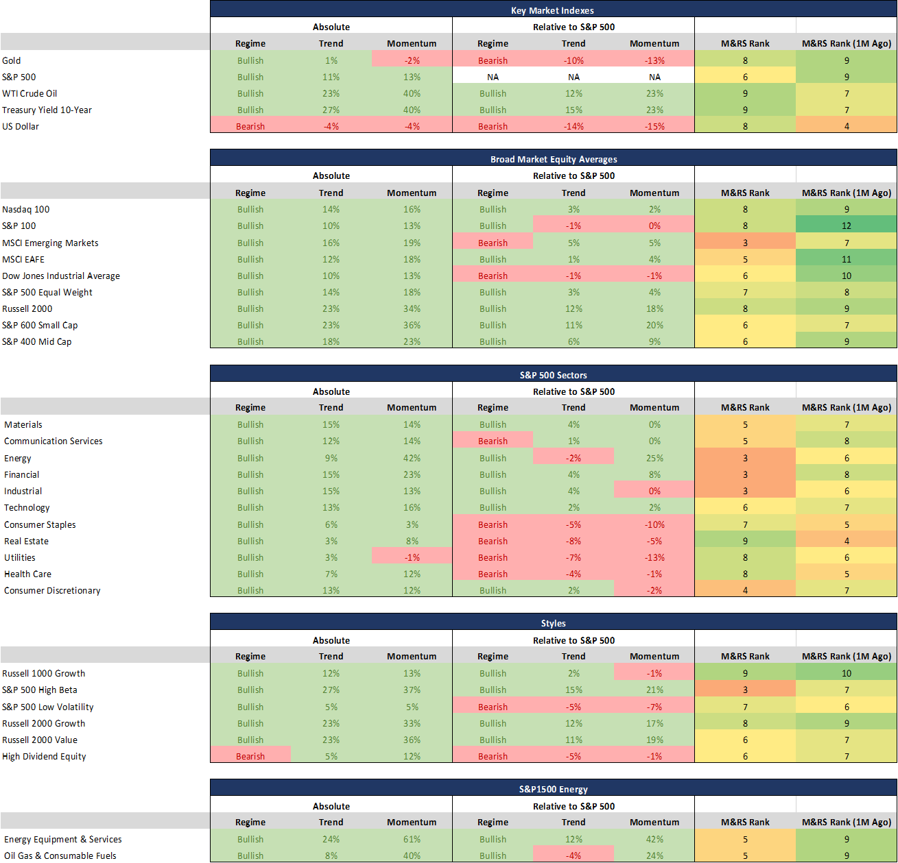
My proprietary momentum and relative strength ranking system is a numerical score that ranks all sectors and industries.
These sectors & industries are assigned a score based on twelve key technical indicators covering different timeframes.

Using this data, we can observe the sectors according to their technical rank to identify the leaders and laggards within a specific market area.
The Regime, Trend and Moment values also provide you with more data to fine-tune who are the leaders or laggards throughout the markets.
Regime: Bullish Regime indicates the 14-day Relative Strength Index reading is between 100-31 and remains until the value is less than 30 and a Bearish Regime indicates the 14-day Relative Strength Index reading is between 0-69 and remains until the value is more than 70
Trend: A positive percentage (coloured green) indicates how far the 50-day moving average is above the 200-day moving average and a negative percentage (coloured red) indicates how far the 50-day moving average is below the 200-day moving average.
Momentum: A positive percentage (coloured green) indicates that the 63-day rate of change is positive, and a negative percentage (coloured red) indicates that the 63-day rate of change is negative.


I am now moving on to the good stuff… charts! As always, I am going to share my favourite charts from my weekend charting session.
World
Shout out to Willie Delwiche for pointing out this great indicator to me! Essentially this indicator points out the percentage of countries (44 indices) in an uptrend and what we saw last week was just a massive exodus of indices! For me, I will be watching to see how it reacts in the coming week.

US
Here is an uptick that has got my attention… 77% of the Russell 3000 stocks have a drawdown of 10% or more from their 52-week highs.

US Sectors
Financials once again failing at the 2007 GFC peak resistance level, but it’s interesting to note that 91% of stocks in the sector are still in an uptrend after an +8% pullback.

US Industries
We can also see short term weakness across the 72 S&P industry groups.
But remember that 92% of the industry groups are still above their 200-day moving average. That is strength!

Fixed Income
How can you be long TLT if it’s below 155?

Commodities
Silver is getting polished by the Reddit traders!

Currencies
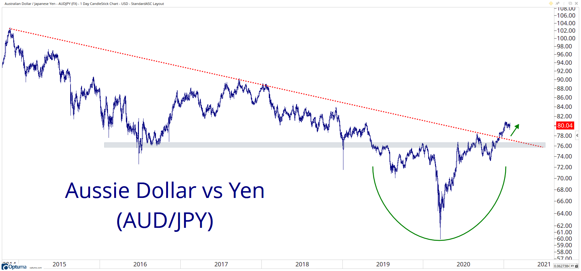
Australian Dollar / Japanese Yen arguably the ‘go-to’ risk-on pair, remains above key levels.
Intermarket
Mega-caps are playing with fire here at these levels.

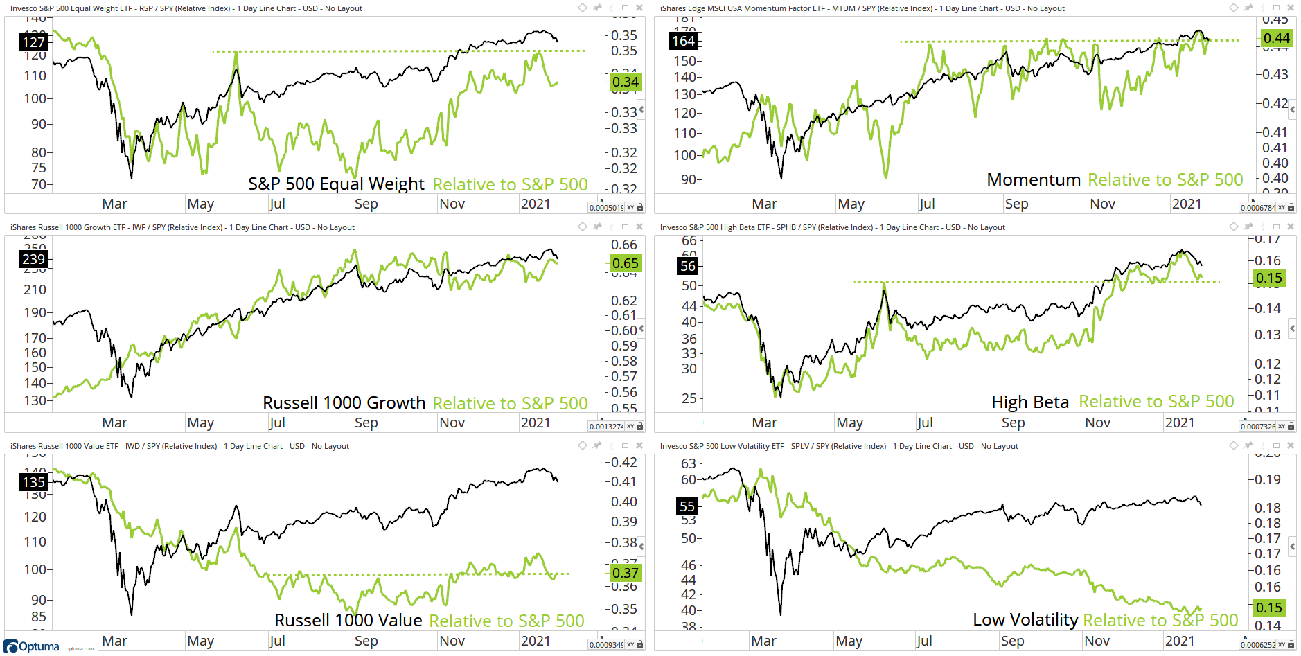
Factor/Style
From failed moves come fast moves, let’s see what this week brings for value stocks.

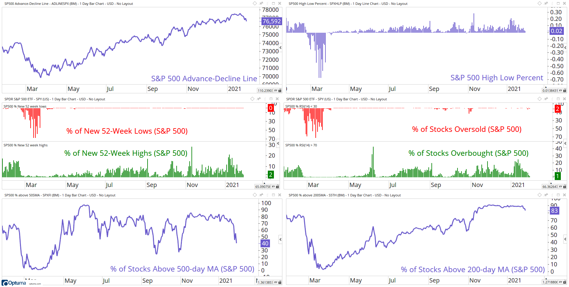
Breadth
Short-term weakness, longer-term breadth levels are unchanged.

Themes
Time to get high?

That’s a wrap for today, hope you enjoyed my charts, and please don’t forget to share your ideas in the comment section or get in contact with me on Twitter @granthawkridge.
If you enjoyed this blog, please consider sharing for more to see!
Stay safe and good luck out there…
GH
DISCLAIMER: The information included in this report are obtained from sources which Jotting on Charts believes to be reliable, but we do not guarantee its accuracy. All of the information contained herein should be independently verified and confirmed. All opinions expressed by Jotting on Charts are for informational purposes only. Jotting on Charts is not a financial advisor, and this does not constitute investment advice nor any opinions expressed, constitute a solicitation of the purchase or sale of any securities or related financial instruments. Jotting on Charts is not responsible for any losses incurred from any use of this information. Do not trade with money you cannot afford to lose. It is recommended that you consult a qualified financial advisor before making any investment decisions.