Welcome to Jotting on Chart’s weekly newsletter. If you’re reading my opinionated charting newsletter but haven’t subscribed, please join to learn more about uptrend, downtrends and everything in between alongside 355 other subscribers (up 9 since the last edition of Measured Move Monday). Thank you to all who are following along on this journey!
If you share this with 2 of your friends who also like to look at charts, it will be GREATLY appreciated. My goal is to hit 1k subs by the end of next year! Thank you to all those who share.
It’s Monday again…
Let’s rise and grind!
Welcome to Measured Move Monday
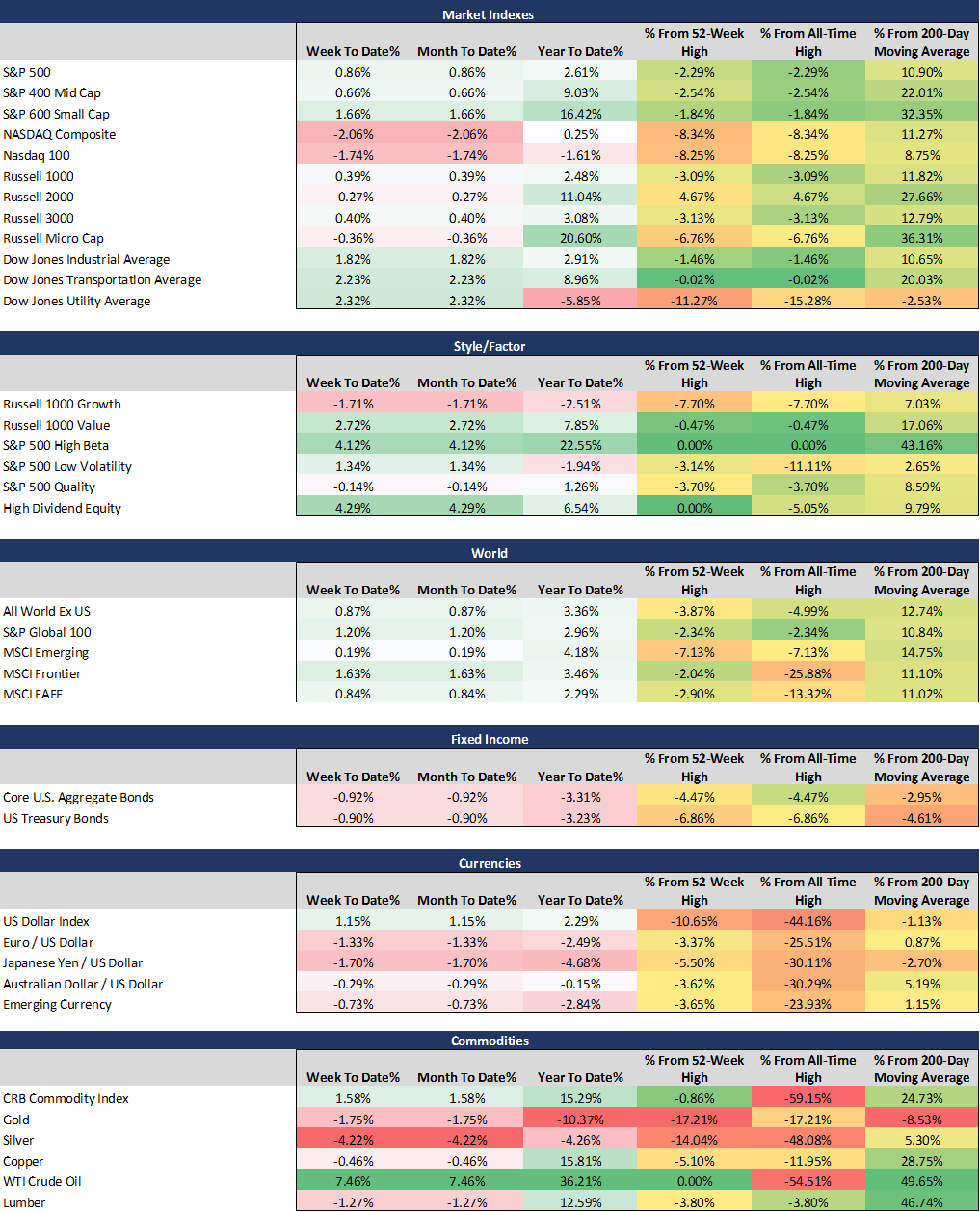
Something’s has happened to value stocks. They have found some upwards momentum! There has been a lot of talk about whether we will see a rotation out of Growth equities into Value. The outperformance of Value over Growth has been relatively significance so far. Year-to-date Value stocks ($IWD) are up 7.85% while Growth stocks ($IWF) are down -2.51%.
I believe the writing has been on the wall for some time regarding the Growth into Value shift.
We saw similar rotations between Large-cap and Small-caps or Emerging Markets and Developed Markets.
The crowd has been piling in equities for the past 6-8 months.
Remember that just because a position is overcrowded doesn’t mean it’s wrong.
But, history has taught us, as crowded positions builds-up, a sharp re-pricing may happen if things do not play out as expected.
But, it might not happen at all…
For this reason, check your support and resistance levels and make sure you have a risk management plan in place!
Know when to get out of the way!
It’s important!
Overall, the weight of the evidence for me continues to suggest further momentum to the upside and strength within the equity markets.
Let’s have a look at the performance overview.
This week’s movers: Oil & High Dividend
This week’s losers: Silver & NASDAQ Comp
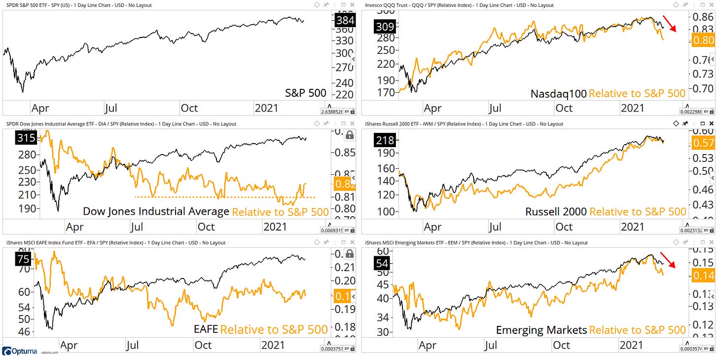
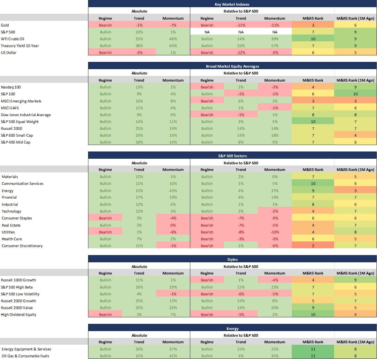
The S&P 500, Russell 2000, Nasdaq, DJI, EAFE, and Emerging Markets continue to come off recent highs.
On a relative basis, Nasdaq and Emerging markets sharply lose their leadership role… Small-Caps continue to hold up the best with this recent sell-off.
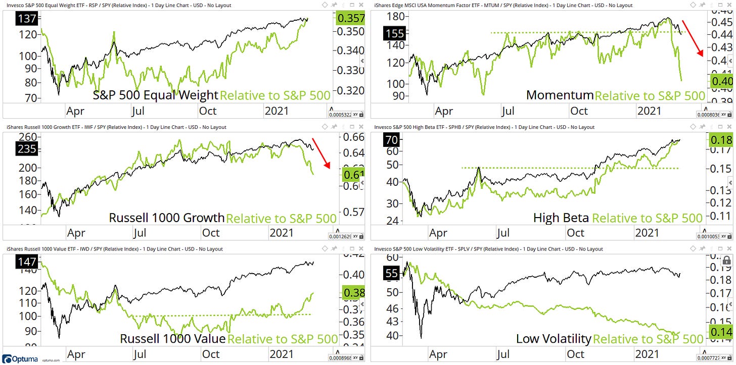
The main theme continues to be High Beta is outperforming.
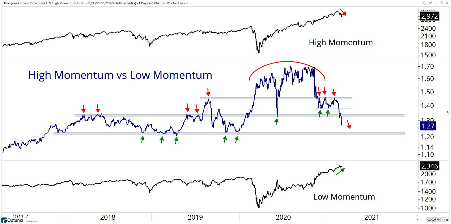
On a relative basis, Clear weakness within Momentum which has now fallen off a cliff the past two weeks, and the Russell 1000 Growth isn’t far behind.
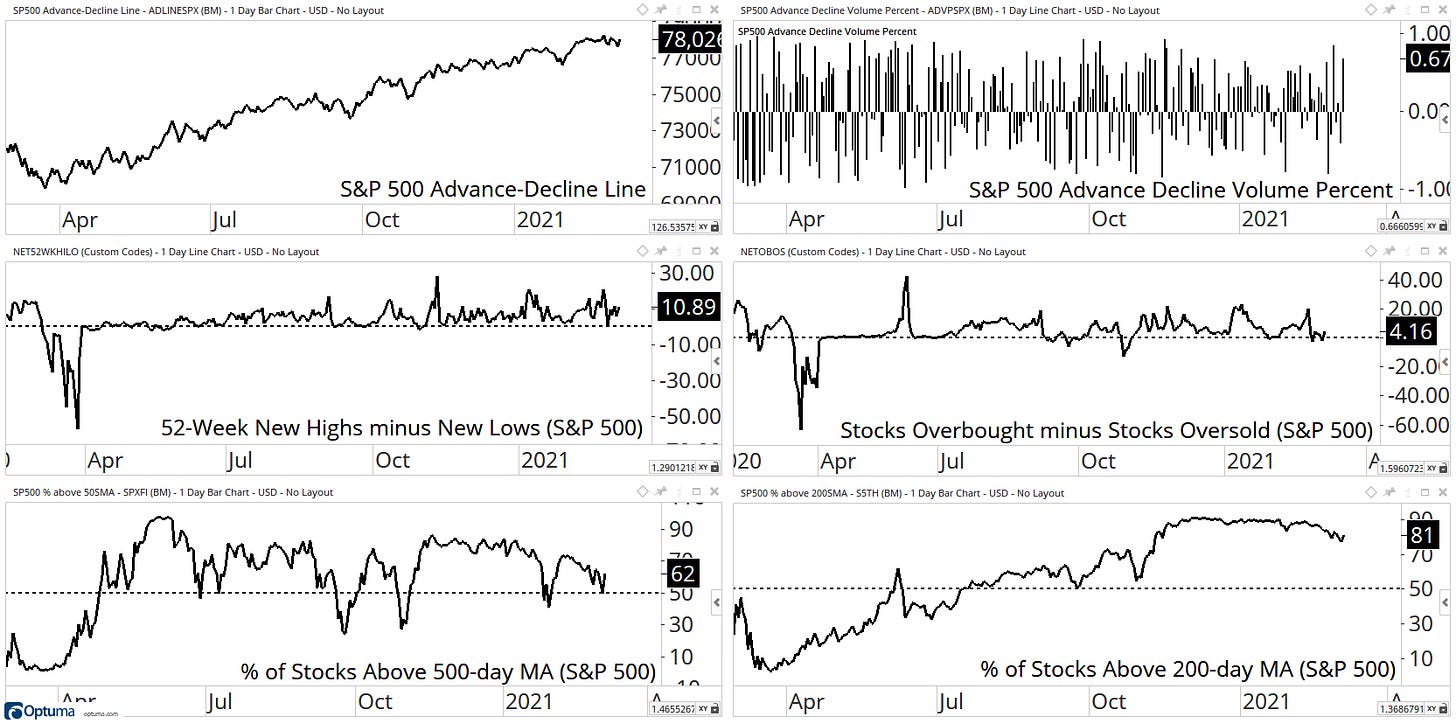
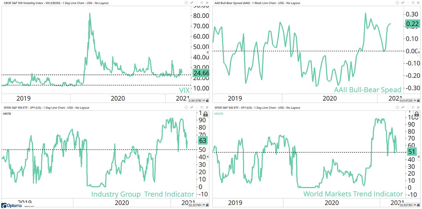
Internals are holding on and continue to look healthy.
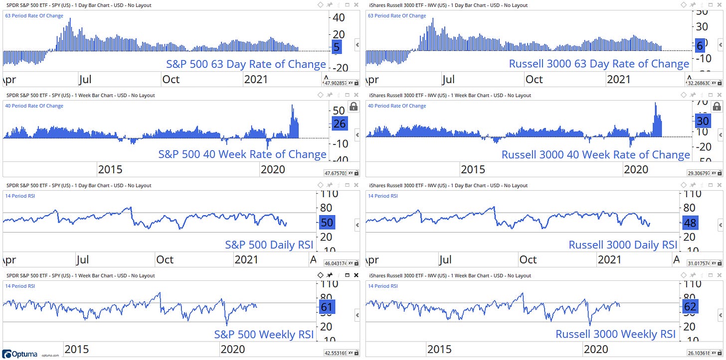
Momentum indicators are fading slowly, and I will be looking for the current level to hold within their bullish zones moving forward.
Sentiment indicators continue to show some signs of weakness.
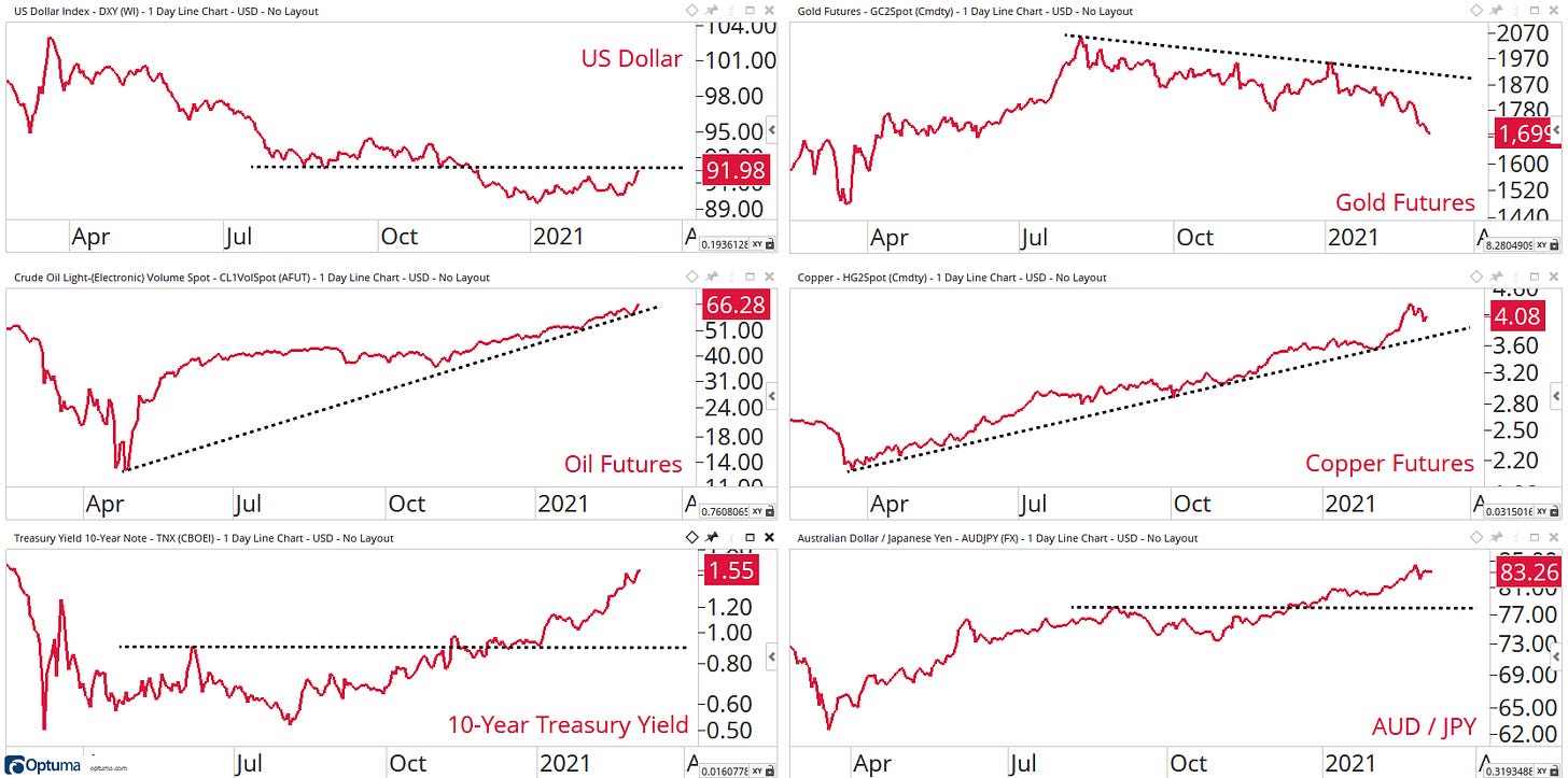
Intermarket areas have seen no damage to their current trends. This suggests that the recent pullback was more about profit-taking rather than something on a bigger scale.
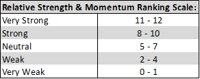
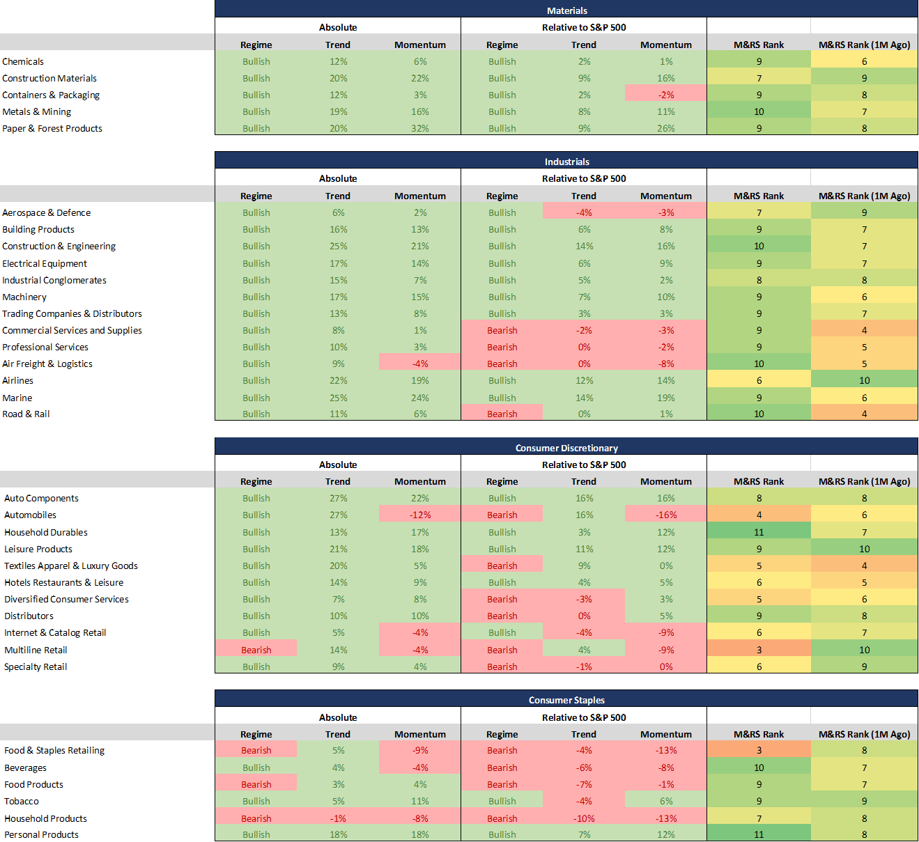
My proprietary momentum and relative strength ranking system is a numerical score that ranks all sectors and industries.
These sectors & industries are assigned a score based on twelve key technical indicators covering different timeframes.
Using this data, we can observe the sectors according to their technical rank to identify the leaders and laggards within a specific market area.
The Regime, Trend and Moment values also provide you with more data to fine-tune who are the leaders or laggards throughout the markets.
Regime: Bullish Regime indicates the 14-day Relative Strength Index reading is between 100-31 and remains until the value is less than 30, and a Bearish Regime indicates the 14-day Relative Strength Index reading is between 0-69 and remains until the value is more than 70
Trend: A positive percentage (coloured green) indicates how far the 50-day moving average is above the 200-day moving average, and a negative percentage (coloured red) indicates how far the 50-day moving average is below the 200-day moving average.
Momentum: A positive percentage (coloured green) indicates that the 63-day rate of change is positive, and a negative percentage (coloured red) indicates that the 63-day rate of change is negative.
I am now moving on to the good stuff…
Here are my favourite charts from the weekend scan.
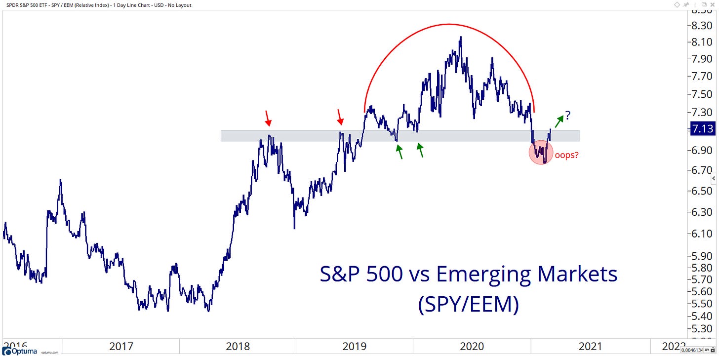
World
Did we just get an oops? Is leadership back with the US now? Time will tell!
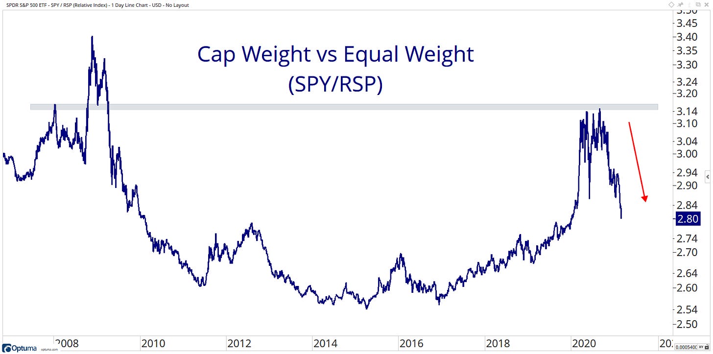
US
We can see the value rotation clear as day in this ratio as the Equal-Weight S&P 500 ETF has a much higher holding weight from cyclical/value areas like Financials, Industrials, Materials, and Energy.
US Sectors
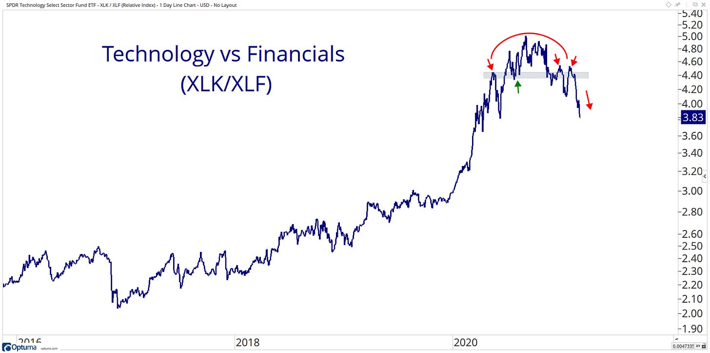
Here we have the Technology sector relative to the Financial sector. For the first time in years, we can see that it shows bearish characteristics as the ratio makes lower highs and lower lows.
US Industries
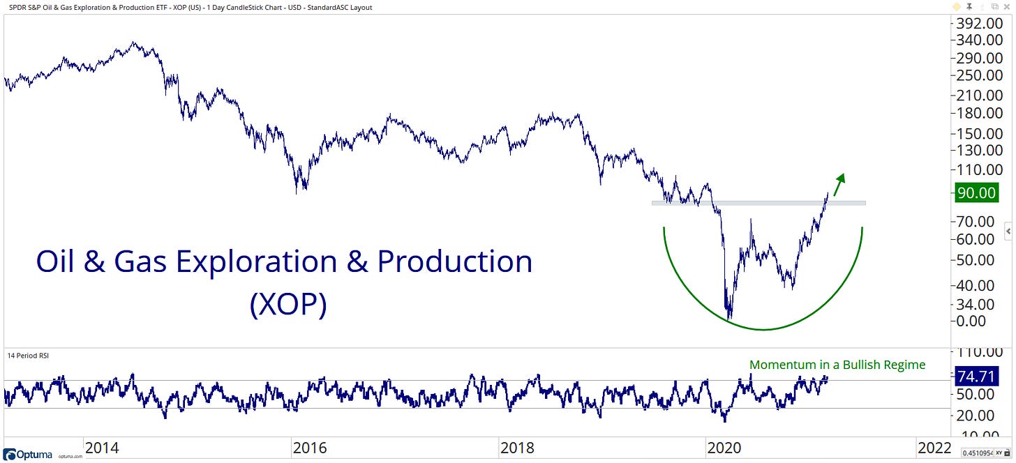
It’s not often we can say that XOP is at a new 52 week highs!
Fixed Income
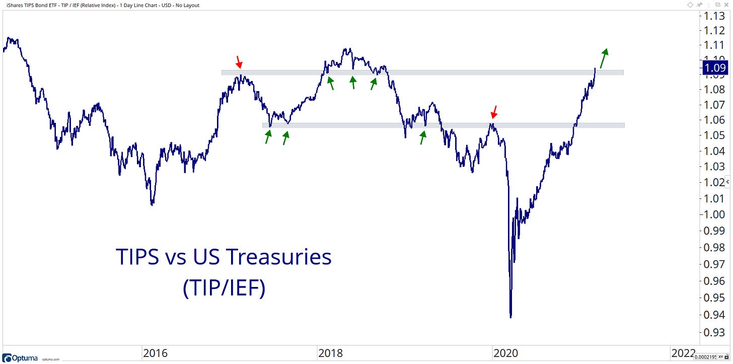
As inflation expectations continue to rise, this ratio to treasuries has been grinding higher since March 2020 lows.
Commodities
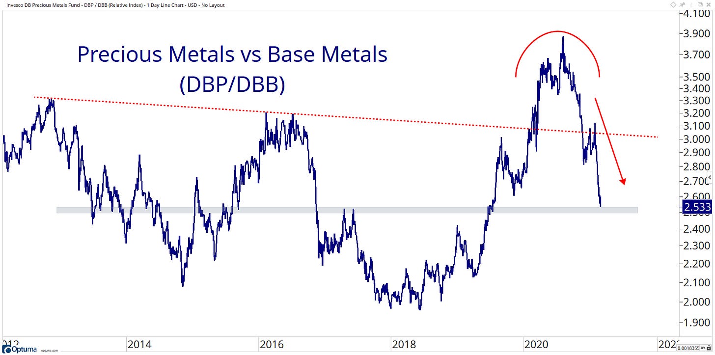
No one wants precious metals! They are underperforming on some many different ratio charts… here they are relative to base metal… What a reversal of the trend!
Currencies
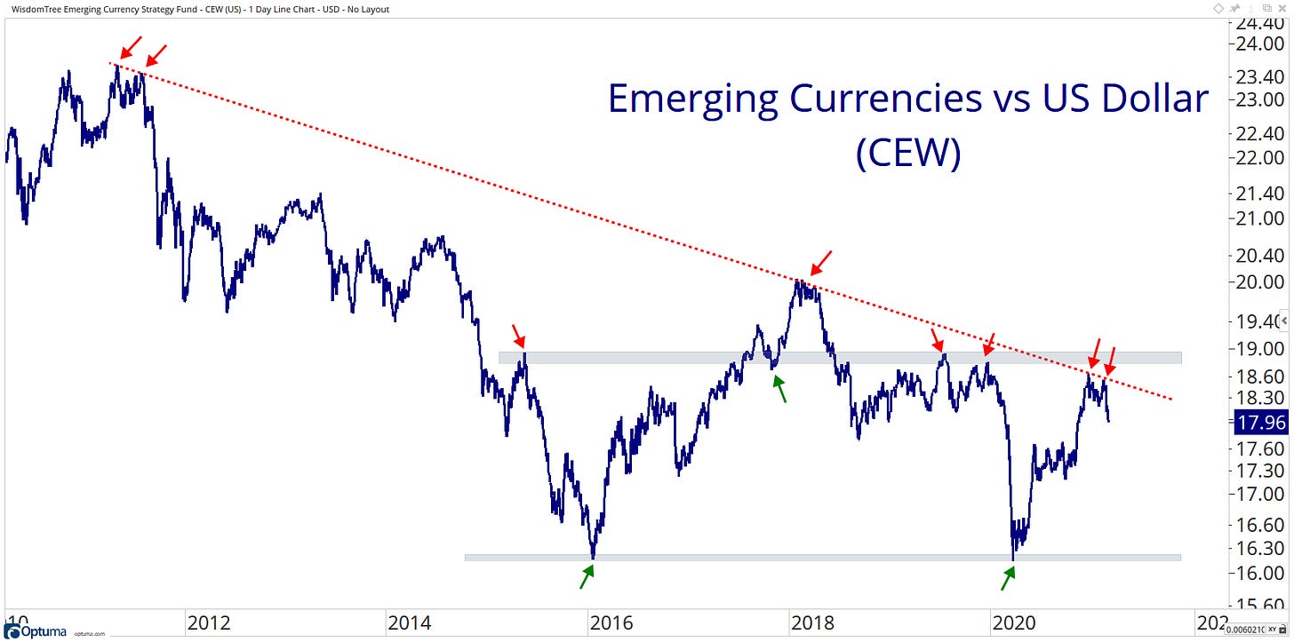
Emerging market currencies have taken a leadership role since the covid crash… However, it has recently failed just under a considerable level of resistance, one to watch moving forward!
Intermarket
Low Mo is coming in hot to test that 2017 to 2019 support level.
Factor/Style
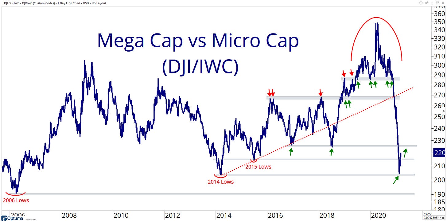
Finally, Mega-Caps finding some support at the 2014 lows!
Breadth
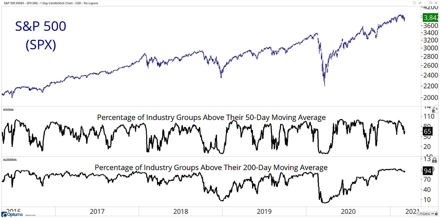
The breadth internals has been fading slowly, but across the board, they are still healthy.
Themes
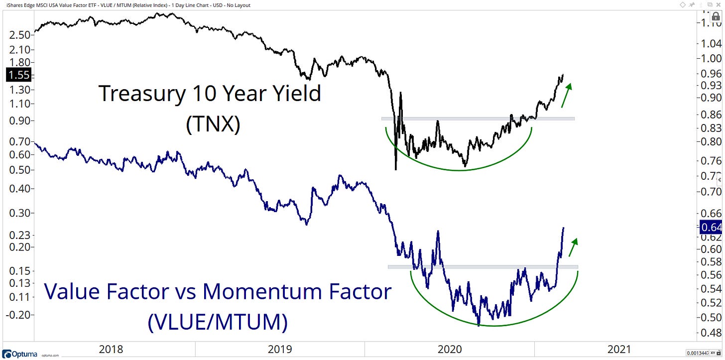
Value areas of the market continue to enjoy higher yields!
That’s a wrap for today, hope you enjoyed my charts, and please don’t forget to share your ideas in the comment section or get in contact with me on Twitter @granthawkridge.
If you enjoyed this blog, please consider sharing for more to see!
Stay safe, and good luck out there…
GH
DISCLAIMER: The information included in this report are obtained from sources which Jotting on Charts believes to be reliable, but we do not guarantee its accuracy. All of the information contained herein should be independently verified and confirmed. All opinions expressed by Jotting on Charts are for informational purposes only. Jotting on Charts is not a financial advisor. This does not constitute investment advice, nor any opinions expressed, constitute a solicitation of any securities or related financial instruments' purchase or sale. Jotting on Charts is not responsible for any losses incurred from any use of this information. Do not trade with money you cannot afford to lose. It is recommended that you consult a qualified financial advisor before making any investment decisions.


