My monthly notebook
a look at my monthly notebook notes

Quick Overview
Hey friends, welcome to ‘monthly notebook’ which is essentially my personal notes for my end of month chart scan. I hope you enjoy, and let me know if you want me to look at any specific chart or have a question about any chart I have posted.
Let us start with a quick overview of what has happened!! The S&P 500 gained 1.33% in June, leaving it down 4.19% on the year at the halfway mark. The Nasdaq 100 gained 16.46% in the first half, while the Dow Jones was weaker losing 9.55% in the first half. Small-caps performed worse than large-caps down 13.58 in the first half.
Looking at S&P sectors, all sectors had a robust second quarter, with all of them in positive territory. Technology was the best sector in June with a gain of 6.66%, while Utilities was down 5.46% in June. For the first half, Tech was the strongest sector up the most at 18.78%. The weakest sector was Energy down 34.31%.
Oil was down 72.62% in the first half, while natural gas was down 39.15%. Gold was up 17.12% in the first half, and silver was just up 1.98%.
Moving to international markets, Demark 9.41% & Lithuanian 3.59 the only countries to end positive over the first half of the year, while China is down 2.15% and Germany is also down 7.08%. The average country is down 12.01% over the last six months, which highlights weakness globally that was due to the March market crash.Finally, Treasury ETFs posted solid returns across the board in the first half, with the 20+ Year $TLT gaining more than 21%.
US Market & Sectors Monthly Performance

US Market & Sectors Quarterly Performance

US Equity Market
S&P 500
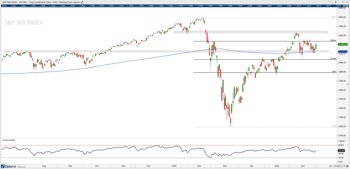
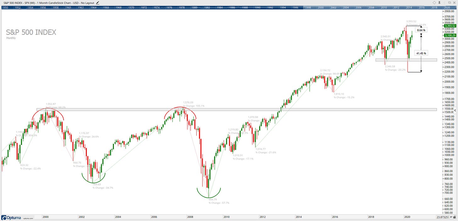
Near term support is in the region of 3020
Near term resistance is in the region of 3230
Price smoothing: Slightly up to flat since early 2018
Momentum: Neutral to bullish ranges
LT Chart: LT tread still an upwards direction
Bullish evidence: ST: 3020 support has held two times, and 200-day MA acted as support and held above LT: Term was not violated, 8% from ATH.
Overall, these charts have bullish appearances with a confluence of technical evidence pointing to further upside. If it can break and hold above the 3230 level, then ATH’s are in reach.
S&P 500 Breadth

Percentage of stock above RSI 70 peak in the recovery from March lows at 40% but more recently has dropped back to 0.6%
Percentage of stocks above 50MA peak in the recovery from March lows at nearly 100% but has now drifted lower to 60%. Holding above 50% is key going forward.
Percentage of stocks above 200MA peak just above 60% from March lows but has drifted lower to 36%, moving forward I would like to see it break back above 50% and hold.

The percentage of stocks trading above their daily 200 simple moving average is a breadth indicator I like to use to measures internal strength or weakness in the underlying sectors. It outlines for me the degree of participation. Breadth is strong when the majority of stocks in a sector are trading above their daily 200 simple moving average. Conversely, breadth is weak when the minority of stocks are trading above a specific moving average.
Sector breadth breakdown shows clear strength within the Tech and Health Care sectors. Laggers include Utilities and absolutely zero help from the Energy sector.
Stocks Vs. Bonds

The relative strength ratio chart of US stocks versus US treasuries over the past year. When the line is rising, it indicates that stocks are outperforming treasuries and vice versa. Looking at the current outperformance of stocks since the March lows have sharply taken this ratio back to square one. Where to next?
Sector Relative Strength

Relative strength ratio is essential when it comes to the selection of what is healthy and what is weak. When the ratio rises, the numerator has relative strength and is outperforming its denominator. Conversely, when the ratio falls, the numerator shows relative weakness and is underperforming its denominator.
Tech is hugely outperforming relative to the S&P 500 and Energy still underperforming… Financials for the past six months have been terrible... Industrials, Health Care and Staples, have nothing to write home about either… Consumer Discretionary has begun to move in the right direction after the early year weakness. Over the past month, we have seen strong outperformance from the Tech and Consumer Discretionary sectors.
Materials sector


Near term support is in the region of 53 & 61.8% Fib level
Near term resistance is in the region of 61.50
Price smoothing: Ranging market / Flat
Momentum: RSI in a slightly bullish range. However, would like it to hold above 50 moving forward;
Relative Strength: Clearly underperforming relative to the S&P 500, Would like to see a move above highlighted area.
LT Chart: XLB is holding above former LT resistance & support for the past 12 years. If we’re above 45, then there is no reason to be bearish about XLB.
Bullish evidence: XLB is above its 200-day moving average. Short term level to watch is the 78.6% fib level.
Overall, this chart has a bullish appearance with a confluence of technical evidence pointing to further upside and a possible retest of 2018 ATH’s.
Communication Services sector


Near term support is in the region of 51.50
Near term resistance is at the all-time high from early February
Price smoothing: Flat to Slightly sloping upwards
Momentum: RSI in a bullish range
Relative Strength: Flat performance relative to the S&P 500, Would like to hold above the highlighted area.
LT Chart: XLC is holding above former LT resistance for the past two years. If we’re above 51.50, then there is no reason to be bearish about XLC.
Bullish evidence: XLC is above its 200-day moving average and continues its upward trend to its all-time high.
Overall, this chart has a bullish appearance with a confluence of technical evidence pointing to further upside. ATH’s only 4% away.
Energy sector


Near term support is in the region of 35
Near term resistance is in the region of 53
Price smoothing: Clearly downwards sloping
Momentum: RSI in a bearish range
Relative Strength: Clearly underperforming relative to the S&P 500
LT Chart: To be bullish I need to see XLE back above its LT significant level of 50
Bearish evidence: Price is below 200-day MA and in an LT downtrend. the only sector to be below its 2018 and 2019 lows
Overall, this chart has a bearish appearance with a confluence of technical evidence pointing to further downside and retest of the 2020 lows
Financial sector


Near term support is in the region of 22.50 (2018 low) & 38.2% Fib level
Near term resistance is in the region of 26.25 & 61.8% Fib level
Price smoothing: Downwards sloping
Momentum: RSI in a bearish range
Relative Strength: Clearly underperforming relative to the S&P 500
LT Chart: LT trend held but is under pressure.
Bearish evidence: XLF has been fading since testing 200-day moving average
Overall, this chart has a bearish appearance with a confluence of technical evidence pointing to further downside if the 38.2% Fib level doesn’t hold going forward and we will see a retest of 2020 lows.
Industrial sector


Near term support is in the region of 66.50 & 50% Fib level
Near term resistance is in the region of 72.50
Price smoothing: Downwards sloping
Momentum: RSI in a neutral range
Relative Strength: Clearly underperforming relative to the S&P 500. Has it found a base?
LT Chart: LT trend line held but is under pressure
Bearish evidence: XLI has been fading since testing 200-day moving average
Overall, this chart has a bearish appearance with a confluence of technical evidence pointing to further downside. The critical level is the 50% Fib.
Technology sector


Near term support is in the region of 95.30 & 78.6% Fib level
Near term resistance is in the region of its ATH this week
Price smoothing: Upwards sloping
Momentum: RSI in a bullish range
Relative Strength: Clearly outperforming relative to the S&P 500
LT Chart: Monthly close ATH and LT trend is up
Bullish evidence: XLK continues to obtain new all-time highs
Overall, this chart has an upbeat appearance with a confluence of technical evidence pointing to further upside.
Consumer Staples sector


Near term support is in the region of 57.20
Near term resistance is in the region of 61.20 & 78.6% Fib level
Price smoothing: Flat
Momentum: RSI in a neutral range
Relative Strength: Flat performance relative to the S&P 500, Would like to see a move above the highlighted area.
LT Chart: XLP is holding above former LT support for the past five years. If we’re above 48, then there is no reason to be bearish about XLP.
Bearish evidence: Third failed attempt to move above its 200-day moving average
Overall, this chart has an LT bullish appearance with a confluence of technical evidence pointing to further upside. ST going forward I would like to see a close above its 200-day MA and the 78.6 Fib level.
Real Estate sector

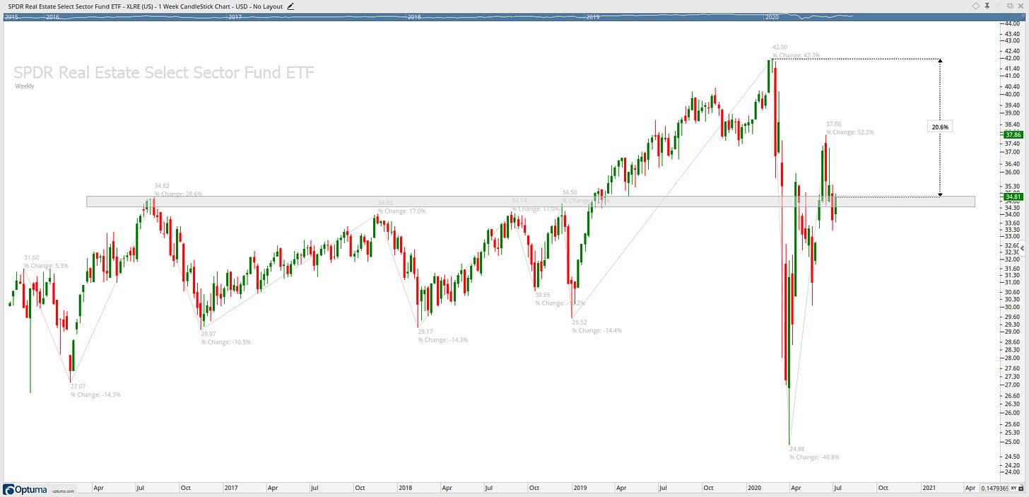
Near term support is in the region of 35.50 & 61.8% Fib level
Near term resistance is in the region of 40
Price smoothing: Starting to slope Downwards
Momentum: RSI in a slightly bullish range. However, would like it to hold above 50;
Relative Strength: Underperforming relative to the S&P 500
LT Chart: Back above the significant price level of 34.50
Overall, this chart has a bullish appearance with a confluence of technical evidence pointing to further upside, would like to see a strong close above the 61.8% Fib level and its 200-day MA.
Utilities sector
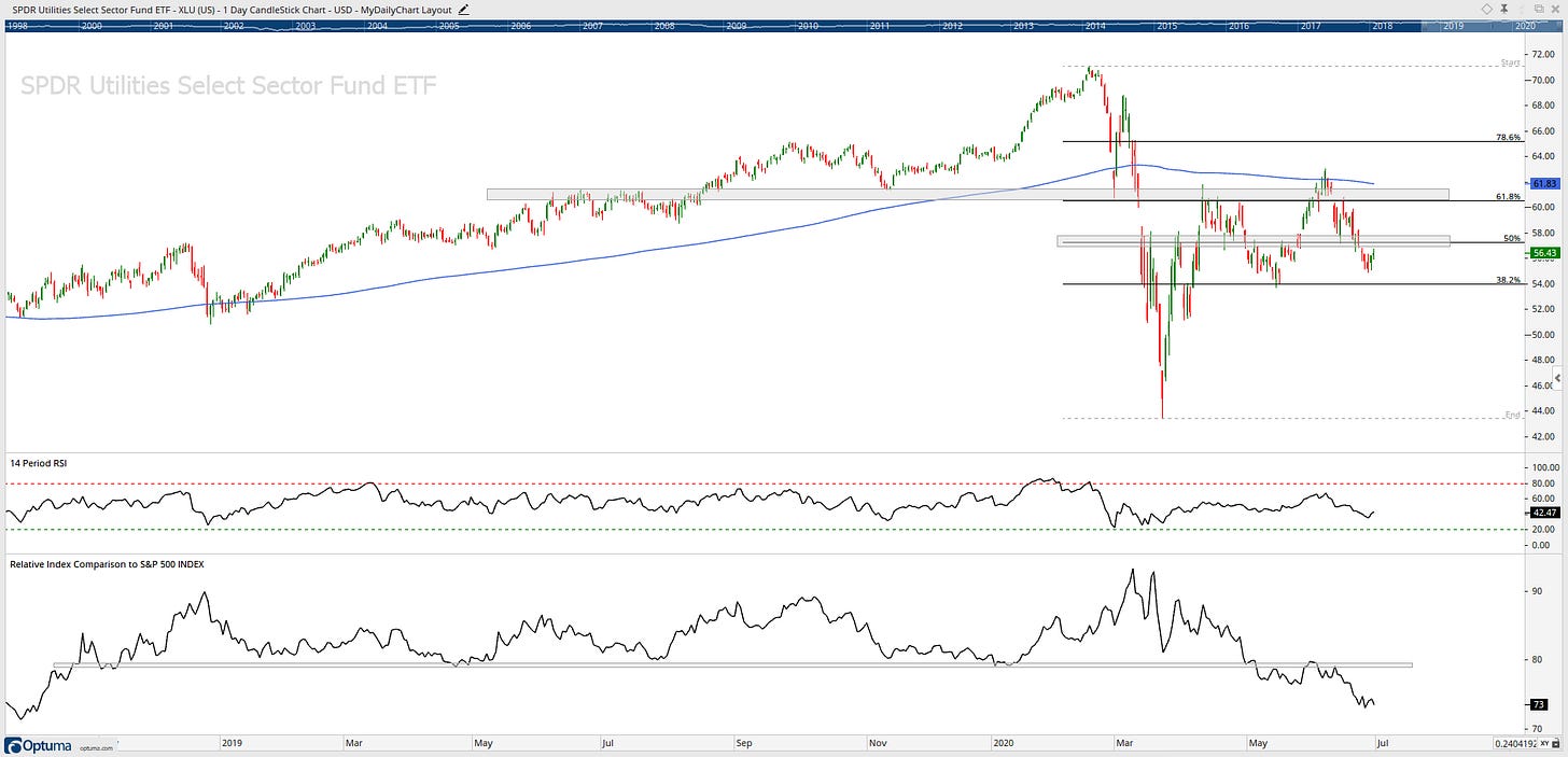

Near term support is in the region of the 38.2% Fib level
Near term resistance is in the region of 57.50 & 50% Fib level
Price smoothing: Moved into a flat movement
Momentum: RSI in a neutral range
Relative Strength: Flat performance relative to the S&P 500, Would like to see a move above the highlighted area.
LT Chart: Major price level at 44 held during the market crash in 2020, LT trend is still moving upwards
Bullish evidence: LT uptrend did not get violated
Overall, this chart has a bullish appearance with a confluence of technical evidence pointing to further upside.
Health Care sector


Near term support is in the region of 104.50
Near term resistance is at the all-time high from January 2020
Price smoothing: Upwards sloping
Momentum: RSI in a slightly bullish range. However, would like it to hold above 50
Relative Strength: Was outperforming now underperforming, Would like to see a move above the highlighted area.
LT Chart: Major price level at 75 held during the market crash in 2020, LT trend is still upwards
Bullish evidence: LT uptrend did not get violated and only 4% from ATH’s
Overall, this chart has a bullish appearance with a confluence of technical evidence pointing to further upside.
Consumer Discretionary sector


Near term support is in the region of 123 & 78.6% Fib level
Near term resistance is at the all-time high from the other week
Price smoothing: Flat
Momentum: RSI in a bullish range
Relative Strength: Recently, a strong move to outperforming relative to the S&P 500. I would like to see a strong move above the highlighted area
LT Chart: Major price level at 82 held during the market crash in 2020, LT trend is still moving upwards
Bullish evidence: LT uptrend did not get violated only 3% from ATH’s
Overall, this chart has an upbeat appearance with a confluence of technical evidence pointing to further upside.
Fixed-Income
20+ Year Treasury Bonds

TLT has gone absolutely nowhere for more than three months now as prices consolidate from record highs. 150 is a crucial level to hold
7-10 Year Treasury Bonds

As above, IEF has also gone absolutely nowhere for more than three months now as prices consolidate from record highs. 122.50 is a critical level that IEF needs to break to move forward.
High Yield Corporate Bonds

HYG tested 78.6% Fib level early June, however, how now faded to re-test 61.8% Fib level as support.
Investment Grade Corporate Bonds

LQD is testing ATH’s and advancing to breakout to the upside with attempt number two.
High Yield Bonds
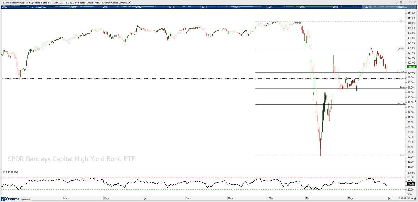
JNK tested 78.6% Fib level early June, however, how now faded to re-test 61.8% Fib level as support.
Currencies
US Dollar Index

DXY is in a highly contested supply and demand area, it’s in an uptrend, however, will we see a trend change if current levels/trendline do not hold?
Euro

Euro has been in a ranging downtrend for the past three years, it tried a breakout in early 2020 but failed, and now it is trying again. Will it succeed this time around? Upside level of resistance I am currently looking at is $1.15
Pound

GBP needs to be above the 1.25 level to see any more upside momentum.
The $1.25 level also coincides with my level of interest and the 50% fib level.
Yen

Say it with me… YEN IS IN A RANGING MARKET! next chart please! before I leave… levels to watch are $105 (support) and $114 (resistance).
Aussie

AUD has been in a prolonged downtrend! Stock market and AUD bottomed in March, and now both have moved higher.
AUD with a constructive breakout of the 0.67 level, now forming a pennant which is usually a continuation pattern.
More upside coming in AUD? I’m watching the 0.70 level.
Commodities
Gold

Gold has been on a mission after breaking out of the $132 level in mid-2019. Next level of resistance is at around $175
Silver

Can silver can break out of this 6-year ranging market? Upside resistance at $18 level and downside support at $13 level
Oil

Oil has been in ranging market or a downtrend, nothing bullish about it!
Natural Gas

Nat Gas is also in a downtrend, nothing bullish about it! Get back to $23 area, and I will get interested.
Intermarket Analysis
S&P 500 vs Gold & Bonds

Stocks Vs. Gold & Bonds... Both ratios not holding above highlighted level is not bullish for the stock markets. Both ratios are in a clear downtrend making lower highs and lower lows.
Cross Asset Relative Performance

High beta has seen sharp momentum relative to low vol in early Q2 but has faded into the last few weeks of Q2.
Large Cap has also seen sharp Q1 momentum relative to small caps but has started to fall away in Q2.
Growth stocks continue to show strong momentum relative to Value stocks.
Strength continues in the US stock market relative to developed & emerging markets.
Dow Theory
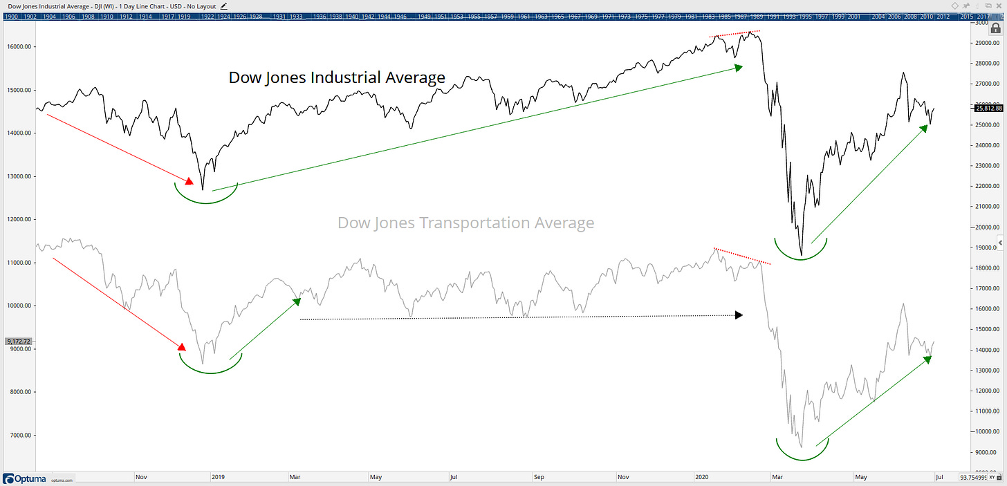
The Dow Theory charts clearly printed a divergence (red dotted lines) in early 2020, and we sure did see a market crash!
Modern Dow Theory
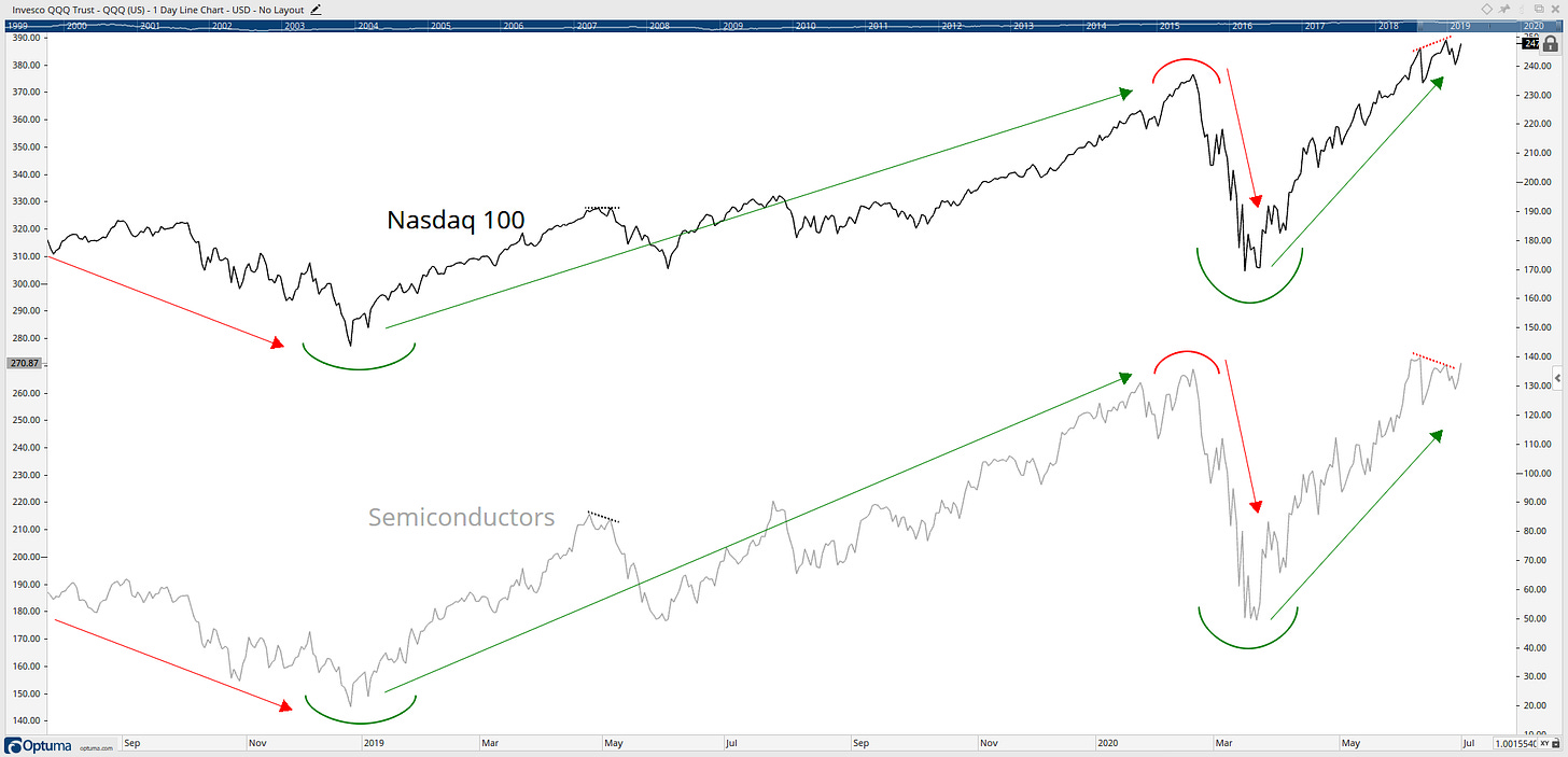
I classify this chart as the modern-day down theory, and I see a divergence (red dotted lines) on the chart, Will we see these markets perform a trend change? I will be watching this chart daily!
Offensive Vs. Defensive

The relative strength chart is showing the basket of the offensive sectors (Financials, Technology and Consumer Discretionary) versus the basket of the defensive sectors (Consumer Staples, Utilities and Health Care). When the line is rising, it means offensive sectors are outperforming defensive sectors and vice versa.
This ratio gives me a good indication of risk appetite among the market. From the market lows in March this ratio held a support level dating back to 2008 and moved higher to re-test a well-established resistance level and over the last week as broken to the upside of that level, this ratio is supporting the bull case for the market with a possible move straight back to 2018 highs.
Discretionary Vs. Staples

Consumer Discretionary vs Consumer Staples is one of my m favourite ratio charts to look at weekly - Consumer Discretionary has made a substantial breakout of a 24-month downwards trend line and is now testing its ATH’s. This chart is bullish for equity markets if the ratio can break to the upside of the highlighted range.
Large Caps Vs. Small Caps

Large-caps continue to outperform relative to small-caps. However, the last few months have seen strength within the small caps.
Growth Vs. Value

Growth stocks continue its march to the upside relative to value stocks.
High Beta Vs. Low Vol

High Beta relative to Low Volatility is now stuck in the middle of a 10-year range. Holding current ratio levels would be positive for equities as an asset class, and this would suggest there is a certain level of risk appetite for stocks.
Safe Havens

Risk-on... Risk-off... Money moves on a daily basis... Interesting to note the recent sharp move up in S&P500 hasn't seen an equally as strong move down in the safe havens assets.
US Dollar & Commodities

It is known that the relationship between the U.S. Dollar and Commodities is an inverse correlation, but what has happened over the last 60 months? Who is going to make the first move?
Copper Vs. Gold
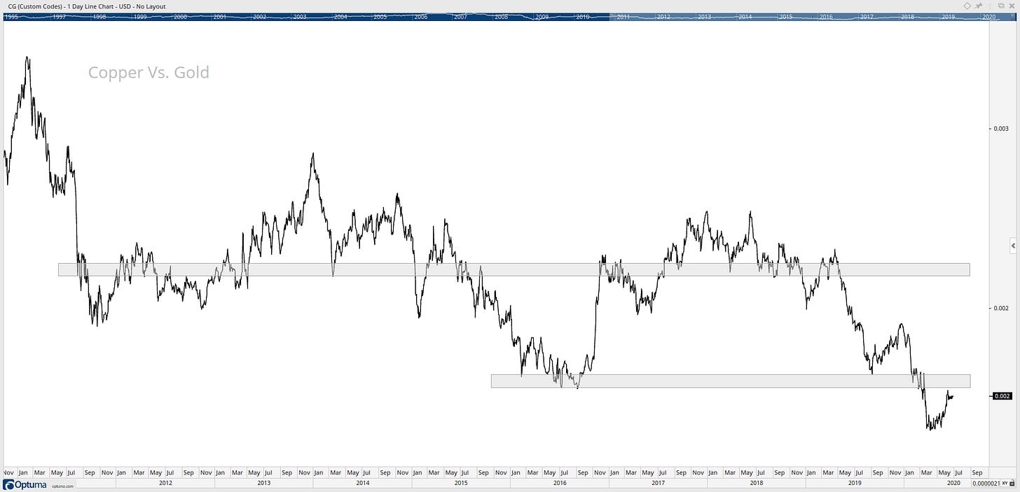
The argument could be that copper is representative of the global growth while Gold is the opposite, but with copper vs gold ratio continues to break to new lows. This is not a sign of an uptrend and is not bullish for the stock markets as a whole.
Stay safe and good luck out there…
GH
DISCLAIMER: The information included in this report are obtained from sources which Jotting on Charts believes to be reliable, but we do not guarantee its accuracy. All of the information contained herein should be independently verified and confirmed. All opinions expressed by Jotting on Charts are for informational purposes only. Jotting on Charts is not a financial advisor, and this does not constitute investment advice nor any opinions expressed, constitute a solicitation of the purchase or sale of any securities or related financial instruments. Jotting on Charts is not responsible for any losses incurred from any use of this information. Do not trade with money you cannot afford to lose. It is recommended that you consult a qualified financial advisor before making any investment decisions.


Nice wide spanning summary, Greg.
A question, on the table below, how do I read the last column 'Yearly Range`?
https://cdn.substack.com/image/fetch/c_limit,f_auto,q_auto:good,fl_progressive:steep/https%3A%2F%2Fbucketeer-e05bbc84-baa3-437e-9518-adb32be77984.s3.amazonaws.com%2Fpublic%2Fimages%2Fc1adf553-c3a1-4fcd-87bf-6ab840e8807c_1829x505.png