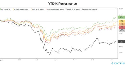
Everyone seems to focus a lot of time on the US market, what about the rest of the world? Let us take a look at some International ETF’s and see how the International markets are travelling so far in 2020.
$IOO seeks to deliver a cap-weighted exposure to 100 of the world's largest multinational companies. Its primary focus on mega-caps companies rather than large-cap and with a heavy emphasis on US companies.
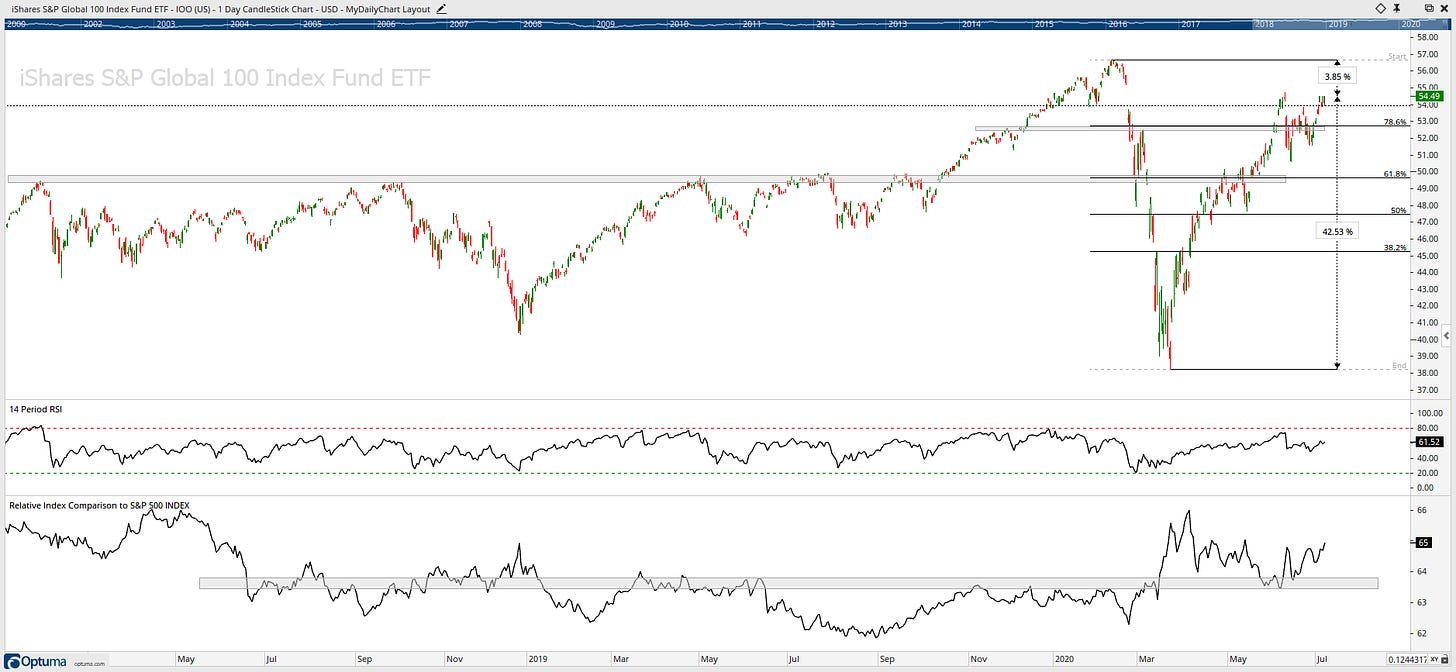
Above key price resistance level of 53 & 78.6 Fib level, the next stop is ATHs.
The only reason the $IOO has done well to get back into positive returns is that the majority of the index is in US Equities (about 70%). So, let us take the US out of the picture by having a look at $VEU.
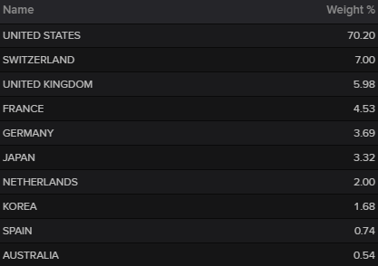
$VEU holds a portfolio of global large- and mid-cap stocks outside the US. $VEU serves as an accurate proxy for the entire international equity market.
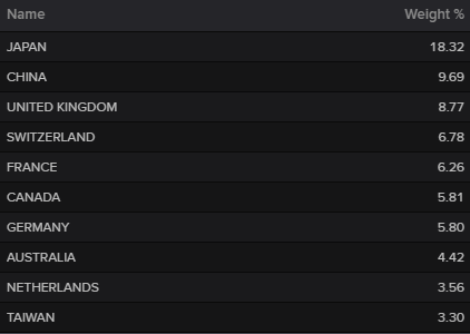
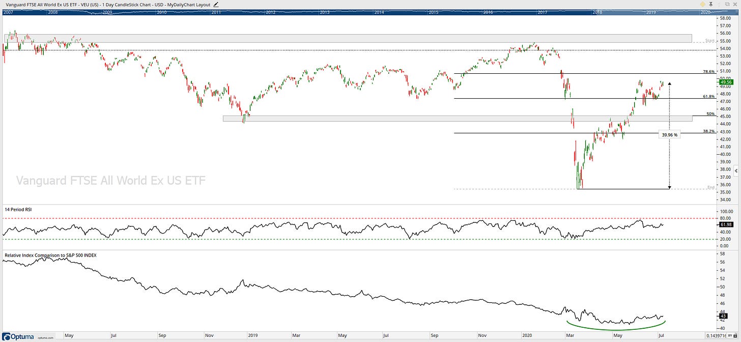
Clearly not as strong as $IOO, however, a strong move from March lows up over 38% in 3 months. Next critical price resistance level is around the 55-56.
Now let us look a little deeper with a look a region charts and performance for 2020.
Regions of the world with more exposure to commodities have been weaker. The money has been flowing to the US. But everything else has been struggling.
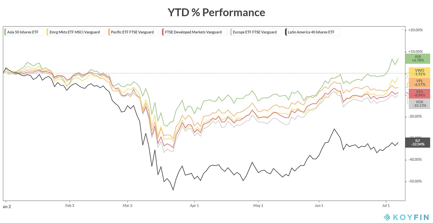
Asia has led the way higher. But what about everywhere else? Emerging markets are down over 1.92% year-to-date, pacific markets are down 6.57%, developed markets down over 8.94%, Europe down 10.13% for the year and Latin America down over 32%.
Developed Market $VEA delivers excellent coverage of developed-market equities outside the US. $VEA tracks a market-cap weighted index of large-, mid- and small-cap stocks from developed markets.
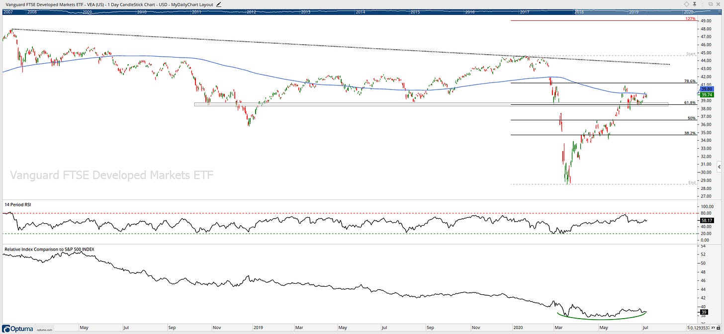
$VEA is stuck between its 61.8% Fib level and its 200-day moving average for the past month. Relative strength has been underperforming, but recently we have seen signs of a basing formation.
Emerging Market $VWO tracks a market-cap weighted index of emerging market stocks. However, it does not count South Korea as an emerging market.
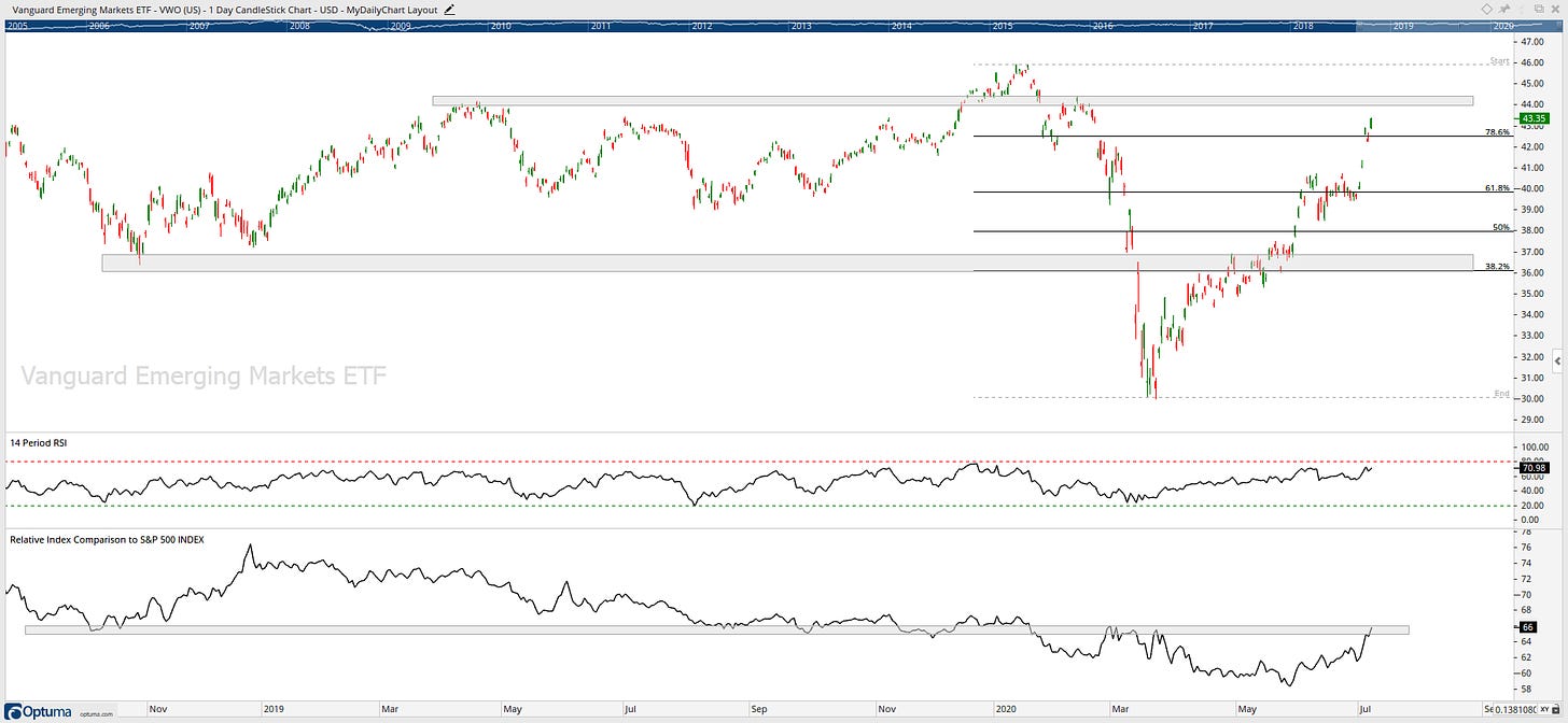
$VWO has been in a ranging market for the past two years, and it is approaching a critical level of resistance at 44, which also coincides with a level of resistance relative to the S&P500.
Europe $VGK holds a broad, comprehensive portfolio of companies from developed European countries.
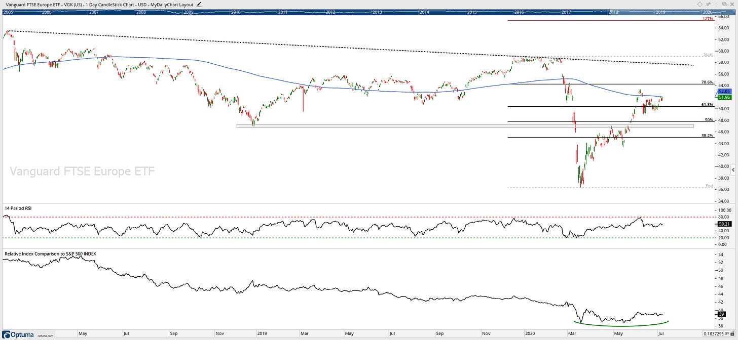
$VGK is stuck between its 61.8% Fib level and its 200-day moving average for the past month. Relative strength has been underperforming, but recently we have seen signs of a basing formation.
Asia $AIA tracks an index of 50 of the largest companies from Hong Kong, South Korea, Singapore and Taiwan. With 50% of the fund invested in Tech.
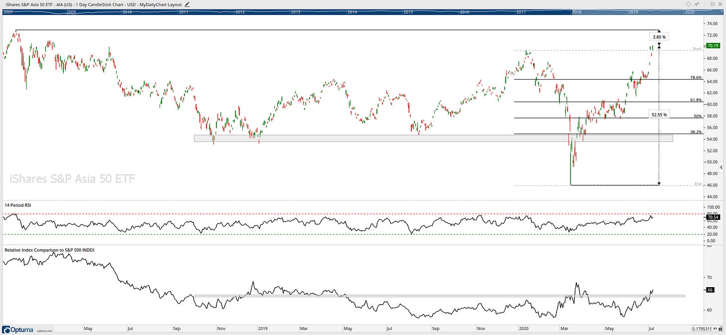
$AIA is marching its way to ATHs after gaining 52.10% from the March lows.
Pacific $VPL is a market-cap weighted index of securities in the developed markets of the Pacific region. The fund covers all the key countries in the Pacific, with a heavy emphasis on Japan followed by Australia & South Korea.
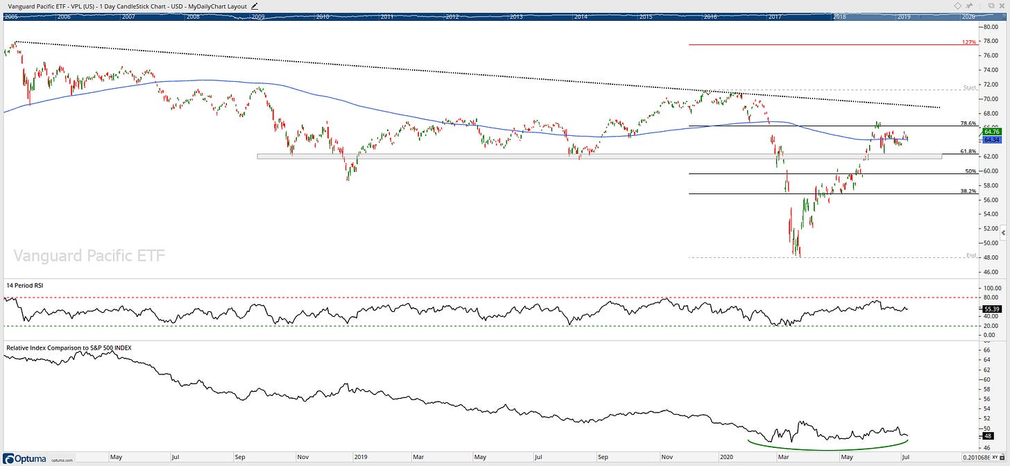
$VPL has been in a sideways market for the past two years and is currently stuck between its 61.8% Fib level and its 200-day moving average for the past month. Relative strength has been underperforming, but recently we have seen signs of a basing formation.
Latin America $ILF is concentrated on the Latin American markets which track a market-cap weighted index of 40 of the largest Latin American firms, with heavy concentration among the top 10 holdings (57%).
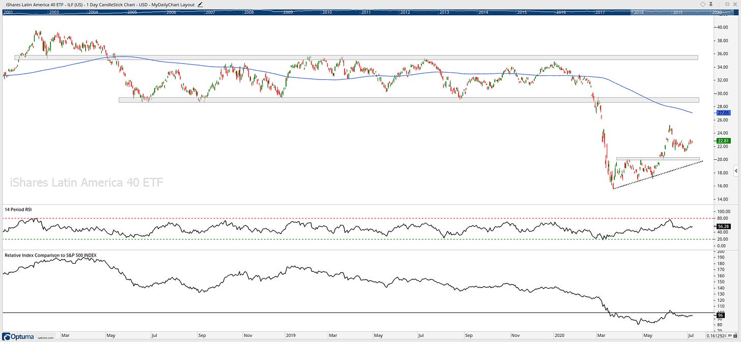
I don’t want to zoom out any more on this chart! It gets ugly! Late February $ILF broke an important support level at 29 which continued its downtrend. I can see a further downside to the price if it can not hold 20.
Europe
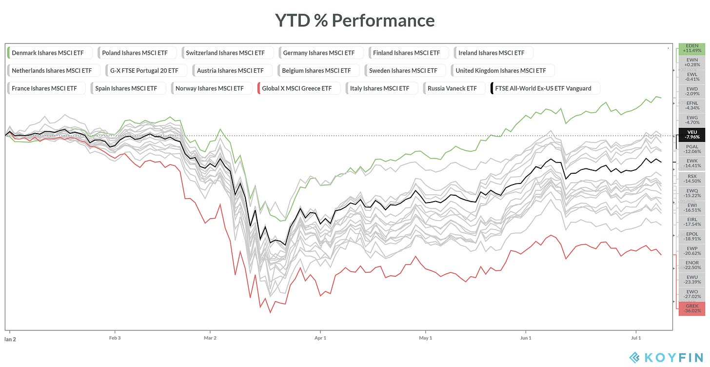
Looking at the European region YTD performance chart we can see that Denmark has clearly been outperforming and Greece has been underperforming since the market crash in March 2020. Let us now have a look at these two charts.
Denmark
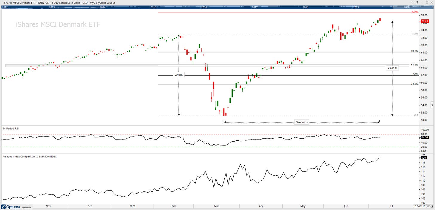
Denmark march continues to claim a new all-time high. 15.49% from its 200-day moving average.
Denmark had a breakout in May of its resistance level which is dating back to Feb 2020 ATH and now has continued its momentum to its 127% Fibonacci level. RSI is in healthy bullish ranges and clear outperformance relative to the S&P500. What will stop this powerhouse from advancing further?
Greece
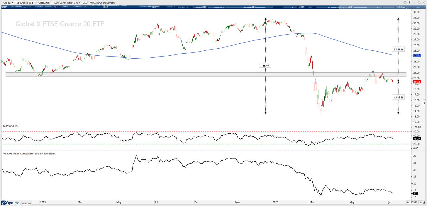
What can you say? This is one bad looking chart!!
Greece is in a downtrend, and it is below its 2018 and 2019 lows.
Currently, 75% from its all-time high and 20.08% below its 200-day MA and the stock has returned -36% YTD… ugly!
Key near term resistance I am watching is in the region of 20.50; however, there is nothing bullish about this chart!
Asia
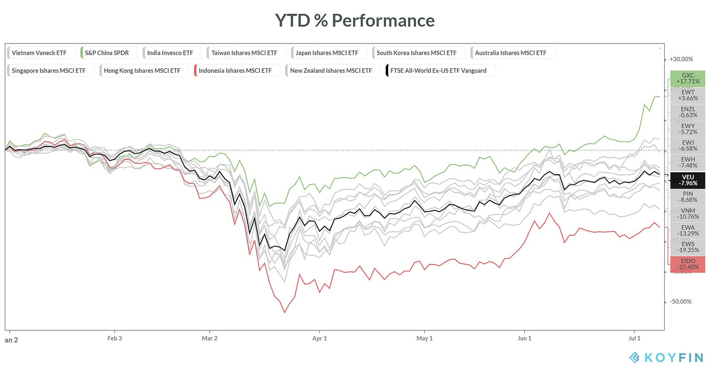
Looking at the Asian region YTD performance chart we can see that China has clearly been outperforming and Indonesia has been underperforming since the market crash in March 2020. Let us now have a look at these two charts.
China
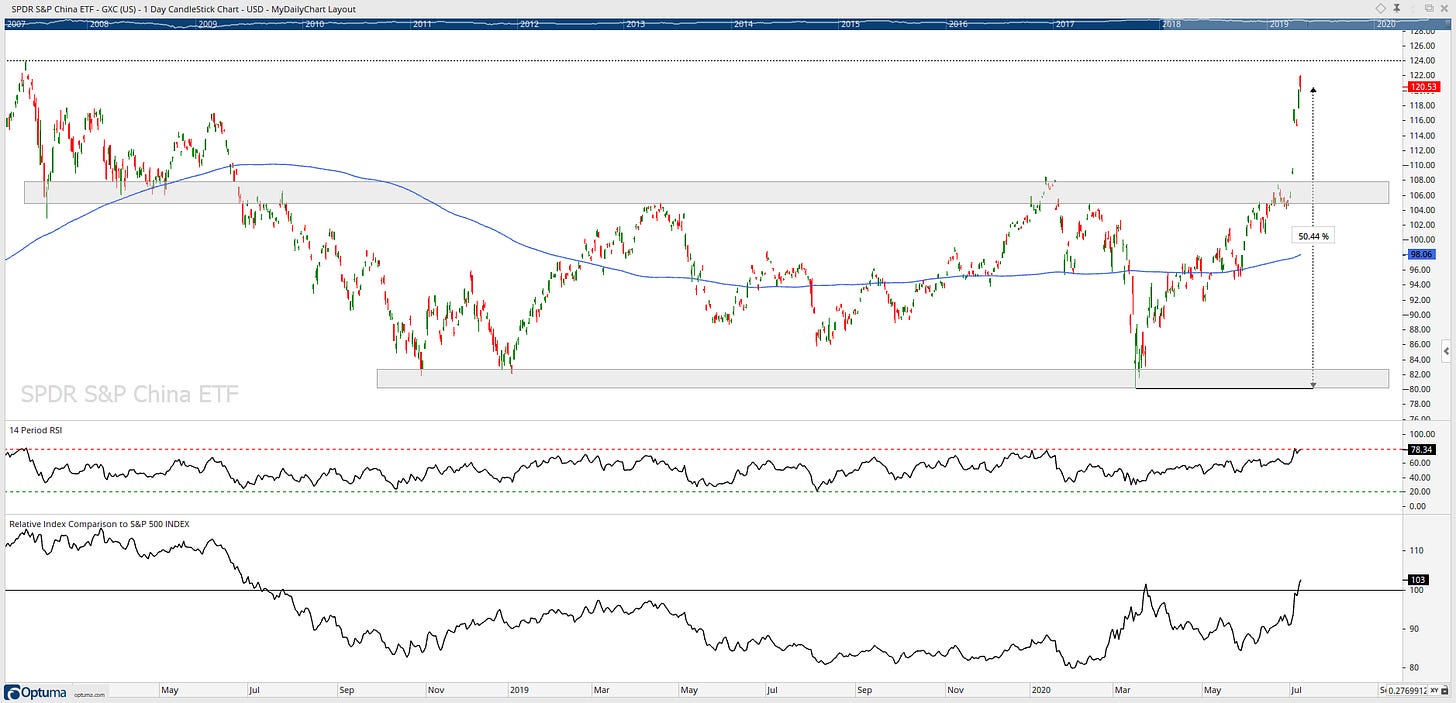
LT this chart has been in a ranging market; however, China closed above its 200-day moving average 42 days ago and has continued it’s upwards trend has moved it 22.92% above the moving average. China has its all-time high in reach with the help of a strong move off its March lows (+50.44%).
Its relative strength has had flat performance relative to the S&P 500; however, it has had a recent strong movement and going forward I would like it to hold above the 100.
Indonesia
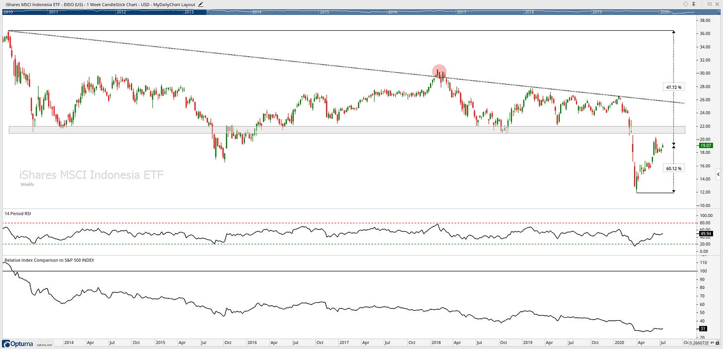
Indonesia is the definition of a downtrend posting lower highs and lower lows, and it is below its 2018 and 2019 lows.
Currently, 47.72% from its all-time high and 10.32% below its 200-day MA and the stock has returned -25% YTD.
Key near term resistance I am watching is in the region of 21.50; however, there is nothing bullish about this chart!
Americas
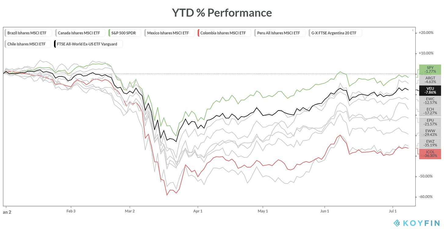
Looking at the Americas region YTD performance chart, we can see that the USA has clearly been outperforming and Colombia has been underperforming since the market crash in March 2020. Let us now have a look at these two charts.
USA
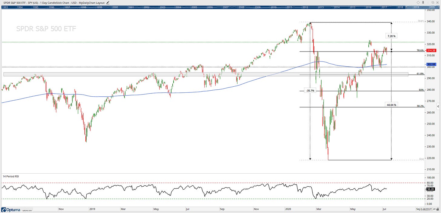
SPY is currently testing its 78.6% Fib level and has been for the past few weeks. Its been four months since its last all-time high. After a 35% drop, If it can break and hold above the 323 levels, then ATH’s are in reach.
Colombia
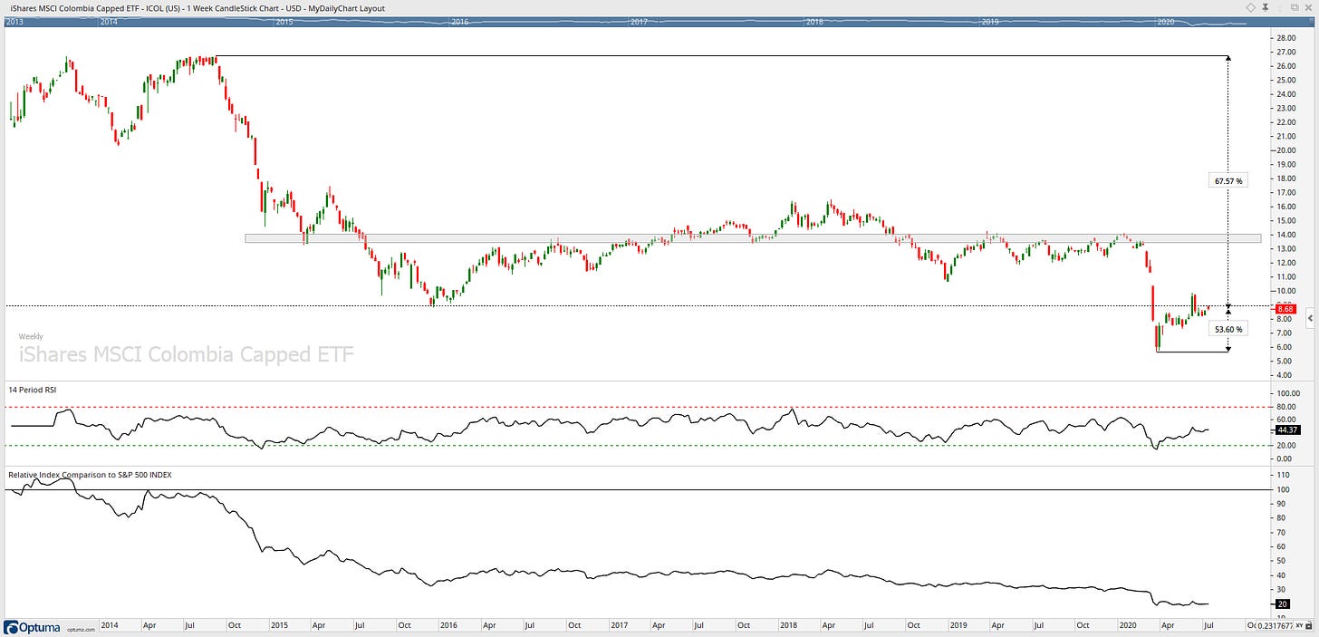
Colombia is in a clear downtrend, posting lower highs and lower lows, it is below its 2018 and 2019 lows, and it sure is one ugly chart.
Currently, 67.57% from its all-time high and 20.71% below its 200-day MA and the stock has returned -20% YTD.
Key near term resistance I am watching is in the region of 14; however, there is nothing bullish about this chart!
Bottom line: Is there weakness in some markets? Sure, for example, Greece looks shocking! But for the worlds more important markets, I see constructive price movement, foundations have been set, but there is lots more building to be done!
If you want my to see a specific countries chart that I have not posted in this blog, please send me a DM on twitter —>> @granthawkridge
Stay safe and good luck out there…
GH
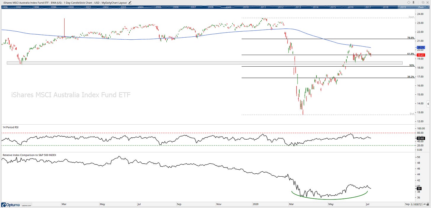
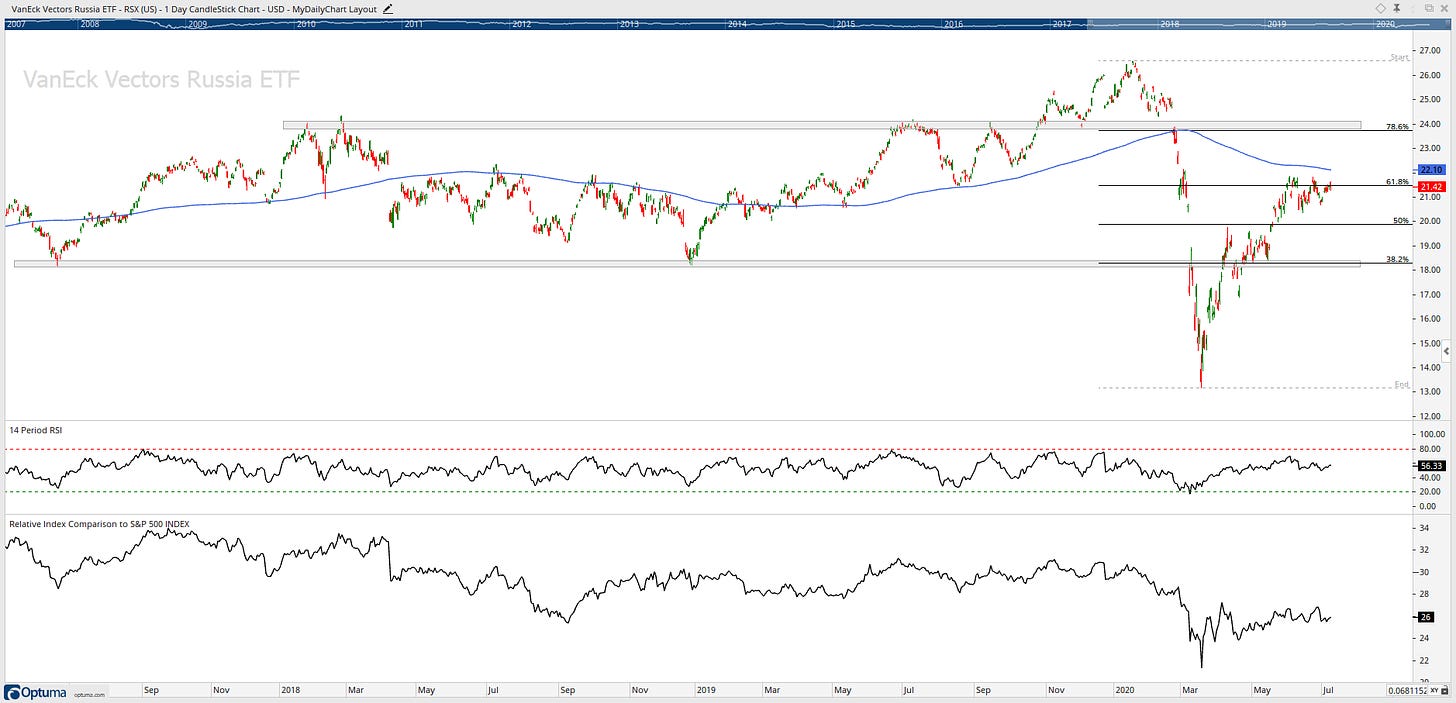
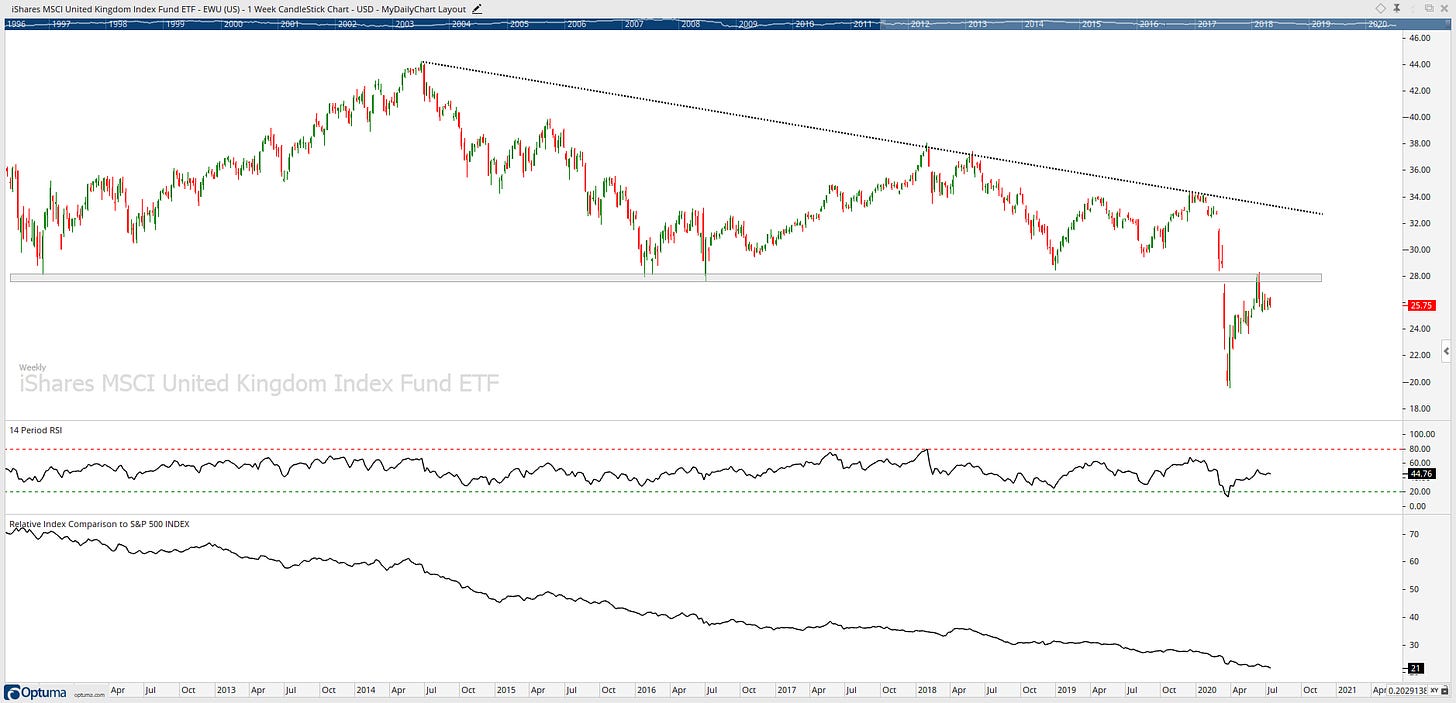
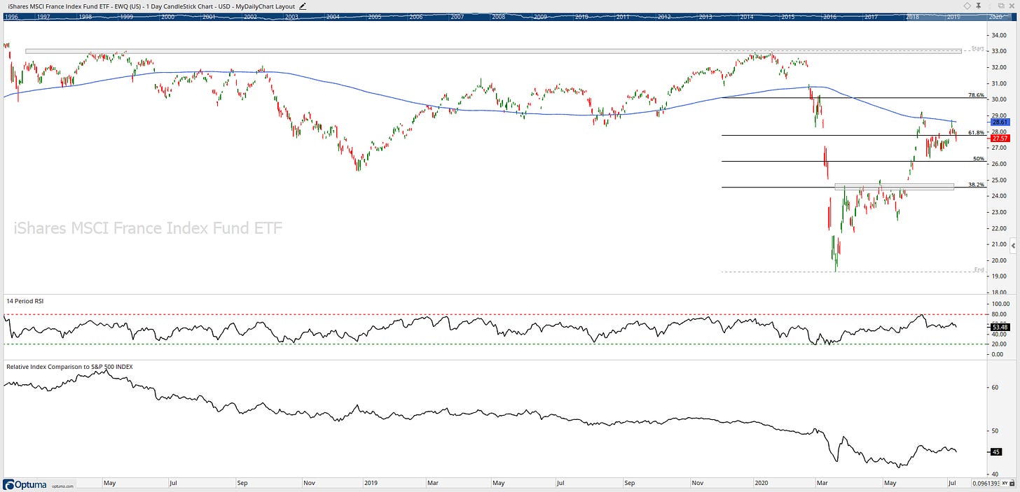
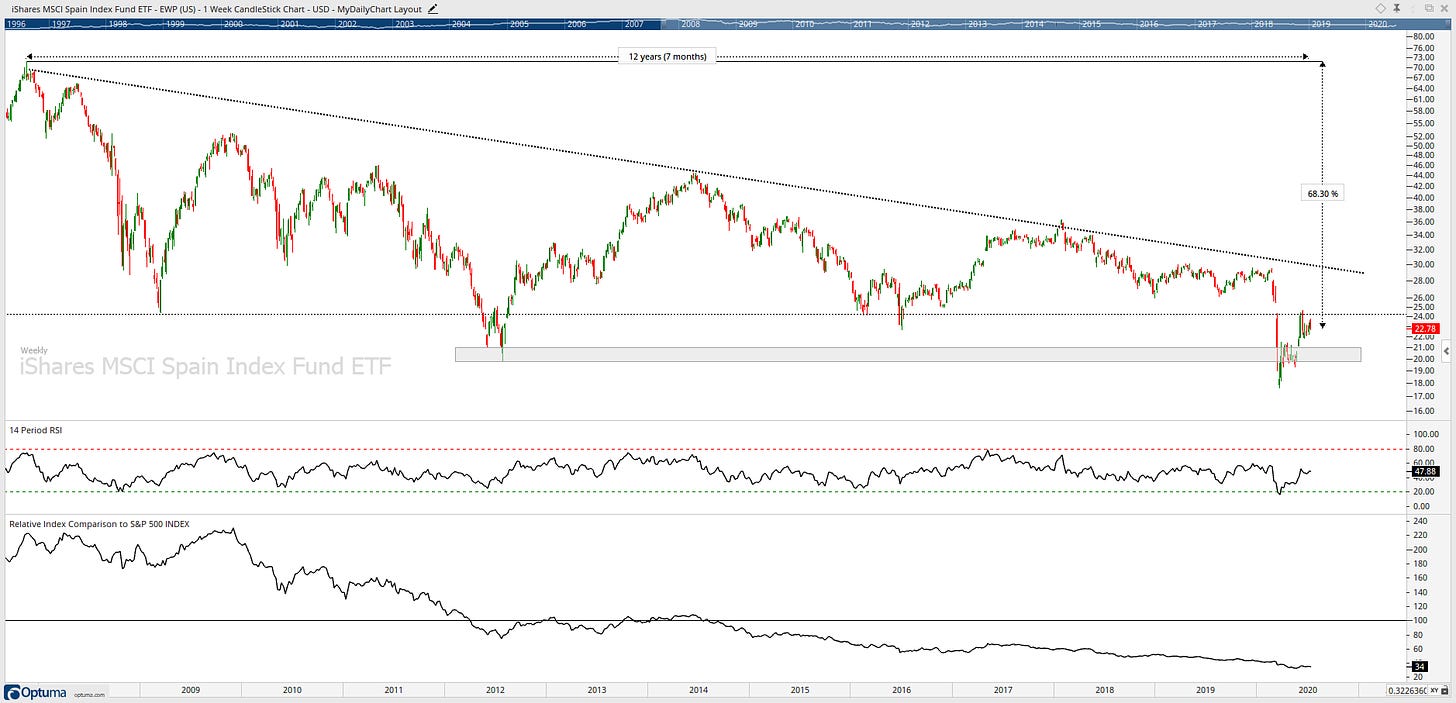
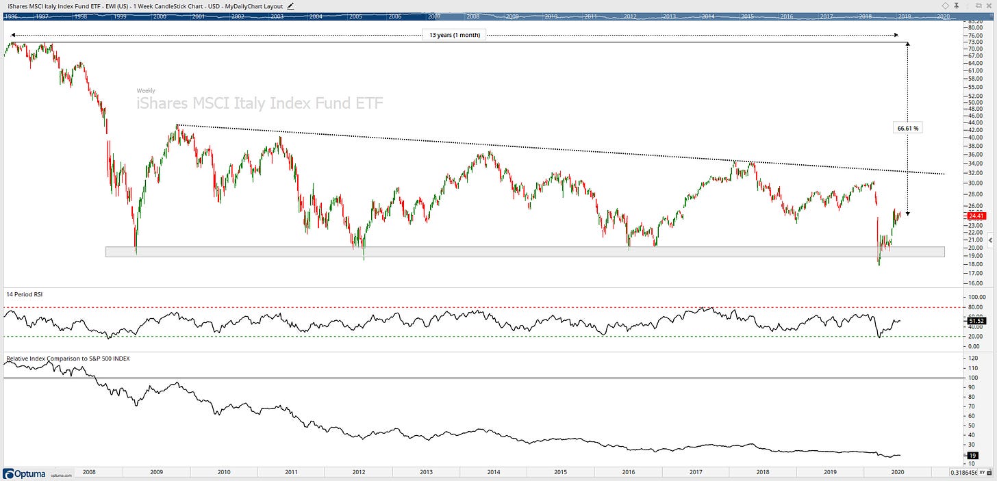
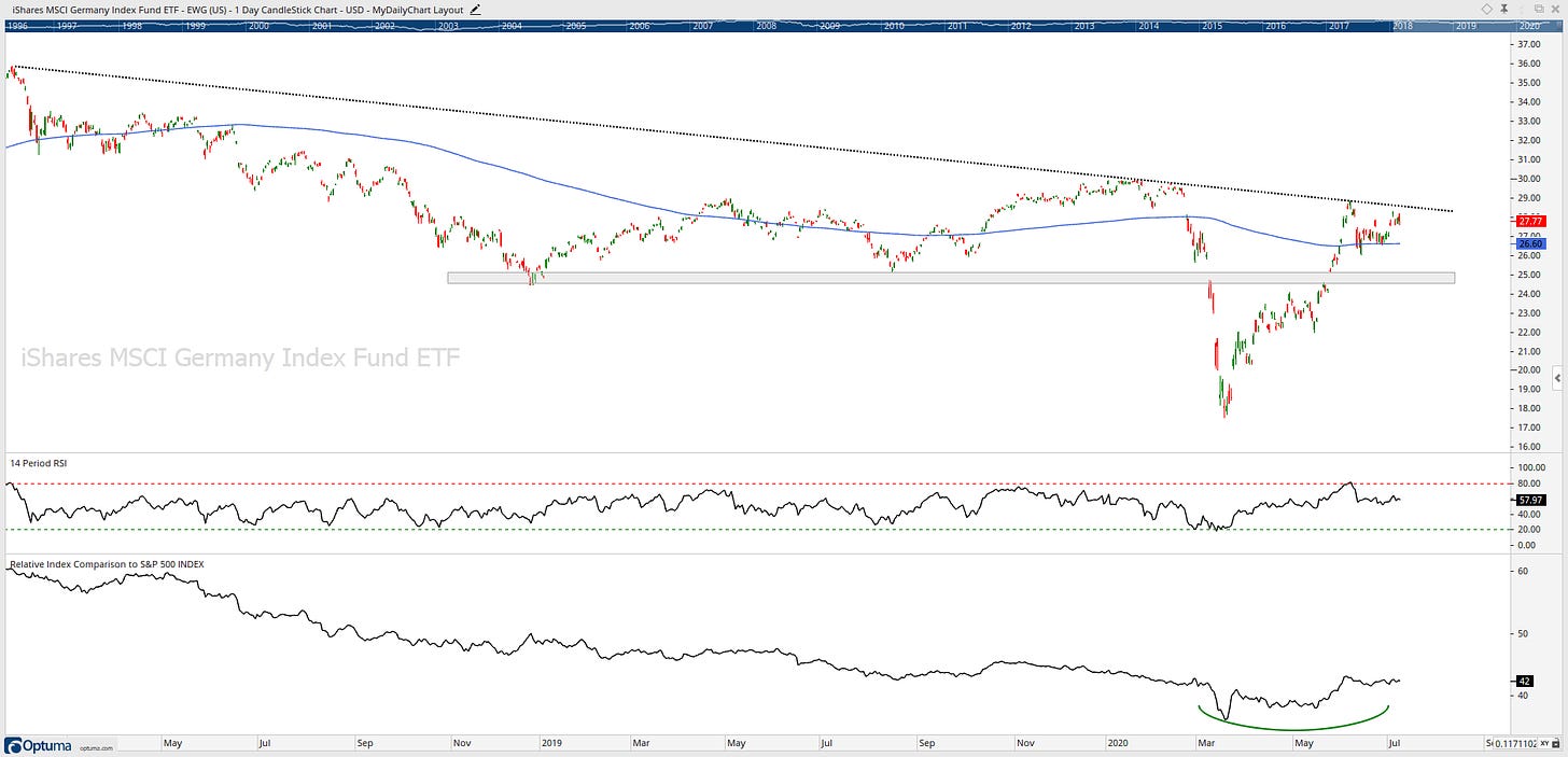
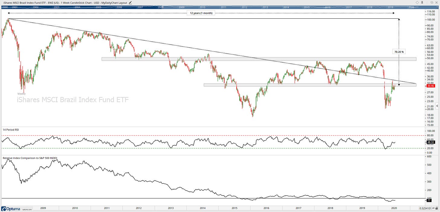
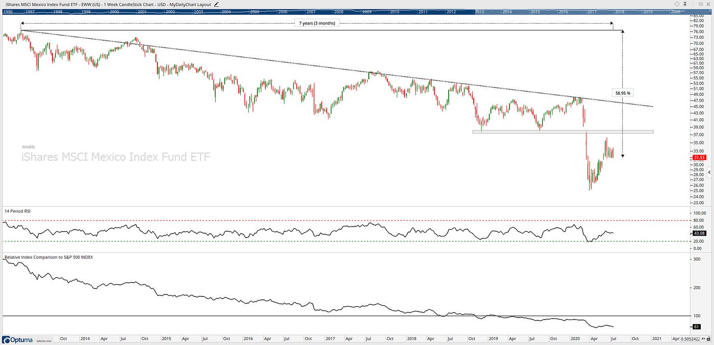
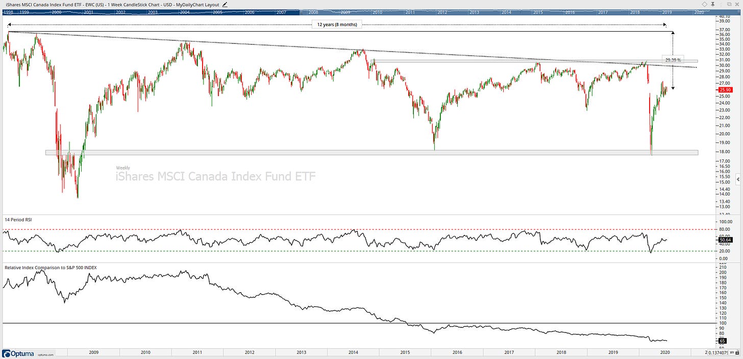
Bonus Charts:
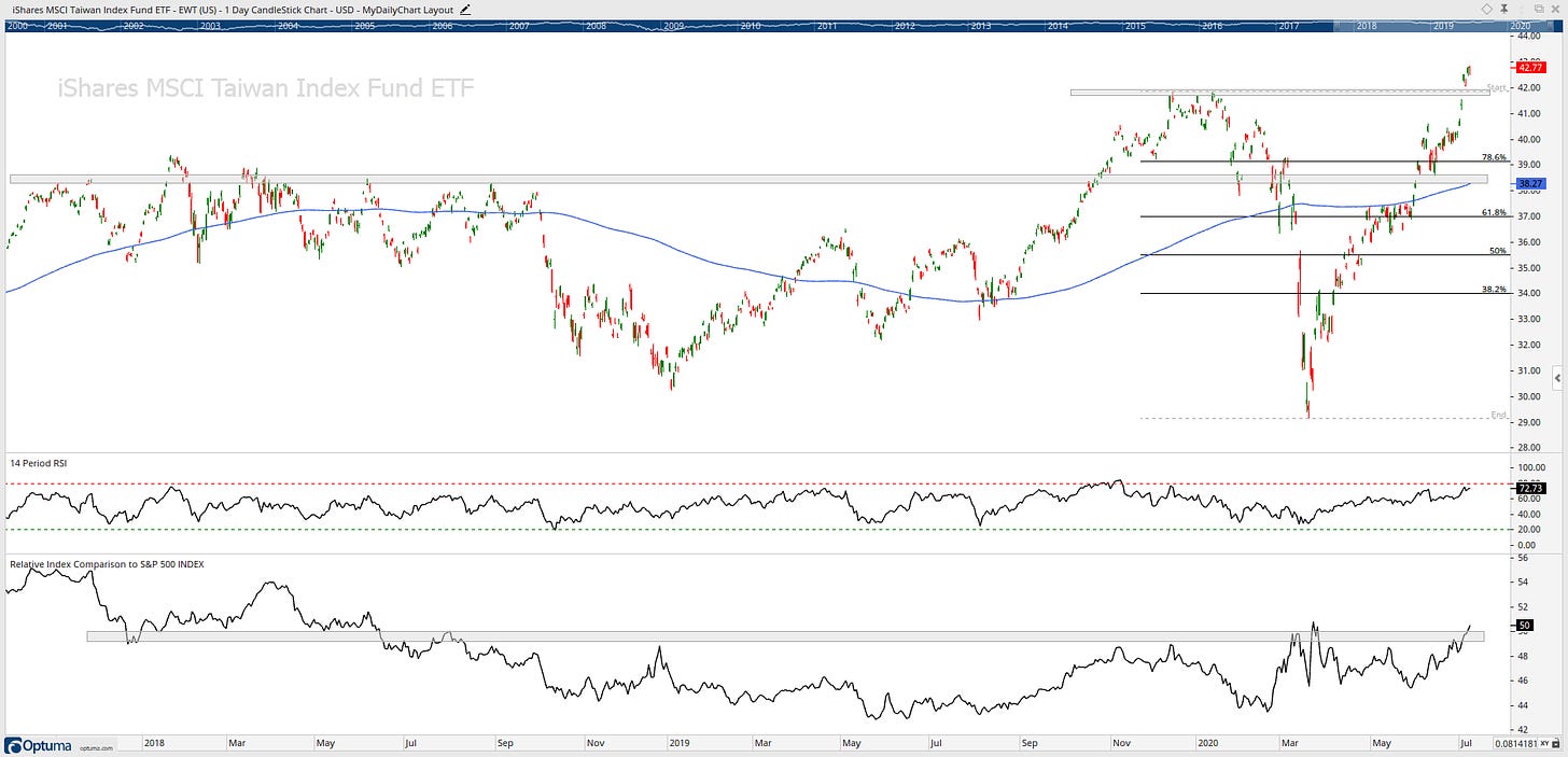
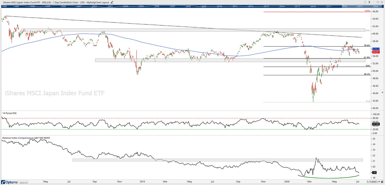
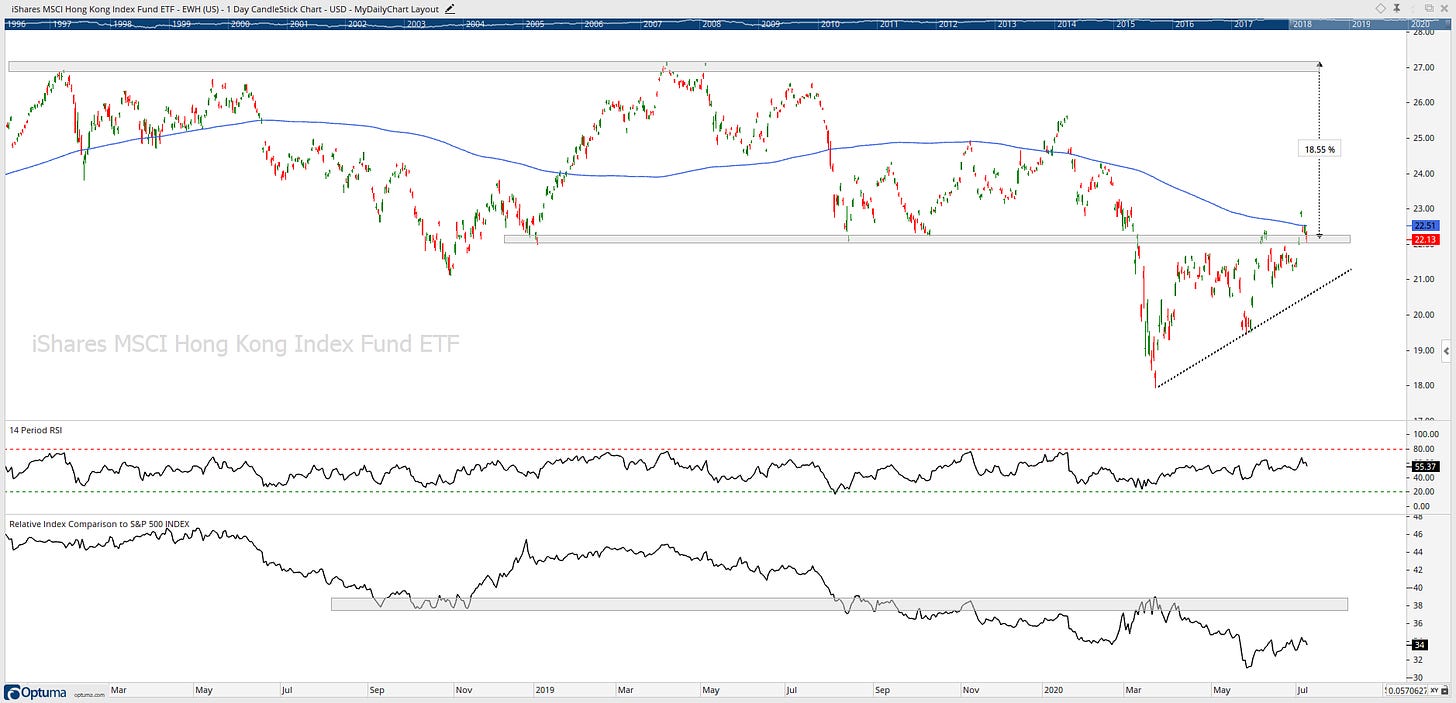
DISCLAIMER: The information included in this report are obtained from sources which Jotting on Charts believes to be reliable, but we do not guarantee its accuracy. All of the information contained herein should be independently verified and confirmed. All opinions expressed by Jotting on Charts are for informational purposes only. Jotting on Charts is not a financial advisor, and this does not constitute investment advice nor any opinions expressed, constitute a solicitation of the purchase or sale of any securities or related financial instruments. Jotting on Charts is not responsible for any losses incurred from any use of this information. Do not trade with money you cannot afford to lose. It is recommended that you consult a qualified financial advisor before making any investment decisions.

