Welcome to the first Jotting on Charts post. I hope you enjoy my thoughts and scribblings.

The first chart is a relative strength ratio chart of US stocks versus US treasuries over the past year. When the line is rising, it indicates that stocks are outperforming treasuries and vice versa. Looking at the current outperformance of stocks since the March lows have taken this ratio back to square one… where to next?

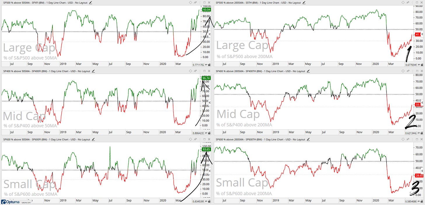
S&P500, 400 and 600 indices breadth breakdown (% of stocks above 50SMA & 200SMA) In March these indices had 2% stocks above 50SMA… Forty days later and these are at 90%+… The % of stocks above 200SMA moved from 2% to ~30% with a constructive move in all of the indices.

I find this chart is always an interesting chart to look at each week. S&P500 sector breadth breakdown (% of stocks above 200SMA) clear strength within the Tech and Health Care sectors. Tech is an offensive sector and Health Care is a defensive sector and in the following chart, you will see that the Health Care sector for the past two months has had a neutral performance relative to the S&P 500.
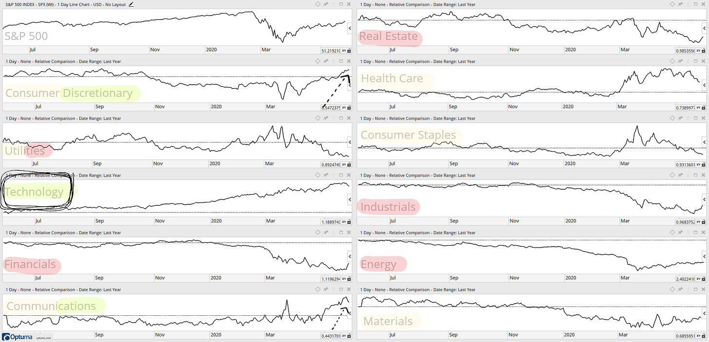
Clear lagging sectors are the Energy and Utes sectors… send the medics.

Tech is hugely outperforming relative to the S&P 500 and Energy still underperforming… Financials for the past three months have been terrible... Industrials, Real Estate and Utes have nothing to write home about either… Health Care for the past two months has been sitting and waiting after strong outperformance. Over the past month, we have seen strong outperformance from the Communications and Consumer Discretionary sectors.

High beta stocks gaining momentum relative to low volatility stocks… Growth stocks showing strong momentum relative to value stock... Strength in the US market relative to Developed & Emerging Markets.

Equally weighted Offensive sectors & Defensive sectors both above their 61.8% Fibonacci retracement level… However, they have different short term direction.

Consumer Discretionary vs Consumer Staples is one of my most essential & favourite ratio charts to look at weekly - Consumer Discretionary has made a substantial breakout of a 24-month downwards trend line. This chart is bullish for equity markets.

This is one of the strange charts I like to look at for Risk-on / Risk-off ideas - Dollartree (Discount store) vs Macy's (Department store). What I ask myself when I look at this chart is “Are people starting to watch their dollar more?”
Dollartree had a strong outperformance move during the March crash and, for the past two months it has levelled off within a range. The world economy is slowly reopening and this ratio at the lower levels of the range will we see a break lower as people start spending on higher-priced items again?
DISCLAIMER: The information included in this report are obtained from sources which Jotting on Charts believes to be reliable, but we do not guarantee its accuracy. All of the information contained herein should be independently verified and confirmed. Jotting on Charts is not a financial advisor and this does not constitute investment advice nor any opinions expressed, constitute a solicitation of the purchase or sale of any securities or related financial instruments. Jotting on Charts is not responsible for any losses incurred from any use of this information. Do not trade with money you cannot afford to lose. It is recommended that you consult a qualified financial advisor before making any investment decisions.


a nice summary of breadth
A great compilation of important charts that are summarized and easy to ready. Very nice, I just signed up!