I usually want to get a blog post out on Thursday, but I was so excited about sharing this post its already live on Wednesday! Hope you enjoy the charts!
Let us start with the chart below, which shows the relative strength of the S&P 500 versus US treasuries. When the line is rising, it indicates that stocks are outperforming bonds and vice versa when it is declining. Stocks peaked in February and bottomed in March; Stocks got crushed. However, Since then the chart shows a steady move upwards in the relative strength of stocks relative to bonds, the pace of stocks has accelerated over the past two weeks to where stocks are now back to outperforming bonds on a trailing one-year basis.

The next chart is how Intermarket analysis involves the analysis of more than just one asset class. I like to look at them all, such as stocks, bonds, commodities, and currencies. This chart helps determine the strength or weakness of the asset classes.

High beta has seen sharp momentum relative to low vol in Q2.
Large Cap has also seen sharp momentum relative to small caps but has started to fall away in Q2.
Growth stocks continue to show strong momentum relative to Value stocks.
Strength in the US stock market relative to developed & emerging markets.
Relative strength ratio is essential when it comes to the selection of what is healthy and what is weak. When the ratio rises, the numerator has relative strength and is outperforming its denominator. Conversely, when the ratio falls, the numerator shows relative weakness and is underperforming its denominator.

Tech still showing strong outperformance relative to the S&P500.
In Q2 of 2020, we saw outperformance movement in Consumer Disc & Communications.
Health Care after a sharp upwards move at the end of Q1 then has had no movement early Q2 however, the last month has started to underperform relative to the S&P 500.
Industrials, Energy & Financials have been clearly underperforming relative to the S&P500 for some time. However, they have each found a base, so are we likely to see outperformance in Q3?
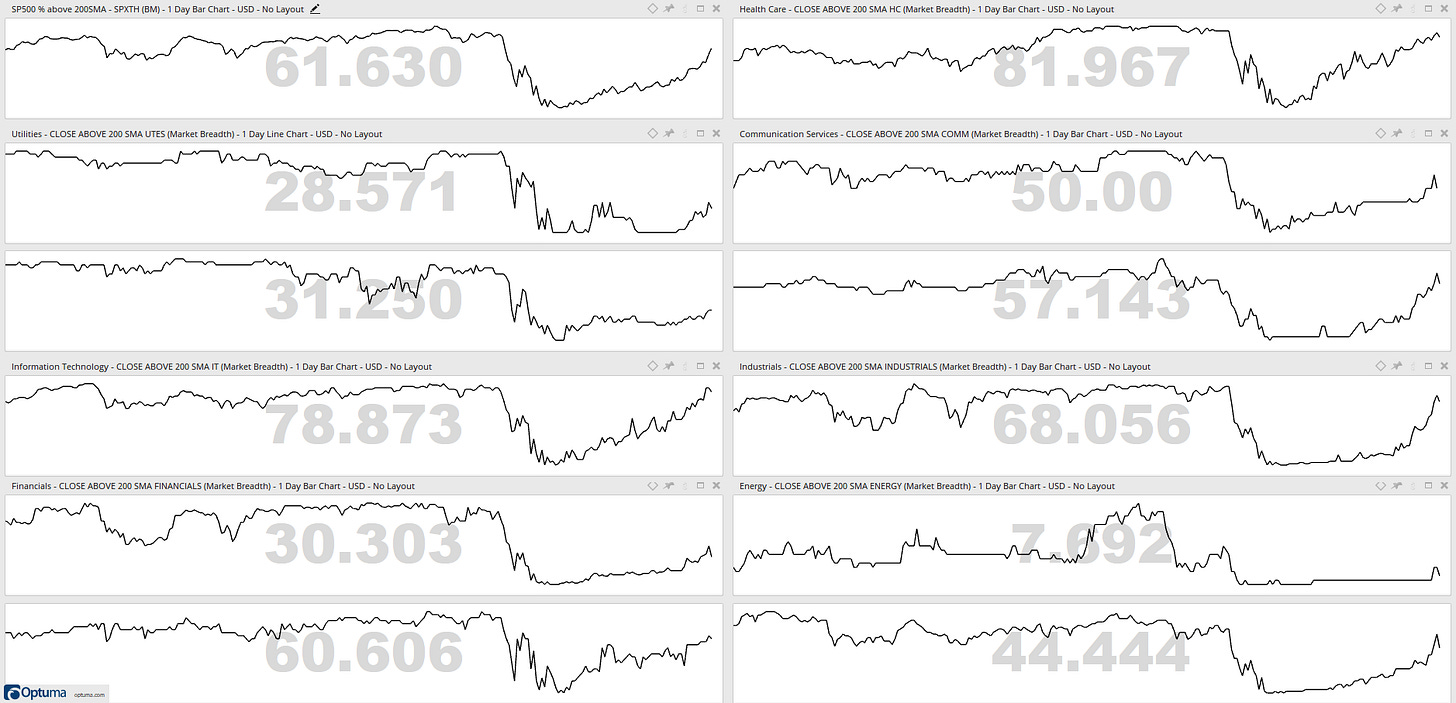
The percentage of stocks trading above their daily 200 simple moving average is a breadth indicator I like to use to measures internal strength or weakness in the underlying sectors. It outlines for me the degree of participation. Breadth is strong when the majority of stocks in a sector are trading above their daily 200 simple moving average. Conversely, breadth is weak when the minority of stocks are trading above a specific moving average.

I see strength in Information Technology, Health Care & Industrials.
I see weakness in Energy, Utilities & Real Estate.
Now, moving on to the main section of this post. Every Sunday morning with my coffee, I run my eyes over a workbook which is a list that contains my significant price levels which in turn provides a base for my bullish or bearish thesis on the markets. Please share with me on twitter @granthawkridge your thesis. let us begin:
Are more than 33% of stocks on the NYSE above their 200-day simple moving average?

Where is the VIX? ($VIX)

Is the Value Line Geometric Index above its January 2016 & 2018 lows? ($VLG)

Is S&P 500 above its April 29th high? ($SPY)

Is the Nasdaq 100 above $237 ($QQQ)

Is the Dow Jones Industrial Average above its April 29th high? ($DJI)

Is the Dow Jones Transportation Average above its April 29th high? ($DJT)

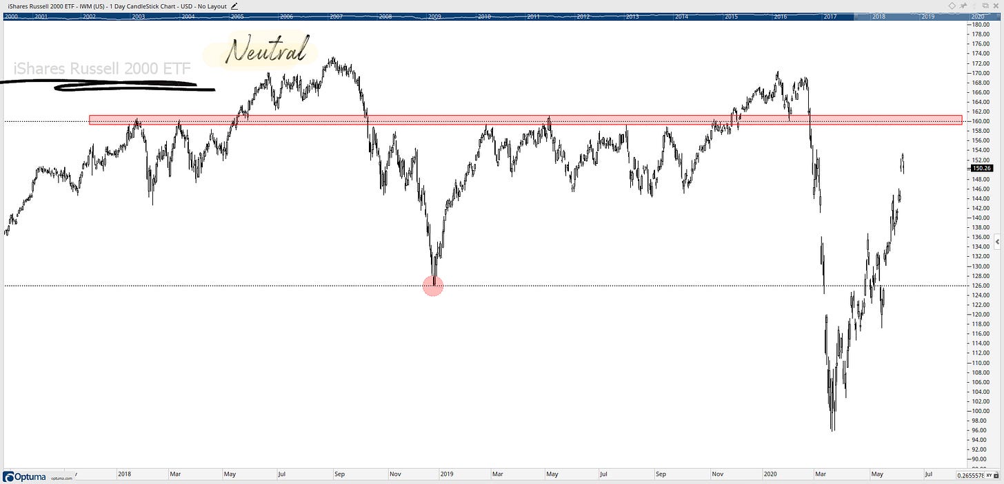
Is the Russell 2000 Small-Caps above their 2018 low & $160 zone? ($IWM)

Is the Russell Micro-cap Index Fund above its 2007 highs & 2018 lows? ($IWC)

Is the Semiconductor Index above $103? ($XSD)

Is the German DAX above 2018 high & the 2018 low? ($DAX)

Is the Communications Services Index Fund above its 2019 high? ($XLC)

Is the Industrials above their late 2018 lows & $73 zone? ($XLI)

Is the High Beta vs Low Volatility Ratio above 2011, 2012 & 2017 lows? ($SPHB/$SPLV)

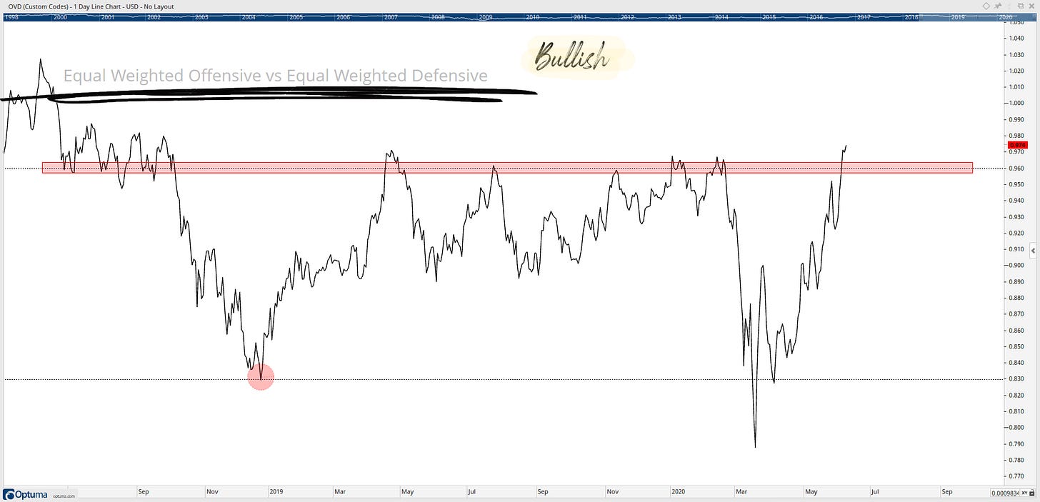
Is the Equal Weighted Offensive vs Equal Weighted Defensive Ratio above 0.83 & 0.96? ($XLK $XLY $XLF / $XLP $XLU $XLV)

Is the Small-Cap vs Mega-Cap Ratio above 2008 & 2016 lows? ($IWM/$DJI)

Is the S&P500 vs Consumer Staples Ratio above its 2018-2019 Lows of 4.8? ($SPY/$XLP)

Is the Consumer Discretionary vs Consumer Staples Ratio above 2018 & 2019 highs? ($XLY/$XLP)

Is the Financials vs S&P500 Ratio above its 2011 & 2016 lows? ($XLF/$SPY)

Is the High Yield vs Treasury Bond Ratio above its 2009 low? ($HYG/$IEI)

Is the US 5-yr Yield above 0.50% ($FVX)

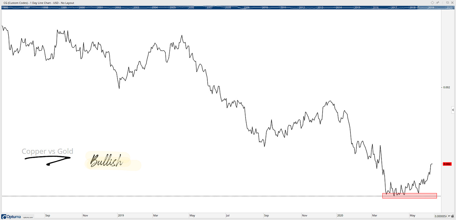
Is the Copper/Gold Ratio above recent basing lows? ($HG_F/$GC_F)

68% of the outlined charts are above my price levels.
Bullish: 15
Neutral: 5
Bearish: 2
Bottom line: I am bullish on the market. These charts outline the levels I want to be above going into the second half of the year. It is worth mentioning these levels are subject to change when the price and data changes... yes tomorrow they might be different! So, If you have a bearish thesis, please share your ideas in the comment section or send me a message on Twitter @granthawkridge. The stock market always has two sides to the story… buyers and sellers, and its okay to switch between the two when the price and data changes.
If you want to know my end of year target for the S&P500, please get in contact with me on twitter: @granthawkridge
Stay safe and good luck out there…
GH
P.S. All charts in this post are at EOD 09/06/2020
DISCLAIMER: The information included in this report are obtained from sources which Jotting on Charts believes to be reliable, but we do not guarantee its accuracy. All of the information contained herein should be independently verified and confirmed. Jotting on Charts is not a financial advisor, and this does not constitute investment advice nor any opinions expressed, constitute a solicitation of the purchase or sale of any securities or related financial instruments. Jotting on Charts is not responsible for any losses incurred from any use of this information. Do not trade with money you cannot afford to lose. It is recommended that you consult a qualified financial advisor before making any investment decisions.


