A Relative Report - 04/23/2024
A brief note on my preferred relative trends within the markets
Welcome to Jotting on Charts! If you're currently reading my blog but haven't subscribed yet, I invite you to join our community of over 900 subscribers. By subscribing, you'll gain access to a wealth of information on uptrends, downtrends, and everything in between.
There have been some updates to the ‘A Relative Post’ format since the last time I posted.
The relative ratio charts are still here, but…
I am bringing you something new!
The Relative Strength Leaderboard.
I am looking for strength across a custom universe of 20 key asset classes - ranging from US Stocks, Global Stocks, Fixed Income & Commodities
I weigh these various components against each other and look for relative leadership.
I then rank the relative performance across multiple time periods, stretching from one week to 52 weeks.
My overall weekly relative strength rankings are based solely on the intermediate and longer-term ranking scores rather than adding in the shorter-term mean reversion moves.
By doing this, it provides me with information about areas that are improving or deteriorating in relative strength.
Let's get stuck into last week’s data.
Here’s the latest asset allocation leaderboard:
Key Movers:
Gold GLD 0.00%↑ No Change (New Rank: 1)
Canada EWC 0.00%↑ +3 (New Rank: 4)
United Kingdom EWU 0.00%↑ +3 (New Rank: 5)
Key Losers:
Nasdaq 100 QQQ 0.00%↑ -6 (New Rank: 9)
Emerging Markets EEM 0.00%↑ -3 (New Rank: 13)
20+ Year Treasury Bonds TLT 0.00%↑ No Change (New Rank: 20)
This week, there has been a lot of activity in the relative strength rankings, which was expected due to the recent overall market volatility. Gold has retained its top spot as the clear winner, which is great news for gold enthusiasts. Notable moves higher were seen from Canada and the United Kingdom. On the other hand, the Nasdaq 100 faced a sharp decline, dropping six spots and currently sits at the ninth position in the rankings. Once again, Bonds bring up the tail.
Relative Ratios.
Let's dig into the charts…
Asset Allocation.
Stocks over Bonds: The trend continues to favour stocks over bonds, but the ratio has shown some weakness recently.
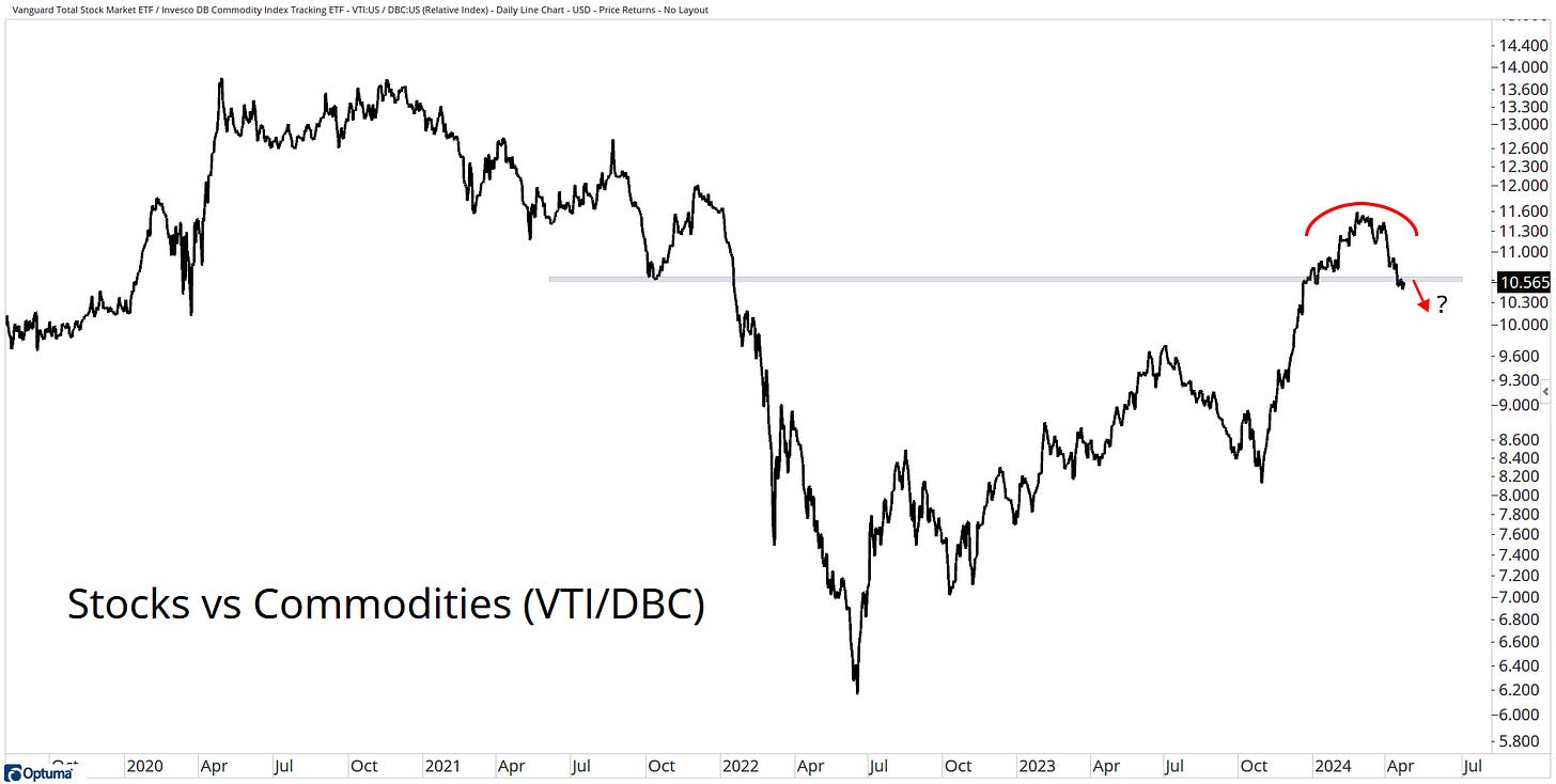
Commodities over Stocks: With an impressive move throughout 2023 from stocks, it now looks like the trend is switching in favour of commodities.
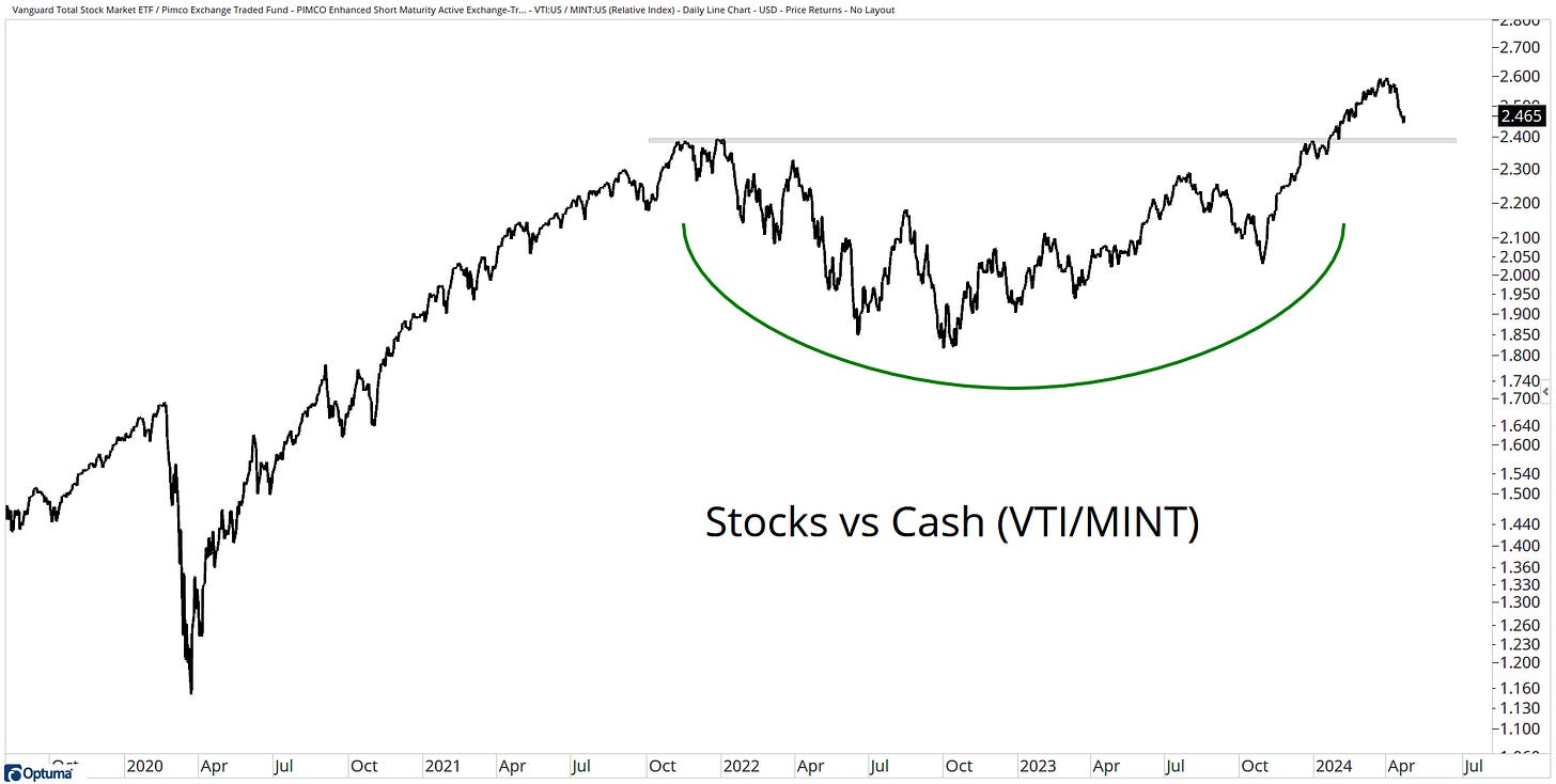
Stocks over Cash: Stocks continue to have strong leadership compared to cash.
Commodities over Bonds: This looks like a 2-year consolidation in the context of a primary downtrend in favour of commodities.
Cash over Bonds: Cash has gained the upper hand versus bonds, with the trend breaking below a key support level.
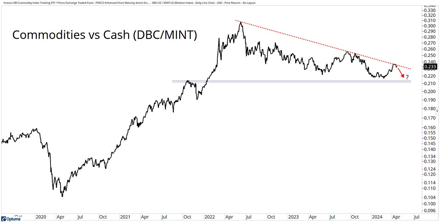
Cash over Commodities: The trend continues lower, which favours cash.
Stocks.
Large over Mid over Small: The trends still favour large over mids over smalls.
Mega over Micro: We still see higher highs and lower lows for Mega vs Micro.
Equal over Market Cap: Equal weight has dug in its heels at a key resistance level.
Value over Growth: This looks like a massive failed breakout. The ratio is now back below its 2020 & 2021 highs. This favours value stocks.
Energy, Industrials & Financials: These sectors are at the top of the relative strength rankings.
US over International: The trend has favoured US leadership for over a decade. Are International stocks trying to put up a roadblock here?
Developed over Frontier over Emerging: Developed markets continue with their strong leadership versus EM & FM.
Bonds.
Corporates over Treasuries: Corporates remain below a falling trend versus Treasuries. The ratio is now at 13-year lows.
High Yield over High Quality: With the ratio at 5-month lows, there is little evidence of stress in the economy, which has helped high yield continue this trend vs high quality.
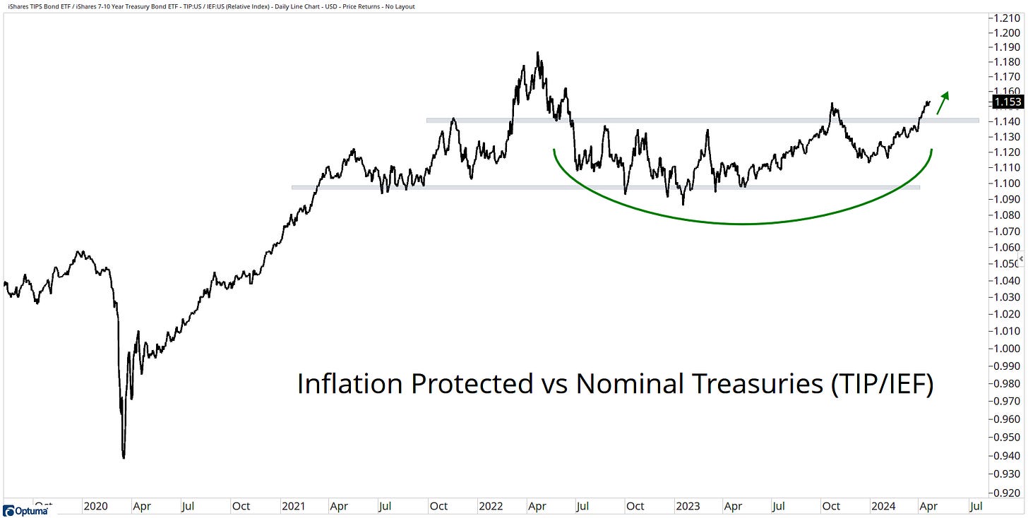
Inflation Protection over Nominal Treasuries: A breakout to new 52-week highs favours TIPs here.
Short-term over Long-term: The short end of the curve is where you want to focus.
Emerging Market Debt over US Debt: This ratio has broken down, with a bias favouring EM debt.
International Debt over US Debt: International debt has been gaining strength, while US debt has broken below a key support level.
Commodities & Alternatives.
Base Metals over Precious Metals: The longer-term trend is with Precious metals, but that is one massive failed breakout. With the ratio back below this level, it favours base metals.
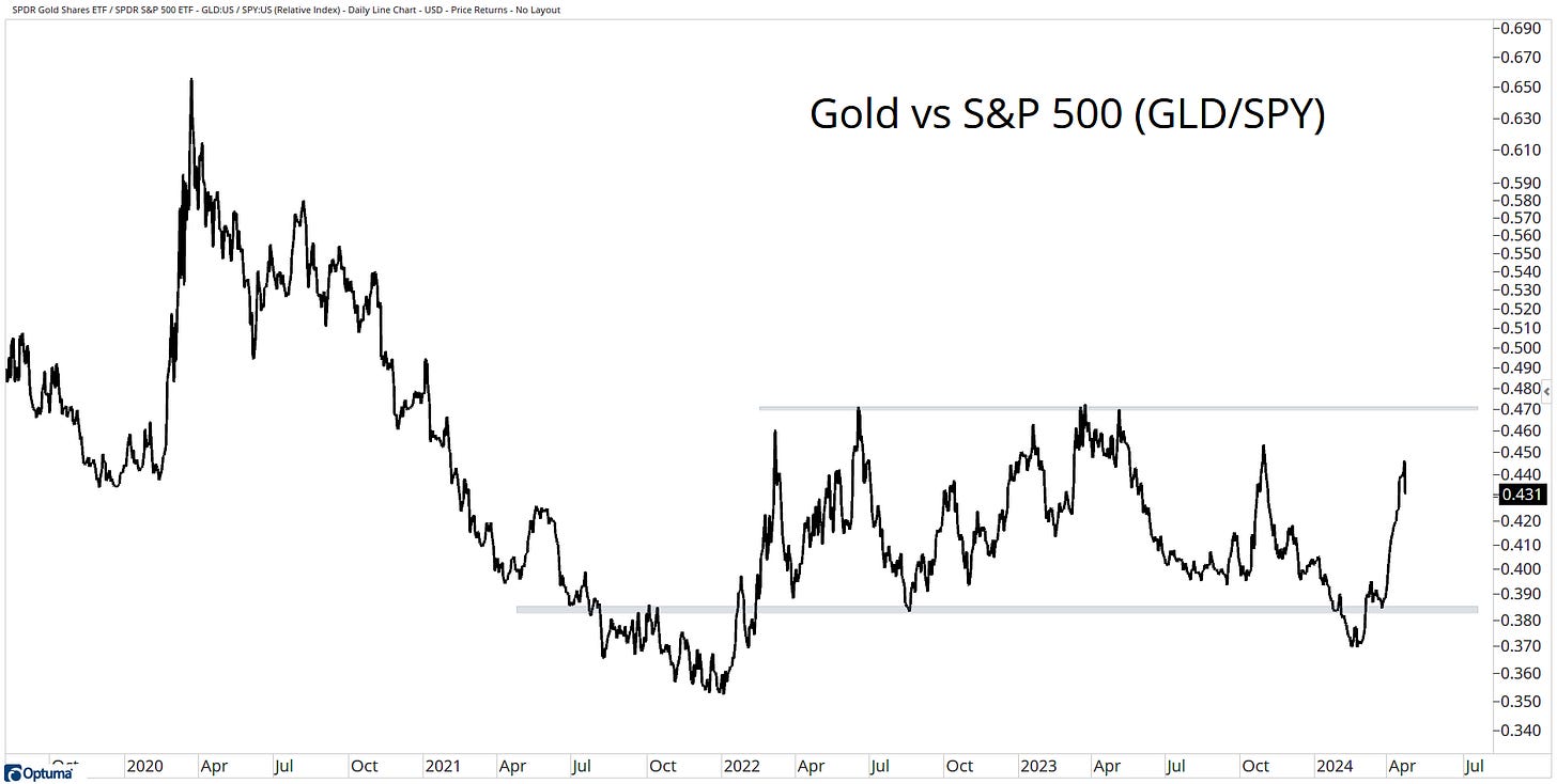
Gold over Stocks: The ratio has been stuck in this range for the past two years; however, gold has found some strength, ripping higher off a key support level.
Gold over Bonds: Gold remains in an uptrend versus bonds. This trend has been in place for the past 8-years.
US Dollar over Yen: The Yen has returned to its logical area of support in a downtrend; the path of least resistance is lower here.
US Dollar over EM Currencies: Back below a key resistance level puts this ratio back in favour of the US dollar.
Aussie Dollar over Yen: Strength from the Aussie Dollar as it nears 10-year highs.
Stocks over Real Estate: Real Estate continues to be under pressure, with a pattern of lower highs and lower lows versus stocks.
Before I finish up, always remember:
Remain flexible.
We can only work with the information that is available today.
Keep an open mind.
“I can't change the direction of the wind, but I can adjust my sails to always reach my destination.” — Jimmy Dean.
I want to take a moment to thank everyone who has been following along with me on this journey. Your support means the world to me.
If you find my content valuable, I would greatly appreciate it if you could share it with two of your friends who also enjoy analyzing charts. Your help in spreading the word would be amazing. Thank you to all those who share!
To subscribe to Jotting on Charts, simply click the "Subscribe now" button.
Subscribed
I would love to hear from you, so please get in touch with me on X.
Stay safe, and good luck out there…
GH
DISCLAIMER: The information in this report is obtained from sources that Jotting on Charts believes to be reliable, but we do not guarantee its accuracy. All of the information contained herein should be independently verified and confirmed. All opinions expressed by Jotting on Charts are for informational purposes only. Jotting on Charts is not a financial advisor. This does not constitute investment advice, nor any opinions expressed, constitute a solicitation of any securities or related financial instruments' purchase or sale. Jotting on Charts is not responsible for any losses incurred from any use of this information. Do not trade with money you cannot afford to lose. It is recommended that you consult a qualified financial advisor before making any investment decisions.


